

14 Weird Artworks by Famous Artists
👁 16 Views
We tend to imagine famous artists as people who always knew exactly what they were doing. Every brushstroke intentional, every composition perfectly thought through, every artwork… flawless.
But then you come across a painting with a strangely stretched cat. Or a sculpture that doesn’t quite understand anatomy. Or a perfectly realistic still life… interrupted by a very questionable-looking animal.
And suddenly, that idea starts to fall apart.
Because the truth is, even the greatest artists made things that feel a little odd. Sometimes unintentionally. Sometimes deliberately. And sometimes in ways that are hard to explain even today.
What makes these works interesting isn’t just that they’re “weird,” but how that weirdness shows up. It can come from a small detail that throws everything off, a concept that goes slightly too far, or an execution that doesn’t quite match the idea.
This list brings together fourteen such weird artworks. Some are amusing, some are confusing, and some sit somewhere in between. But all of them have one thing in common, they make you pause and think, what exactly is going on here?
And honestly, that might be what makes them worth looking at.
1. Angry Dog – Edvard Munch
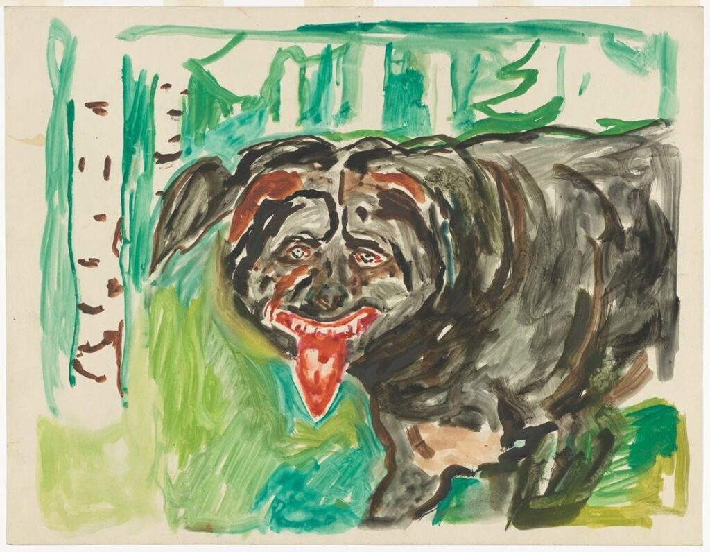
When you think of Edvard Munch, you probably think of existential dread, psychological tension, and haunting compositions like The Scream. What you don’t expect is a strangely personal feud with a neighbor’s dog. And yet, Angry Dog exists.
The story behind the work makes it even more unusual. The dog, named Rolle, belonged to Munch’s neighbor and had a reputation for being aggressive. It attacked locals, harassed postmen, and, at one point, even targeted Munch himself. What followed wasn’t just irritation, it became an oddly persistent fixation. Munch complained, wrote notes, and escalated the issue repeatedly. Somewhere in the middle of all this, he also began painting the dog.
What’s fascinating is how the artwork reflects this tension. The dog isn’t rendered with anatomical precision or softness. Instead, it appears exaggerated, almost grotesque, more emotional than real. It feels less like a portrait of an animal and more like a projection of frustration. The intensity of the image seems disproportionate to the subject, which is exactly where the work begins to feel strange.
This is where the “weirdness” shifts. The work isn’t strange because of technical failure or lack of skill, but because it is too personal, too specific, and too rooted in something mundane. A neighborhood annoyance is treated with the emotional weight of serious art. It blurs the line between artistic expression and everyday irritation, making the viewer slightly unsure of how to read it.
And maybe that’s what makes it linger, not because it’s perfect, but because it’s oddly, uncomfortably human.
2. The Overturned Bouquet – Abraham Mignon
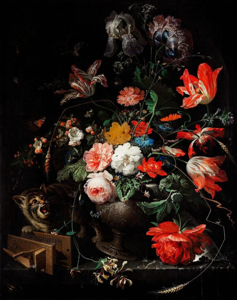
At first glance, Abraham Mignon’s The Overturned Bouquet looks exactly like what you’d expect from a 17th-century still life. It’s meticulous, richly detailed, and almost obsessively precise in its rendering of flowers, insects, and textures. Everything feels controlled, intentional, and technically impressive.
And then you notice the cat.
Tucked into the lower corner of the composition is a creature that completely disrupts the painting’s realism. It is, technically, a cat, but something about it feels deeply off. Its face carries oddly human features, with a strange nose, exaggerated expressions, and a mouth that feels closer to something primate than feline. The longer you look at it, the more unsettling it becomes.
What makes this particularly strange is the contrast. Mignon was clearly capable of incredible realism, as seen in the flowers, the glass, and even the smallest insects, all rendered with remarkable precision. Which makes the awkwardness of the cat even harder to ignore. It doesn’t feel like a stylistic choice. It feels like a moment where the artist simply didn’t get it right.
And yet, that “mistake” becomes the most memorable part of the painting.
The overturned bouquet itself suggests chaos or disruption, a common theme in still life paintings symbolizing the fragility of beauty and life. But the cat unintentionally amplifies that chaos in a way that feels almost accidental. Instead of subtle symbolism, we get something visually jarring, something that pulls you out of the painting rather than deeper into it.
That’s where the weirdness lies.
Not in what the painting is trying to say, but in how one small detail quietly undermines everything else, turning a masterful still life into something strangely unforgettable.
3. The White Cat – Pierre Bonnard
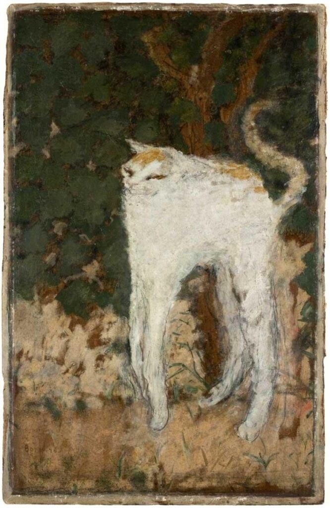
Pierre Bonnard was part of the Post-Impressionist group known as the Nabis, artists who were deeply interested in composition, decoration, and flattening reality into something more stylized. So distortion, in his case, isn’t entirely unexpected. And yet, The White Cat feels strange even within that context.
At first glance, the painting is simple. A white cat arches its back, stretching across the canvas. But the longer you look, the more something starts to feel off. The proportions don’t quite make sense. The body is unusually long, the legs feel awkwardly placed, and the cat seems to lack a clear sense of structure. It’s recognizable, but just barely.
What makes this particularly interesting is that this distortion wasn’t accidental. Studies of the painting show that Bonnard reworked parts of it multiple times, especially the positioning of the legs. This wasn’t a quick sketch or a careless rendering. It was a deliberate process that still resulted in something that looks oddly unresolved.
There’s also a visual rhythm to the painting that echoes influences from Japanese prints, which the Nabis admired. The curved lines and flattened space give the cat a decorative quality, but they also contribute to its unnatural appearance. Instead of feeling fluid or elegant, the form becomes slightly exaggerated, almost caricature-like.
This is where the weirdness sits.
Not in failure, but in intention that doesn’t fully translate. The painting exists somewhere between stylization and distortion, where the familiar slips just enough to feel uncomfortable. It’s still a cat, but not one you’d ever expect to encounter in real life.
And that tension is exactly what makes it stay.
4. The Sphinx – Georg von Rosen
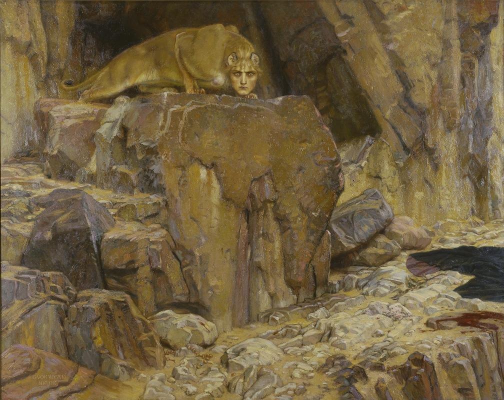
Georg von Rosen was primarily known for historical scenes and landscapes, which makes The Sphinx feel like an unusual direction in his work. The subject itself is not unfamiliar. Mythological hybrids have appeared throughout art history, especially in Symbolist and classical traditions. However, what makes this painting stand out is not the idea, but how it has been executed.
At first glance, the figure appears to be a typical sphinx, with a human head and the body of a lioness. But the longer you look, the more the structure begins to feel disjointed. The proportions do not align naturally, and the connection between the head and body feels awkward. It becomes difficult to imagine how this figure would exist physically, which creates a subtle but persistent discomfort.
The blending of human and animal elements adds to this unease. Instead of forming a cohesive hybrid, the painting draws attention to the mismatch. The face appears somewhat detached, and certain anatomical details only make the figure more confusing. Rather than symbolic or fluid, the combination feels forced and unresolved.
This is where the strangeness of the work becomes apparent. It does not function fully as a symbolic image, nor does it embrace surreal distortion in a deliberate way. Instead, it sits in an in-between space where the concept is clear, but the visual result feels uncertain.
That uncertainty is what makes the painting difficult to interpret and hard to ignore.
5. Night – Michelangelo
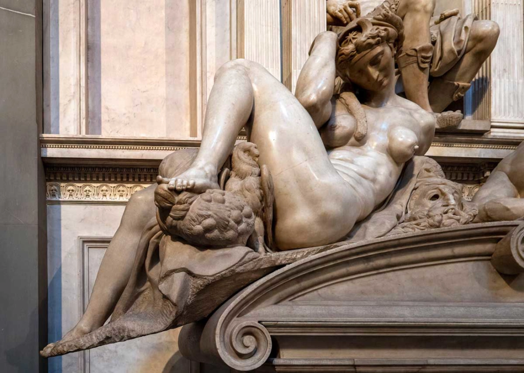
Michelangelo is often considered the benchmark for anatomical perfection. His sculptures are studied for their precision, balance, and deep understanding of the human body. Which is exactly why Night, one of the figures from the Medici Chapel, feels so unexpectedly off.
At first glance, the sculpture carries all the hallmarks of Michelangelo’s style. The figure is powerful, sculpted with strong musculature and a sense of weight that feels grounded and deliberate. But as you look closer, the inconsistencies begin to surface. The figure is meant to represent a woman, yet the body reads as distinctly masculine, with broad shoulders, heavy limbs, and a torso that does not align with conventional female anatomy.
The most noticeable tension lies in the chest. The breasts appear almost attached rather than integrated, creating a visual disconnect that is difficult to ignore. It feels less like a unified form and more like two ideas placed together without fully resolving into one.
This is where the work becomes particularly interesting. The issue is not a lack of skill, but a clash between expectation and execution. From an artist known for near-perfect anatomical understanding, this departure stands out far more than it would in another context.
There are multiple interpretations. Some suggest Michelangelo relied heavily on male models, applying the same structure across figures. Others point to the limitations of the time, where access to female models was restricted. Regardless of the reason, the result is a sculpture that feels unresolved in a way that is hard to overlook.
And that tension is exactly what makes it so compelling.
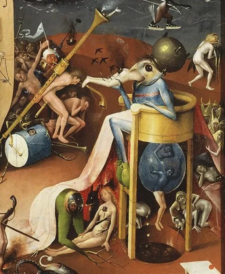
6. The Garden of Earthly Delights – Hieronymus Bosch
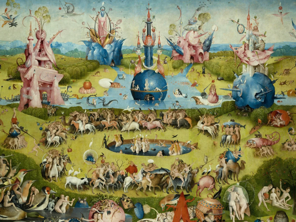
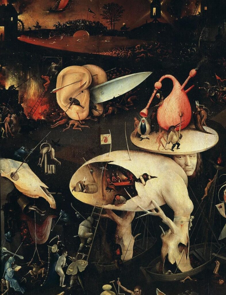
Hieronymus Bosch’s The Garden of Earthly Delights is often described as one of the strangest paintings in Western art history, and it’s not difficult to see why. At first glance, the work appears overwhelming, filled with countless figures, animals, and scenes that seem to unfold all at once. The more you look, the less it feels like a single composition and more like a collection of strange, loosely connected moments.
The painting is structured as a triptych, traditionally read from left to right. It begins with a relatively calm depiction of paradise, shifts into a chaotic and sensual middle panel, and ends in a dark, nightmarish vision of hell. While this structure suggests a clear narrative, the details within each panel resist easy interpretation. Everywhere you look, there is something unexpected: oversized fruits, hybrid creatures, distorted bodies, and scenes that feel both playful and disturbing.
What makes the work particularly unusual is the way these elements coexist. Some figures appear engaged in ordinary activities, while others are involved in actions that feel surreal or symbolic, yet not fully explained. The painting does not guide the viewer toward a single meaning. Instead, it creates a sense of visual overload, where attention keeps shifting from one strange detail to another.
There is also a tension between familiarity and distortion. Human figures are recognizable, but their actions and surroundings often defy logic. Animals behave in unusual ways, and objects take on exaggerated forms. This combination creates an atmosphere that feels both imaginative and slightly unsettling.
Rather than presenting a clear message, the painting invites observation without resolution. It is this refusal to fully explain itself that makes it one of the most compelling and perplexing works in art history.
7. Truth Coming Out of Her Well – Jean-Léon Gérôme
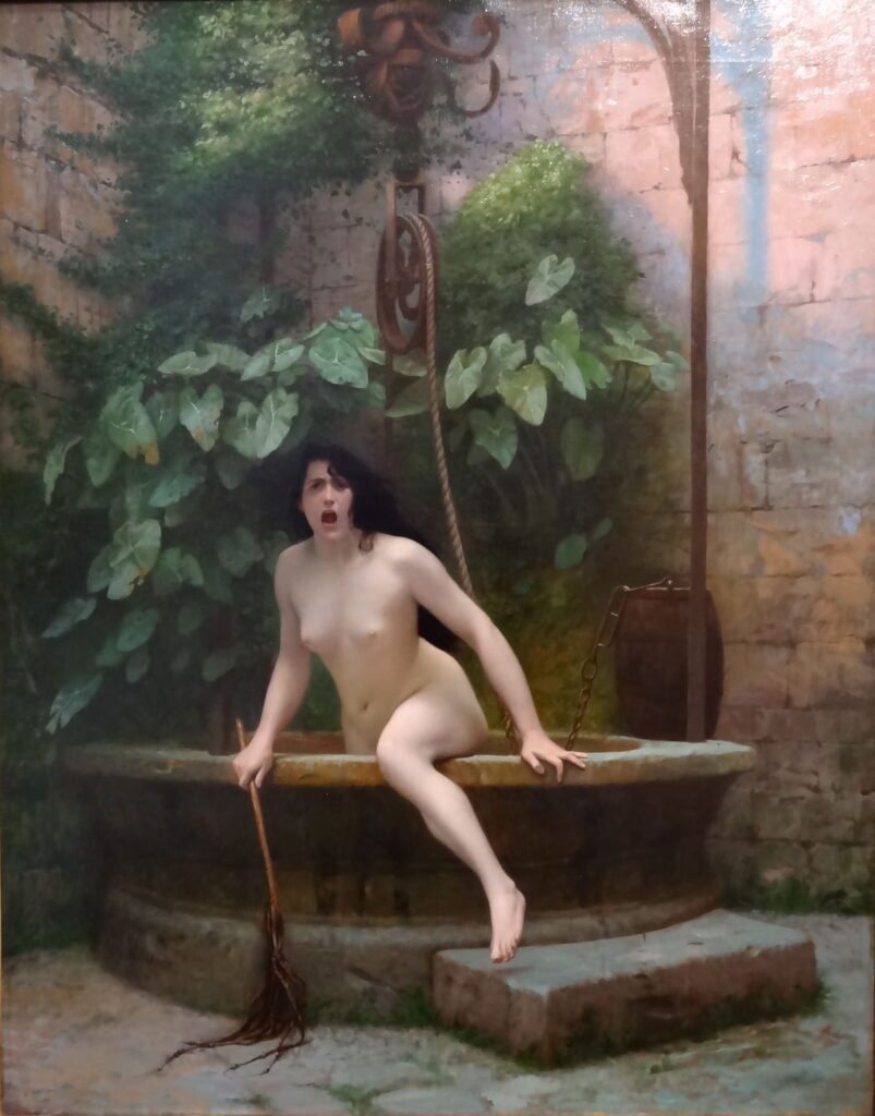
Jean-Léon Gérôme was known for his polished, academic style and carefully composed historical and allegorical scenes. His work typically reflects control, precision, and clarity of intent. Which is why Truth Coming Out of Her Well feels unexpectedly strange.
The painting is based on a philosophical idea that “truth lies hidden,” often associated with the notion that truth is difficult to access or understand. Gérôme visualizes this concept quite literally by depicting Truth as a naked woman emerging from a well, holding a whip as if ready to confront or punish the world.
On paper, the symbolism is clear. But visually, something doesn’t fully align.
The figure itself feels exaggerated in a way that draws attention away from the idea and toward the expression. Her face, in particular, carries an intensity that borders on theatrical. Instead of appearing symbolic or restrained, it feels almost confrontational, even slightly exaggerated to the point of distraction. The result is a painting that is difficult to take at face value.
This is where the work becomes unusual. The allegory is straightforward, but the execution introduces an unintended tension. The image sits somewhere between serious symbolism and something that feels almost unintentionally dramatic. It creates a moment where the viewer is unsure whether to read it as profound or slightly absurd.
That ambiguity is what gives the painting its strange quality. It is not confusing in concept, but in tone. The clarity of the idea clashes with the intensity of its presentation, making it feel both deliberate and oddly exaggerated at the same time.
8. Portrait of Eve – Giuseppe Arcimboldo
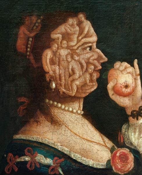
Giuseppe Arcimboldo is known for his composite portraits, where faces are constructed from objects like fruits, vegetables, books, and animals. These works are often playful, clever, and visually surprising. But Portrait of Eve takes that idea in a direction that feels far more unsettling.
At first glance, the image reads as a traditional portrait. A female figure stands in profile, holding an apple, clearly referencing the Biblical Eve. But the illusion quickly breaks down. Her face and body are not made of a single form, but of multiple intertwined human figures. Limbs, torsos, and bodies come together to construct her features, creating an image that is both intricate and deeply disorienting.
The concept behind this choice is logical. As the first woman, Eve is often understood as the origin of humanity, so constructing her body from many human forms becomes a visual metaphor for that idea. In theory, it is a thoughtful and symbolic approach.
In practice, however, it feels strange in a very different way.
The overlapping bodies create a sense of visual discomfort. The more you look, the harder it becomes to separate the individual forms from the whole. What initially appears clever begins to feel slightly overwhelming, even unsettling. The human body, usually familiar and readable, is fragmented and rearranged into something that resists easy recognition.
This is where the painting stands apart. It is not strange because it fails, but because it succeeds in a way that feels almost too literal. The idea is clear, but its execution pushes the viewer into a space that feels visually and conceptually uneasy at the same time.
9. Cat with Cat Necklace – Louis Wain
Louis Wain became widely known for his illustrations of cats, often depicting them in human-like situations with a sense of humor and charm. His earlier works are relatively naturalistic, showing cats dressed in clothes, attending parties, or engaging in everyday activities. But over time, his style changed dramatically.
Cat with Cat Necklace comes from this later phase, where the imagery becomes far more intense and visually complex. At first glance, the subject still seems familiar. It is a cat, posed almost like a formal portrait, wearing decorative elements that resemble a necklace or ceremonial attire. But the longer you look, the more the image begins to shift.
The face is highly stylized, almost geometric, with patterns that feel more decorative than anatomical. The colors are vivid and layered, creating a surface that feels busy and slightly overwhelming. Instead of focusing on the structure of the animal, the painting emphasizes pattern, repetition, and visual rhythm.
This creates a strange tension. The image sits somewhere between representation and abstraction. It is still recognizable as a cat, but the details push it toward something more symbolic, almost hypnotic in its repetition.
Some interpretations link this shift in style to Wain’s mental health later in life, though such readings remain debated and often oversimplified. What is clear, however, is that the work moves away from observation and toward a more internal, expressive language.
That transition is what makes the painting stand out. It is not just unusual in appearance, but in how it transforms a familiar subject into something that feels intricate, excessive, and slightly disorienting.
10. Snail Cat
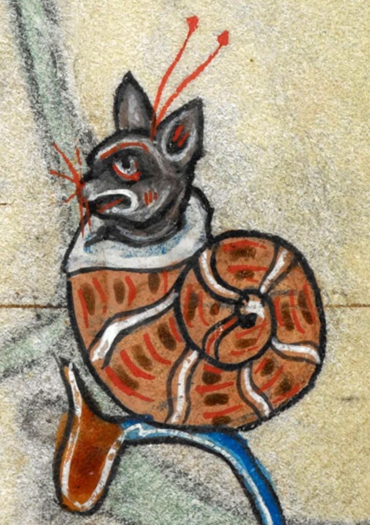
Unlike the other works in this list, Snail Cat does not come from a single named artist or a grand artistic movement. It belongs to the world of medieval marginalia, the small, often bizarre illustrations that appear in the margins of illuminated manuscripts. These images were not always directly related to the main text, which gave artists a surprising amount of freedom.
And that freedom led to some very strange results.
Snail Cat is exactly what it sounds like. A cat, placed inside the shell of a snail. There is no clear narrative, no obvious symbolism, and no attempt to make the image logically coherent. It exists almost as a visual interruption, something unexpected that sits alongside otherwise serious religious or literary content.
What makes this particularly interesting is how common this kind of imagery was. Medieval manuscripts are filled with unusual scenes, animals behaving strangely, hybrid creatures, and moments that feel oddly humorous. Snails, in particular, appear frequently in these illustrations, though their exact meaning is still debated. Some interpretations suggest they symbolized weakness or caution, while others view them as purely decorative or even satirical.
In this context, Snail Cat becomes less about meaning and more about imagination. It reflects a space within art where rules are relaxed and experimentation takes over. There is no pressure for realism or coherence, only the opportunity to create something visually engaging.
That is what makes it such a fitting conclusion to this list. After works that feel strange because of tension, distortion, or conceptual complexity, this image stands out for a different reason. It is strange simply because it can be.
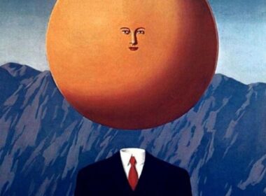
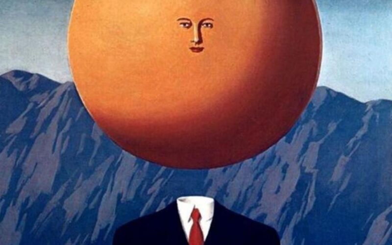
11. The Art of Living – René Magritte
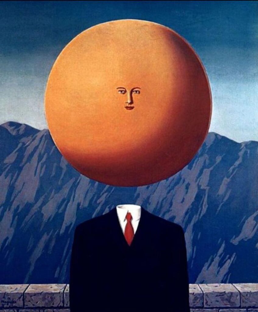
René Magritte built his entire practice around making the familiar feel strange. His paintings rarely rely on distortion alone. Instead, he places ordinary objects and figures into slightly altered situations, just enough to disrupt how we understand them. The Art of Living follows this approach, but in a way that feels particularly disorienting.
At first glance, the painting appears relatively straightforward. A man stands in a quiet, open setting, his body rendered in a realistic manner. But the normalcy ends at the head. Instead of a face, we see a large, smooth, orange sphere. It replaces identity entirely, turning the figure into something anonymous and difficult to interpret.
What makes this unsettling is not the scale alone, but the contrast. Everything else in the composition feels grounded and believable. The proportions of the body, the posture, and the setting all suggest a sense of realism. Which makes the head feel even more out of place, as if it has been inserted into the scene without explanation.
Magritte’s work often resists clear interpretation, and this painting is no exception. The oversized head could suggest a focus on thought, identity, or perception, but the artist never confirms any single meaning. Instead, the image holds its ambiguity, allowing the viewer to sit with the contradiction.
This is where the painting’s strangeness becomes most effective. It does not overwhelm with detail or complexity. It alters just one element, and in doing so, changes the entire reading of the image. The result is quiet, controlled, and deeply unsettling in its simplicity.
12. Portrait of Antonietta Gonzalez – Lavinia Fontana
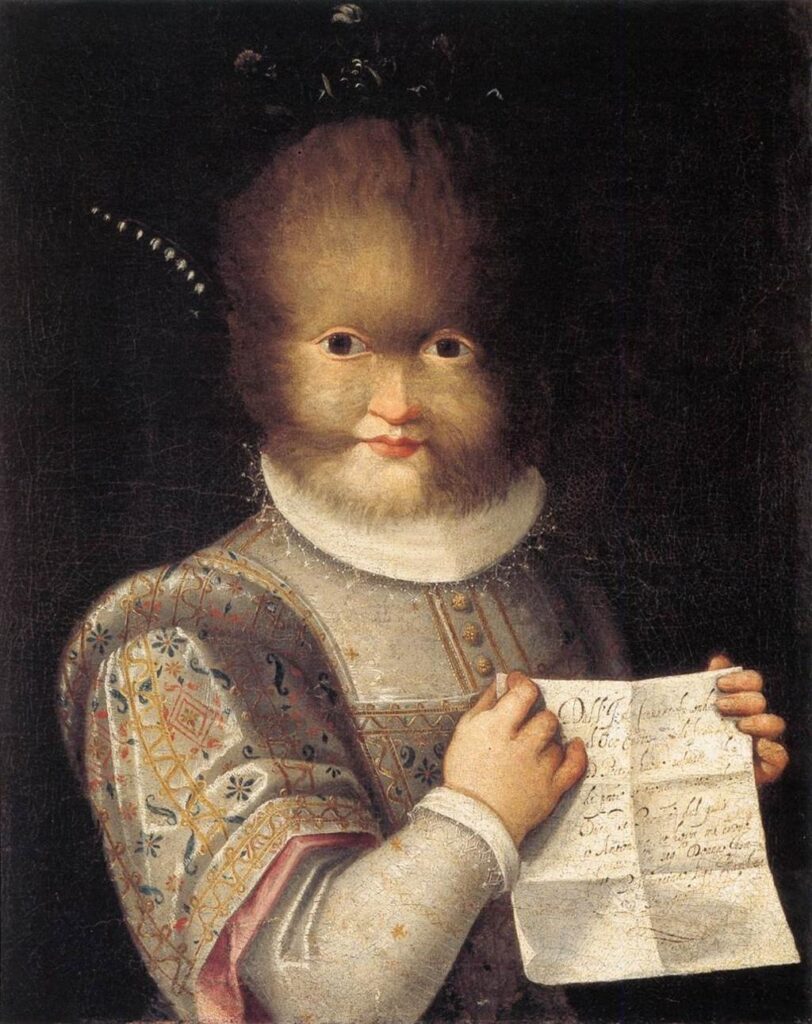
At first glance, Portrait of Antonietta Gonzalez feels like a traditional Renaissance portrait. The composition is formal, the clothing is detailed, and the subject is presented with a quiet dignity that reflects the conventions of the time. But the longer you look, the more the image begins to stand apart from what you expect.
Lavinia Fontana painted Antonietta Gonzalez as a real individual, not a fictional or symbolic figure. Antonietta was born with hypertrichosis, a rare condition that causes excessive hair growth across the body. Rather than hiding or minimizing this feature, the painting presents it directly, making it an unavoidable part of how the viewer engages with the work.
What makes the painting unusual is not just the subject, but the way it is handled. Fontana does not treat Antonietta as a curiosity or exaggerate her condition for effect. Instead, she follows the structure of a formal portrait, carefully rendering her clothing, posture, and expression with the same attention given to other sitters of the period. This creates a tension between familiarity and difference.
The viewer is placed in an uncertain position. On one hand, the painting invites a respectful reading, emphasizing Antonietta’s presence as an individual. On the other, the visual impact of her condition makes it difficult to look at the work without a sense of discomfort or curiosity. The painting does not resolve this tension, nor does it attempt to guide the viewer toward a single interpretation.
That is what makes it stand out. It challenges the expectations of portraiture without abandoning them, creating an image that feels both conventional and unusual at the same time.
13. Saint Lucy – Domenico Beccafumi
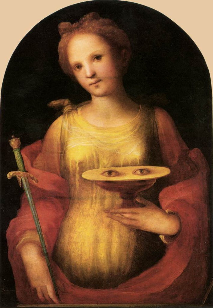
In Renaissance art, religious figures are usually presented with clarity and symbolic consistency. Saints are often identifiable through specific attributes that reference their life or martyrdom. In the case of Saint Lucy, painted by Domenico Beccafumi, that symbolism takes a particularly unusual form.
Saint Lucy is traditionally associated with vision and blindness. According to Christian accounts, her eyes were removed during her martyrdom, which is why she is often depicted holding them as an attribute. In Beccafumi’s version, this detail is presented quite literally. Lucy is shown holding a dish with a pair of eyes placed on it, while still having eyes in her own face.
This creates an immediate visual contradiction. The symbolism is clear within its historical context, but when viewed directly, the image feels strange. The presence of two sets of eyes disrupts the natural reading of the figure, making it difficult to process the image without focusing on that detail.
What adds to the effect is the otherwise calm and composed presentation. Lucy is not shown in distress or suffering. Her posture remains steady, and her expression is relatively neutral. This contrast between the disturbing attribute and the composed figure creates a subtle tension within the painting.
The work does not aim to shock, yet it inevitably does. The symbolism, while traditional, becomes visually unsettling when taken at face value. It highlights how certain historical conventions, when removed from their original context, can feel unexpectedly unusual.
This is where the painting stands out. It remains faithful to its symbolic tradition, but at the same time, it creates an image that feels difficult to reconcile visually.
14. Sirens – Arnold Böcklin
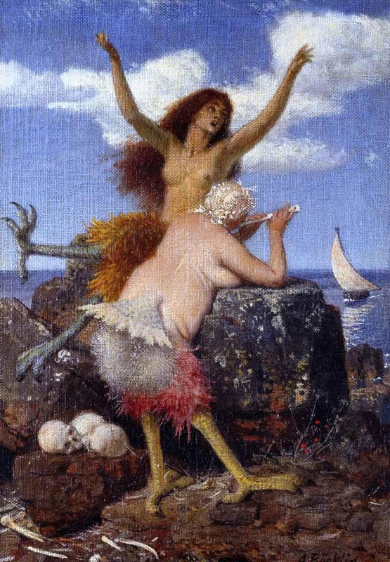
Arnold Böcklin was one of the key figures of Symbolism, known for drawing on mythology to create atmospheric and often dramatic compositions. His works frequently feature creatures like nymphs, satyrs, and sirens, figures that traditionally carry a sense of mystery, danger, and allure. In Sirens, however, that expected balance feels noticeably disrupted.
According to Greek mythology, sirens were meant to be irresistible. Their beauty and voices were said to lure sailors toward destruction, making them both seductive and threatening. Böcklin’s interpretation, however, does not fully capture that tension. Instead of appearing enchanting or powerful, the figures come across as slightly awkward and visually inconsistent.
The most striking issue lies in their anatomy. The combination of human and bird elements does not merge seamlessly. Their bodies feel heavy, and details like the feathered lower halves and bird-like feet draw attention in a way that breaks the illusion. Rather than forming a cohesive hybrid, the figures appear assembled, making it difficult to read them as convincing mythological beings.
This creates a disconnect between concept and execution. The symbolism of the siren, often associated with danger and seduction, is still present in theory. But visually, the painting does not fully support that idea. The figures lack the intensity and presence typically associated with such subjects, which makes the overall image feel uncertain.
The result is a work that is not entirely unsuccessful, but clearly uneven. The intention is evident, yet the execution does not fully align with it, and that gap is where its strangeness becomes most apparent.
Looking at all these works together, one thing becomes clear. Weirdness in art isn’t an exception. It’s part of the process.
Sometimes it comes from pushing an idea too far. Sometimes from not pushing it enough. And sometimes, it just appears in places you don’t expect, in the middle of an otherwise “perfect” artwork.
But that’s also what makes these pieces interesting.
Because the moment something feels slightly off, you stop. You look again. You question it. And in doing that, you end up spending more time with the work than you probably would have otherwise.
Maybe that’s the real role of these artworks.
Not to be flawless, but to interrupt. To confuse just enough. To stay in your mind a little longer than expected, even if you’re not entirely sure why.
Which of these artworks felt the most unusual to you and do you think that strangeness adds to the work or takes away from it?
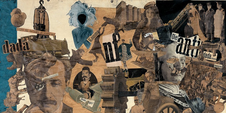
If this made you rethink what “weird” in art really means, it goes even further. Some of the strangest ideas didn’t come from single artworks, but entire movements.
Read more: Strangest Art Movements in History