
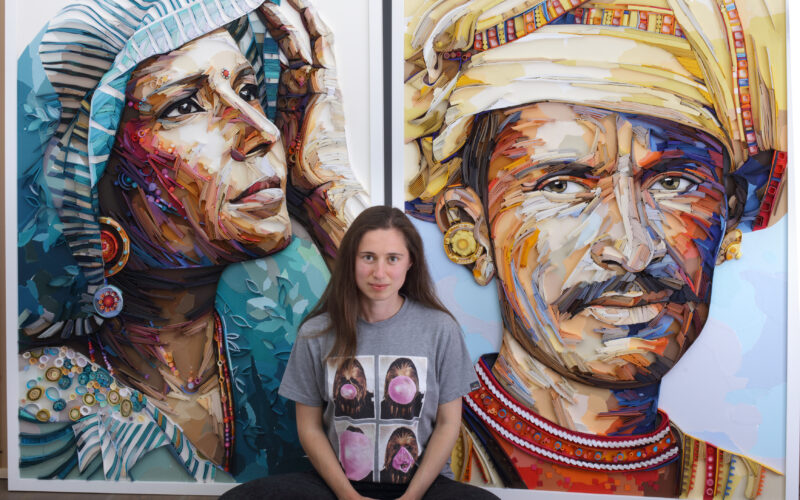
Why Does Her Work Look Like Painting but Isn’t Paint at All? I Yulia Brodskaya
👁 98 Views
Some artists reinvent a medium. Others reinvent the way we see it. Yulia Brodskaya has done both. Long before the world recognised her as a pioneer of contemporary paper art, she was a child in Moscow quietly mastering colour, form, and the discipline of visual expression. And this week, for our Best of the Art World series, we are honoured to share her extraordinary creative evolution a journey that began with intuition and became a global redefinition of what paper can be.
From the beginning, creativity wasn’t something Yulia discovered; it was simply part of the rhythm of her life. She grew up believing that art was a natural way of being, shaped by early years in art school, surrounded by pencils, brushes, and the quiet understanding that making things with her hands mattered. Yet, like many artists, her path wasn’t linear. She studied graphic design in Moscow, moved to the UK in search of a more open creative world, and spent years exploring paper only as a side passion, convinced that “real work” could only happen digitally.

But the turning point came unexpectedly not through a grand decision, but through a small but pivotal moment. While designing a self-promotional booklet, she needed a striking cover. She scribbled, sketched, refined, and rejected ideas. Then, almost without thinking, she reached for paper. She cut strips, shaped them, glued them piece by piece into the letters of her own name. What emerged in those few hours was not just a design it was a revelation. A completely new visual language. A door opening.
From that moment, everything shifted.
She abandoned the booklet and stepped fully into a medium she had, unknowingly, been searching for. What began as a curiosity became a calling. And in redefining quilling transforming it from a delicate craft into a form of sculptural painting, Yulia carved out a space entirely her own. Her technique grew more expressive, more painterly, more dimensional. Colour became movement. Paper became emotion. Portraits, nature, and human expression became living, breathing forms shaped by hundreds of precisely placed strips. Today, her pieces carry emotional charge, textural richness, and a sense of life that transcends the material itself. She doesn’t just create images; she reveals something about perception, colour, and the beauty of slow, intentional craft.
Let’s get to know Yulia Brodskaya and her incredible journey through this in-depth interview
To begin, can you share your background where you grew up, your early creative influences, and how your path led you to where you are now?
My parents sent me to art school when I was about six years old, so I was deeply involved in creative practices long before I had any conscious idea of what I wanted to do with my life. I grew up believing that creativity, in one form or another, was an integral part of life — simply how things were meant to be. After finishing art school, I went on to study Graphic Design at a university in Moscow. Later, I moved to the UK to immerse myself further in the world of Advertising and Graphic Design, as I felt that the Russian educational system in the early 2000s couldn’t provide the kind of industry experience I needed. For as long as I can remember, paper has always held a special fascination for me. Still, if someone had told me back then that I would one day become a paper artist — and have little to no interest in using any other materials I would never have believed them. Over the years, I tried many different methods and techniques of working with paper, mostly as a side hobby, convinced that digital work was the only reliable way to make a living.

However, after completing my Master’s degree in Graphic Communication, I realised I would much rather become an illustrator and create with my hands. I spent about a year and a half drawing and searching for my own unique style — but instead of finding it, I found paper. At the time, I was working on a small self-promotional booklet showcasing my best drawings, hoping to attract editorial commissions from magazines and newspapers. The only thing missing was an eye-catching cover image that would make the booklet stand out. I decided to illustrate my name for the cover and created several hand-drawn versions of “Yulia,” but none of them felt quite right, so I scrapped them all. What happened next completely changed the direction of my career. I can’t quite remember how the idea came to me — especially since I hadn’t even heard of the term quilling back then — but I cut several sheets of paper into thin strips and glued them along the outlines of my name, adding coils and flourishes inside. The piece took me only a couple of hours, but once it was finished, I realised I had stumbled upon something far more exciting than any of my previous illustrations. I immediately abandoned the booklet idea and immersed myself in this new, fascinating world of creating art with strips of paper.
Many know quilling as a decorative craft. You reframe it as “painting with paper,” pushing its boundaries. How do you conceive that reframing, and what does it allow you to do that traditional quilling does not?
Traditional quilling uses thin, lightweight paper strips that need to be rolled into one of several basic shapes to ensure they can stand on their edges. Because I reinvented quilling for myself — without knowing how it was traditionally done — I used heavy paper (essentially card stock) to cut my strips. This allowed each strip to stand on its own; I would simply shape it, dip it in glue, and place it onto the background. I think of this process as recreating a drawn line with a three-dimensional strip of paper. I began “drawing” with paper strips early in my paper art journey, focusing mainly on typography-based designs where every line and element was neat and precisely defined. Over time, however, I transitioned to what I call the “painting” method — a much more expressive way of working with paper strips. Painting with paper involves imitating brushstrokes using densely packed strips of coloured paper. By combining strips of different hues — much like mixing pigments on a painter’s palette — I create an effect that comes remarkably close to real painting, but with the added depth of a third dimension. Of course, combining coloured paper strips doesn’t produce a smooth new colour as paint would. Instead, it relies on an optical illusion: the human eye’s limited ability to distinguish individual colour stripes at a distance. When viewed from afar, the alternating strips visually blend, creating the impression of a new, unified colour. In this way, I see my technique as pushing painting into the third dimension — transforming a traditionally flat medium into something tactile and spatial, while still retaining the essence of painterly expression.
In your “Nature of Things” (birds) series, you talk about the drawn line becoming a three-dimensional strip of paper. How do you mentally translate or “see” a line in 2D becoming a sculptural form in your compositions?
There isn’t much special skill involved in translating a two-dimensional drawing into three dimensions. When I create a pencil sketch, I focus on ensuring that the design already looks visually appealing and well-balanced in its flat form. Following the sketch with three-dimensional paper strips is a more mechanical process — though it still requires focus and conscious decision-making, especially when choosing colours and making sure the developing piece looks harmonious. In general, if the sketch or design works well in 2D, the paper stage becomes much easier; it simply adds depth, complexity, texture and new angles to an already strong visual. One thing that is different, however, is the way overlapping lines are handled. When you draw on paper, you can freely crisscross lines or layer them on top of each other. But when working with paper strips, you’re dealing with physical segments. If you want lines to cross, you have to glue down one entire strip first, then cut the crossing strips so they stop at the edge of the first line and continue on the other side. It’s a small but fundamental difference — something you’d never have to consider when working on a flat, two-dimensional surface.

When tackling human faces with paper, capturing skin tone, expression, light, shadow those are subtle effects in painting. What are the hardest visual challenges you face when doing portraiture with strips of paper?
In the early days, my main struggle came from the fact that edge-glued paper strips always create texture — something that doesn’t resemble skin. For that reason, all my early portraits were of elderly people, where I could justify using strips of paper to depict wrinkled or less smooth skin. However, after gaining more confidence with creating 3D brushstrokes in my painting with paper method, I began applying them to younger subjects as well. I started to embrace the expressive, rough nature of the 3D brushstrokes, adding vibrant colours and patterns to enhance the feeling of dynamic energy and liveliness to convey youthfulness in the absence of a smooth-looking skin. That was my personal journey of breaking through self-inflicted creative constraints. Speaking more generally about making a paper portrait, the main challenge I face every time is that the piece doesn’t look good during the initial or halfway stages of the process. Paper strips always cast shadows, which look odd and unnatural until I fill enough of the space with details for the image to make sense as a whole. So, a lot of faith and trust in the process are required during the first two-thirds of the work — but then comes that “second breath,” so to speak, when I can see the ugly duckling slowly turning into the beautiful swan.

Many of your pieces especially portraits and nature motifs carry emotional weight. How do you translate internal feelings, moods, or narratives into a material like paper?
Nature has always been my main source of inspiration. Over the years, I’ve created numerous compositions featuring flowers, butterflies, fish, feathers, birds, and other natural motifs. However, I often feel the urge to expand my subject matter — depicting a beautiful flower, a pretty shell, or a decorative wave on its own sometimes feels not enough. A human presence adds depth to the visual experience — it enhances the emotion and energy that radiate from the artwork. That’s why I often end up combining natural motifs with human faces. I occasionally create purely natural pieces, like flowers or birds, when I need a short break from the complexity of portraying human faces. Still, I believe my strongest works emerge when I merge the two — the organic beauty of nature with the expressiveness of the human form.
Your collaborations span from luxury fashion houses to public institutions like USPS. What does it mean to you to have such a wide audience for a once “niche” medium?
Most of my high-profile commercial projects and collaborations happened during the early years of my paper art career, which now spans over 16 years. During that time, I witnessed how my paper art practice helped to popularize quilling in particular, and papercraft in general. There was a period of about three to four years when paper, in all its creative applications, was everywhere — from high-profile advertising campaigns to the pages of almost any magazine you picked up from the shelf. That wave has passed now, as most of the focus has shifted toward social media and online marketing. Still, I’m happy knowing that I played my part in showing that paper can be an incredible medium for expressing messages, feelings, and emotions — just as effectively as any other, more established art form.

How did publishing your book Painting with Paper change how you reflect on your career and technique?
My greatest personal gift from writing the Painting with Paper book a few years ago — and more recently from creating the online course Painting with Paper: Foundation — was the realisation that there is real depth behind every creative decision I make. It feels strange to admit now, but I used to believe that my artworks weren’t serious or important, simply because I couldn’t put into words why I wanted to create them or why I was making certain creative choices. When I first started out, quilling was often regarded with a certain disdain — seen as a meaningless decorative craft — and that reputation didn’t help my confidence either. But when I began writing, something shifted. Gradually, light bulb after light bulb, I realised that the only reason I thought there was no deeper meaning in my work was because all my creative actions and decisions were bypassing my conscious mind. Everything came from intuition — from following what brought me joy, what looked and felt right. Once I started consciously connecting my mind to the process, I began to see a depth that even surprised me. There were no random actions. When I finally learned to verbalise why I chose certain colours, why I mixed one with another, or why I felt drawn to include a specific element, my entire art practice evolved to a new level. I’m currently working on a portrait-focused online course, and I find myself digging even deeper in order to share and pass on this knowledge. I love this art form so much — it holds so much meaning for me — that I want it to live on long after I’m gone. So, I’m in a very different place now, thanks to writing the book and beginning to teach.
What advice would you give to emerging artists especially those choosing a path that feels unconventional or undervalued about staying true to themselves?
Keep going no matter what and try to enjoy every moment of it 🙂
As our conversation with Yulia Brodskaya comes to a close, one truth rises clearly to the surface: an artist doesn’t need to chase new materials to create something revolutionary—they only need to look at what they already love with new eyes. Yulia’s work is a reminder that reinvention often begins quietly, in the humble space between intuition and experimentation.
Her practice shows us how profoundly a simple material can transform when guided by intention. In her hands, paper is no longer a craft supply it becomes emotion, movement, atmosphere, and presence. Her portraits feel alive long before they are finished. Her birds, florals, and organic forms radiate energy, shaped with the sensitivity of a painter and the precision of a sculptor.

Through her books, her teachings, and her constantly evolving technique, Yulia has built more than a visual identity she has built a legacy. One that expands the boundaries of quilling, elevates paper into fine art, and encourages emerging artists to honour the unconventional paths that call to them. Her work is proof that joy can be a methodology, intuition can be a compass, and simplicity can hold extraordinary depth.
Follow Yulia Brodskaya to experience a practice that continues to evolve and astonish a place where colour becomes sensation, where paper becomes poetry, and where creativity becomes an act of clarity, presence, and wonder.