







5 Artists Behind Some of the Most Iconic Album Covers Ever

Before we had playlists, streaming thumbnails, or even music videos, there was the album cover. A record was not simply something you listened to. It was something you held. You looked at it before the music began, studied the photographs and artwork while the record played, and often kept the sleeve long after you had finished listening.
For artists, this made the album cover an unusually interesting canvas. A square piece of artwork could travel into millions of homes, become associated with a particular sound, and sometimes become almost as recognisable as the musician who made the music.
Some of the artists behind these covers were already working within the art world. Others came from graphic design, photography, or experimental visual culture. What they had in common was an ability to understand that music could have a visual language too.
Here are five artists and creative collaborators who helped turn album covers into unforgettable pieces of popular culture.
1. The Beatles’ Sgt. Pepper’s Lonely Hearts Club Band
by Peter Blake
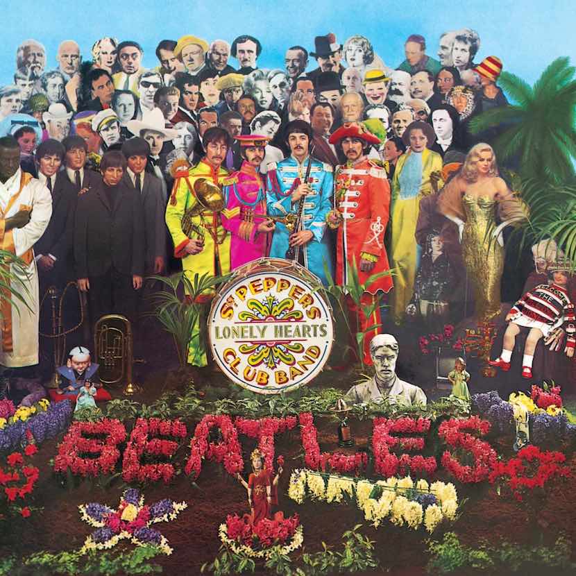
In 1967, the Beatles were already one of the biggest bands in the world, but Sgt. Pepper’s Lonely Hearts Club Band felt like something completely different.
The album was adventurous, colourful, theatrical and deliberately removed from the straightforward pop image the Beatles had established earlier in their career. Its music moved through psychedelic rock, experimental studio production, traditional Indian influences, vaudeville-inspired sounds and more.
The cover needed to match that sense of transformation. Enter British Pop artist Peter Blake, working with artist Jann Haworth.
The resulting image is almost overwhelming in the best possible way. The four Beatles appear in brightly coloured military-inspired uniforms, standing in front of a crowd of historical, cultural and fictional figures. The cover brought together people from different eras and worlds, turning the sleeve into something closer to a giant Pop Art collage than a conventional record cover. The Met describes Blake as best known for his design of the 1967 album cover.
What makes the collaboration especially interesting is how naturally Blake’s existing artistic interests fit the Beatles’ new direction. Blake had long been fascinated by popular entertainment, celebrity, spectacle and the strange mixture of real and imagined characters that surrounds popular culture.
The Beatles were doing something similar with music. They were taking familiar sounds, personas and cultural references and putting them together in unexpected ways. The cover became part of the experience of the album rather than simply packaging around it.
And perhaps that is why it has lasted so well. You can look at it decades later and still find another face, another detail, another little piece of visual history.
2. The Velvet Underground & Nico
by Andy Warhol

Few album covers are as immediately recognizable as a banana.
In 1966, Andy Warhol created the artwork for The Velvet Underground & Nico, the debut album by the New York band The Velvet Underground, which featured German singer Nico on several tracks.
The music was not exactly designed for everyone. The Velvet Underground’s sound was experimental, abrasive and atmospheric, moving between droning guitars, avant-garde influences, poetic lyrics and the darker side of New York nightlife. It was very different from the polished pop dominating much of the mainstream music scene at the time.
And then there was the banana. The original cover featured a simple yellow banana against a white background with Warhol’s name. The early pressing even invited listeners to peel the banana, revealing a pink fruit underneath. MoMA identifies Warhol as the collaborating artist for the cover.
Warhol’s connection to the band was deeper than simply designing a sleeve. He was closely involved with the group and their early New York scene, and The Velvet Underground became part of his multimedia project, the Exploding Plastic Inevitable. MoMA’s archive also records Warhol’s 1966 film Nico/Nico Crying, featuring Nico and members of the Velvet Underground’s music.
So the banana was not an isolated art commission. It came from a relationship between an artist who was fascinated by celebrity, popular culture and mass reproduction and a band making music that challenged what popular music could sound like.
That makes the cover feel almost inevitable in retrospect. A completely unexpected image became attached to completely unexpected music, and both became part of the mythology of New York’s 1960s art and music scene.
3. Pink Floyd’s The Dark Side Of The Moon
by Storm Thorgerson
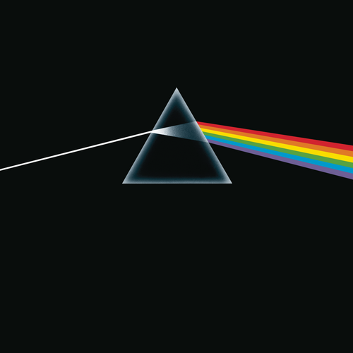
There are album covers you recognise even if you have never listened to the album. Pink Floyd’s The Dark Side of the Moon is one of them.
Released in 1973, the band’s eighth studio album explored themes including time, mortality, money, conflict and mental health. Its atmospheric sound, elaborate production and long-form compositions made it one of the defining albums of progressive rock.
The cover reduced all of that complexity to one remarkably simple image: white light passing through a prism and emerging as a rainbow. The design came from Hipgnosis, the British creative studio founded by Storm Thorgerson and Aubrey “Po” Powell. MoMA’s collection identifies Hipgnosis, Storm Thorgerson and George Hardie in connection with the album’s cover.
But there is a lovely personal connection here. Thorgerson was not a stranger brought in from nowhere. He grew up in Cambridge and was an early friend of Pink Floyd members Syd Barrett, Roger Waters and David Gilmour. According to Pink Floyd’s official archive, Thorgerson eventually asked David Gilmour, who had joined the band, to help persuade the other members to let Hipgnosis design their artwork.
The relationship became enormously important to both sides. Hipgnosis went on to create numerous covers for Pink Floyd and other major musicians, developing a visual language that often favoured mysterious, surreal photographs over obvious portraits of the performers.
For The Dark Side of the Moon, the prism was inspired by a physics textbook image, and its simplicity perfectly suited an album that was ambitious without needing an equally complicated image on its front.
The result became one of those rare moments when sound and image seem impossible to separate. Think of the album, and you see the prism. See the prism, and you immediately hear Pink Floyd in your head.
4. Miles Davis’ Bitches Brew
by Mati Klarwein
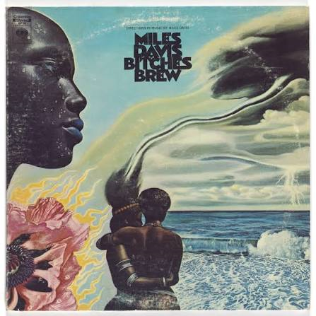
Now for something a little more psychedelic. When Miles Davis released Bitches Brew in 1970, he was moving jazz somewhere new.
The double album brought together electric instruments, extended improvisation, rock influences, experimental production and musicians who would go on to become important figures in their own right. Miles Davis’ official site describes it as an era-defining album filled with swirling jams, electric instruments, strong grooves and rock energy.
For the cover, Columbia Records turned to German artist Mati Klarwein. Klarwein created an extraordinary Afro-futurist painting filled with faces, bodies, colour, nature and surreal imagery. MoMA holds the album cover as a work by Klarwein, dating it to 1970.
The choice made sense. Klarwein’s visual world was as layered and unconventional as Davis’ musical world at the time. The cover did not attempt to illustrate a song or simply show the musician. Instead, it created an entire atmosphere around the music.
And there is a particularly interesting piece of history here: Columbia Records was willing to embrace the unusual visual direction because it understood that Davis was reaching towards a younger audience influenced by rock, soul and R&B. According to Davis’ official site, the label accepted the Afro-futurist cover, released the album as Davis’ first double LP, and actively promoted it to a new audience.
Bitches Brew went on to sell more than 100,000 copies, an extraordinary number for a jazz release at the time. The cover helped communicate that this was not simply another Miles Davis jazz record. Something had changed. And the artwork gave that change a visual identity.
5. The Sex Pistols’ Never Mind The Bollocks
by Jamie Reid

By the time punk arrived in the late 1970s, subtlety was hardly the point.
The Sex Pistols’ Never Mind the Bollocks, released in 1977, was loud, confrontational and deliberately provocative. The album became one of the defining records of the British punk movement, with songs that challenged authority and captured the anger and frustration surrounding a generation of young people.
Its cover looked like it belonged to the same world. British artist and designer Jamie Reid created the visual identity around the Sex Pistols, including the artwork for the album. MoMA’s collection holds Reid’s 1977 album cover as well as other pieces he created for the band.
The ripped-paper aesthetic, ransom-note lettering and deliberately rough appearance became inseparable from the Sex Pistols’ image. And unlike some album artwork that simply reflected a musician’s existing identity, Reid’s work actively helped construct one.
The Sex Pistols’ music was already challenging conventions. Reid’s graphics looked as though they had no interest in respecting them either. The album itself went straight to number one in the UK when it was released in October 1977. London Museum describes the record as ferocious, energetic and influential among young people who were inspired to form their own bands.
The visual language of the Sex Pistols became just as influential as the music. It was messy on purpose. It looked handmade, angry and immediate. And perhaps that is exactly why it still feels so connected to punk decades later.
When Music Gives Art Another Life
What is fascinating about these album covers is that none of them feel like decoration. They became part of the story.
Peter Blake’s crowded Pop Art composition captured the Beatles at a moment when they were reinventing themselves. Andy Warhol’s banana became inseparable from the strange, experimental world of the Velvet Underground.
Storm Thorgerson’s prism gave Pink Floyd’s ambitious music a visual symbol that could travel far beyond the record itself. Mati Klarwein created a surreal world for Miles Davis’ musical transformation, while Jamie Reid’s raw graphics became part of the visual language of punk.
The artists were not simply making something that looked nice on a square piece of cardboard. They were helping musicians create a world around their music. And that is perhaps why we still remember these covers.
Long after the first record played, the images remained. They became posters on bedroom walls, references in fashion, objects in museums, symbols on T-shirts and pieces of visual culture that people could recognise even when they had never owned the original album.
A great album cover can do something wonderful. It can make you curious about the music before you hear a single note. And sometimes, years later, it can make you want to listen all over again.
Editor’s Note:
If you enjoyed discovering the artists behind some of the most unforgettable album covers, you might also enjoy our feature on 5 Films That Turned Artists Into Pop Culture Icons. From the artwork we see on record sleeves to the stories we watch on screen, it is always fascinating to see how artists become part of the wider culture around us.