



How Wes Anderson Makes Every Film Feel Like a Walk Through an Art Gallery
There are films we watch, and then there are films we want to step inside. A Wes Anderson film often feels like the second kind.
You might enter a hotel lobby painted in shades of pink and red. Then a train compartment. Then a tiny French apartment. Then an old-fashioned newsroom filled with typewriters, paintings, papers, lamps, books and people who somehow look as though they have been carefully arranged inside a beautiful little box.
Everything has a place. Everything has a colour. Everything seems to have a story. And yet, beneath all that symmetry and charm, Anderson’s films are rarely just pretty things to look at. They are full of loneliness, friendship, grief, first love, family, failure, longing and the strange tenderness of people trying to find their place in the world.
Perhaps that is why his films feel so much like art. You do not simply look at them. You linger.
A World Built One Detail At A Time
It only takes a few seconds of a Wes Anderson film to recognize that you are watching a Wes Anderson film. The perfectly centred compositions. The carefully chosen colors. The characters looking directly into the camera. The sudden sideways camera movements. The handwritten signs. The vintage costumes. The miniature buildings. The unusual objects sitting quietly in the background.
His visual language has become so distinctive that even people who have never watched one of his films can often recognize the look. Symmetry is one of his most famous tools, but it is not really the symmetry alone that makes his films so captivating. It is what happens when everything inside that symmetry has been considered. A desk is not simply a desk.
It might have a stack of letters, a little lamp, an old telephone, a photograph, a cup, a book and a perfectly placed pencil.A room is not just a room. It tells us something about the person living inside it. This meticulous approach has been a defining part of Anderson’s filmmaking for decades, with production design, costumes, props, colour and camera movement all working together rather than existing separately.
For artists, there is something especially lovely about that. It is a reminder that details can become storytelling.
Look At The Grand Budapest Hotel

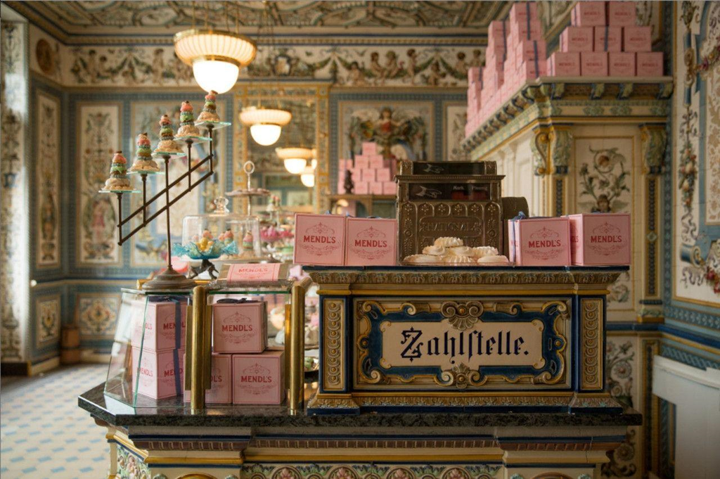
Perhaps nowhere is this more obvious than in The Grand Budapest Hotel. The hotel itself feels almost too beautiful to be real. Its pink façade sits against snowy mountains. Its interiors glow with reds, golds and deep wood tones. The lobby is full of carefully arranged objects, uniforms and little visual details that make the fictional Republic of Zubrowka feel as though it existed long before we arrived.
Anderson and production designer Adam Stockhausen even looked at historic Photochrom images of European resorts while developing the film’s visual world. The filmmakers also used elaborate miniatures and matte paintings to create the hotel’s grand landscapes.
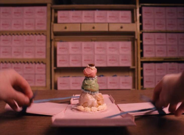
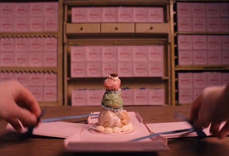
Then there are the little things. The pink pastry boxes from Mendl’s. The hand-lettered signs. The uniforms. The keys. The luggage. The painting that becomes central to the story. You could pause almost anywhere and find something worth looking at. That is what makes the film feel less like a collection of locations and more like a carefully assembled exhibition.
And Then There Is Moonrise Kingdom
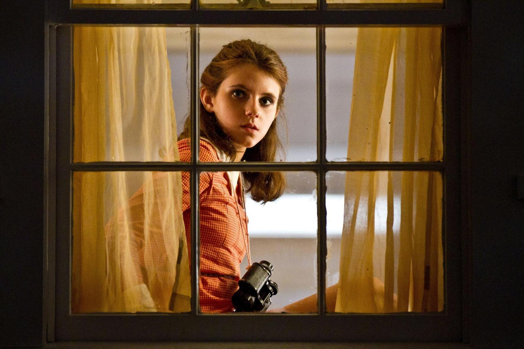
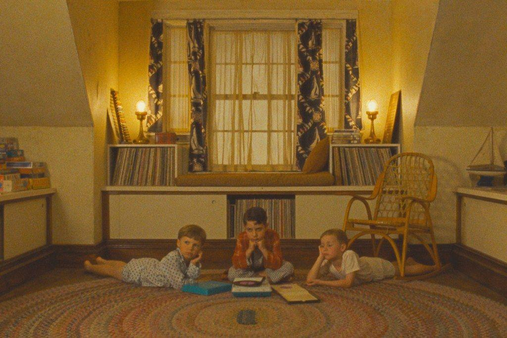
If The Grand Budapest Hotel feels like stepping into a beautifully illustrated European storybook, Moonrise Kingdom feels like opening an old box of childhood memories. The film follows Sam and Suzy, two young people who decide to run away together, but its emotional world is much larger than that simple premise.
Look at Suzy’s binoculars. Her yellow dress. The little island. The scout uniforms. The church. The old house. The storm. Even the way characters stand inside rooms feels deliberately composed.
There is a famous sense of order to Anderson’s images, but the emotions inside them are often anything but orderly. Two children are trying to escape because they feel misunderstood. Adults are struggling with their own unhappiness. Families are imperfect. Everyone seems slightly out of place. And somehow, the beautiful visual order makes those feelings even more touching. The frames are controlled. The people are not.
He Turns Objects Into Characters
One of the most wonderful things about Anderson’s filmmaking is how much personality he gives to objects. Think about The Royal Tenenbaums. The characters have their clothes, their rooms, their books, their trophies and their collections. You learn about them through the things they surround themselves with.
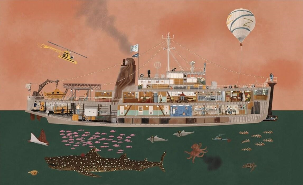
Or The Life Aquatic with Steve Zissou, where the entire ship becomes a world of its own. The ship is even presented through a cutaway view, allowing us to see its rooms almost like a dollhouse.
And then there is Fantastic Mr. Fox, where the handmade quality becomes part of the emotional experience itself. The fur of the animals. The little clothes. The miniature food. The underground homes. The tiny tools. It all looks tactile enough to touch.
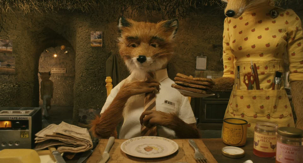
That is not accidental. Anderson has repeatedly embraced miniatures and handmade elements, and the artists working on Isle of Dogs described how the small scale itself contributed to the aesthetic because of the way materials could be physically touched and manipulated.
There is something deeply satisfying about that. In an age where so much can be generated digitally, Anderson’s worlds often remind us how magical it can be to make something with your hands.
Color Is Never Just Color
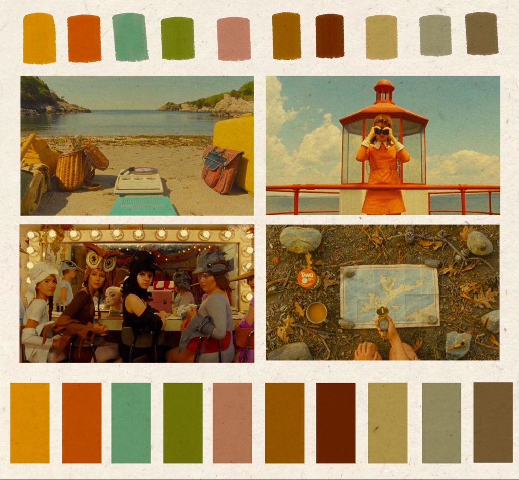
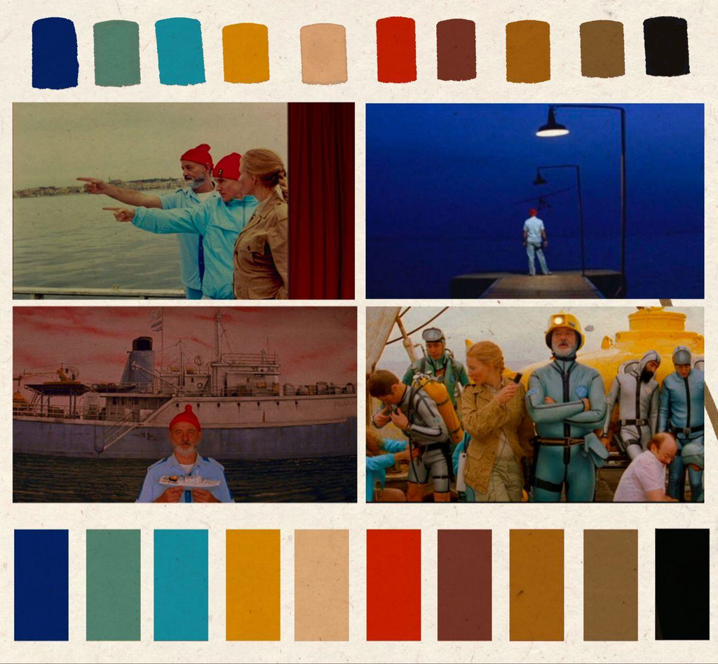
Anderson’s films are also lessons in colour. The Grand Budapest Hotel gives us pinks, reds, creams, purples and warm golds. Moonrise Kingdom leans into mustard yellows, greens and soft browns. The Life Aquatic gives us ocean blues, red caps and the famous Zissou uniform. The French Dispatch moves between rich colour and striking black-and-white passages. And Asteroid City creates an entirely different palette, with its desert landscape, dusty pinks, oranges and pale blues.
The colours do more than make the films recognisable. They create moods. They tell us where we are emotionally. They make an ordinary hallway feel nostalgic. They make a hotel feel magical. They can make loneliness look strangely beautiful.
Anderson’s long collaboration with cinematographer Robert Yeoman has been central to this visual language. The two have worked together from Bottle Rocket onward, developing an increasingly precise relationship between composition, camera movement, colour and storytelling.
The Camera Moves Like It Knows Where It Is Going
Then there is the camera. Anderson does not usually let the camera wander. It moves with purpose. A character walks and the camera tracks alongside them. Someone enters a room and we move with them. A conversation shifts and the camera may suddenly whip from one person to another.
In The Life Aquatic, tracking shots can move through spaces with an almost theatrical precision. In The Grand Budapest Hotel, the camera glides through corridors and rooms as though we are being given a guided tour of the building.
And in The French Dispatch, the camera becomes part of the storytelling architecture, moving between different visual formats, time periods and sections of the fictional magazine.
It is almost as if Anderson does not simply want us to watch the story. He wants to show us around.
His Films Feel Like Art Because He Treats Them Like Art
Perhaps this is the real secret. Anderson does not treat production design as decoration. He does not treat costumes as something characters simply happen to wear. He does not treat props as things that sit in the background.
Everything participates. That philosophy becomes especially fascinating in The Phoenician Scheme, where Anderson went so far as to use real artworks rather than simply fictional reproductions for certain parts of the story. He specifically sought works by artists including Renoir and Magritte to exist inside the world of the film.
And Anderson’s relationship with visual art goes much further back. The work of artist Joseph Cornell has been a particularly important influence. Cornell’s shadow boxes, filled with carefully arranged objects and miniature worlds, share an obvious visual conversation with Anderson’s own love of curated objects, dioramas and nostalgic little universes. Anderson has spoken about Cornell’s influence on The Grand Budapest Hotel, and later collaborated on an exhibition recreating Cornell’s studio.
Suddenly, the gallery comparison makes even more sense. A Cornell box asks you to look closely. A Wes Anderson frame does too.
Other Filmmakers Have Seen The Magic Too
Anderson’s visual language may be instantly recognisable, but his appeal goes beyond aesthetics. Martin Scorsese became an early champion of Bottle Rocket, praising the film’s affection for its characters and its lack of cynicism. He later compared Anderson’s ability to capture the richness of human interaction to the work of French filmmaker Jean Renoir.
That is an especially beautiful connection because Anderson’s films can sometimes be mistaken for exercises in style. But underneath the colours and symmetry is affection. He loves his strange characters. He lets them be ridiculous and vulnerable at the same time. And the people who work with him seem to feel that affection too.
Bill Murray, who has returned to Anderson’s films again and again, once described their projects as “art films” and spoke about the pleasure of continuing to work together.
That recurring creative family is part of what makes Anderson’s filmography feel so personal. You begin to recognise the faces. The actors return. The collaborators return. The visual language evolves, but the feeling of entering a familiar little universe remains.
Every Frame Wants You To Stay A Little Longer
Maybe that is why Wes Anderson’s films are so beloved by artists. They remind us that how something is made can be part of what it means. A painting can be about its subject, but it can also be about brushwork, color, texture and composition. A film can tell a story, but it can also be about framing, architecture, costume, objects, movement and light.
Anderson seems to understand that completely. He gives us stories that are funny and sad, strange and sincere, miniature and enormous. He gives us characters who are often lonely but rarely without hope. And he builds worlds so carefully that we begin to wish we could walk through them ourselves. Perhaps that is the real reason a Wes Anderson film can feel like a walk through an art gallery. Not because every frame is perfect. Not because everything is symmetrical. But because he asks us to look.
Look at the wallpaper. Look at the costume. Look at the little painting in the corner. Look at the way the light falls across a room. Look at the person standing quietly in the middle of it all. And then, just when you think you have finished looking, something else catches your eye. That is the magic of his cinema. You can watch a Wes Anderson film for the story. You can watch it for the colors.
You can watch it for the costumes, the miniatures, the compositions, the music or the wonderfully strange characters. But there is always another little detail waiting for you. And perhaps that is what great art does best. It gives us a reason to look again.
Editor’s Note
Only one week left to submit your work for ATH Magazine Issue 15: Where I Am! If this theme speaks to you, now is the perfect time to share your work and become part of this beautiful collection of artists and stories. Submit your work before the deadline and let your art find its place in Where I Am.