




The Paintings, Posters and Art Hiding in Your Favorite TV Shows
We spend so much time looking at the people in our favorite TV shows that it is easy to forget to look at everything around them. The painting behind the sofa. The strange sculpture sitting on a shelf. The poster above a character’s desk. The photograph hanging in the hallway. The chair that seems to have been there forever. The little objects sitting on a coffee table that we barely register because someone is busy delivering the next line.
But television sets are rarely filled by accident. Every room has to tell us something before the characters even speak. A home can tell us whether someone is wealthy, sentimental, messy, pretentious, artistic, traditional or trying very hard to look like they are all of those things at once. A painting can quietly establish a period. A poster can hint at a character’s interests. An object can become part of a visual joke or, sometimes, a clue that only makes sense several episodes later.
Set decorators and production designers spend enormous amounts of time building these worlds. And sometimes, the art on the wall is not just decoration. It is part of the storytelling. Once you start noticing it, your favorite shows can become a completely different kind of art tour. Here are some of the paintings, posters and objects worth looking for.
The Paintings Of Central Perk In Friends
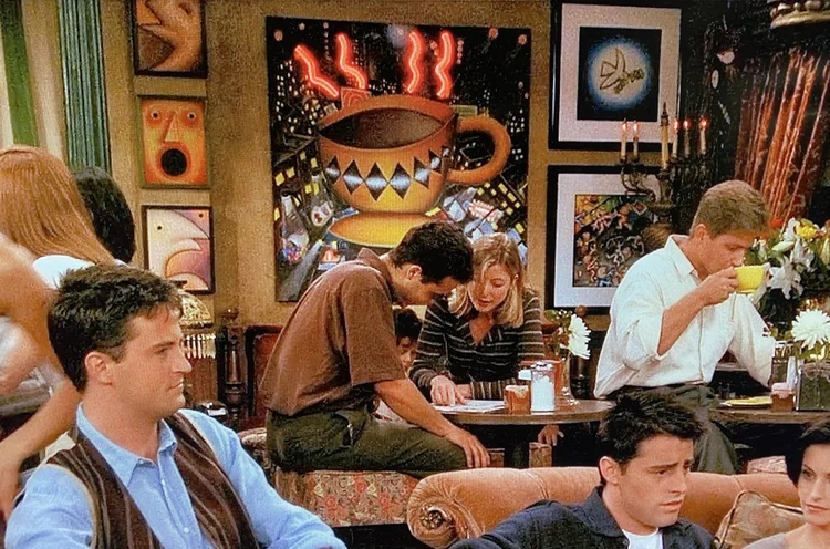
Few television interiors are as instantly recognizable as Central Perk. The orange sofa, mismatched chairs and huge coffeehouse windows are permanently attached to our collective memory of Friends. But look behind the characters and you will find something else: a constantly changing little gallery.
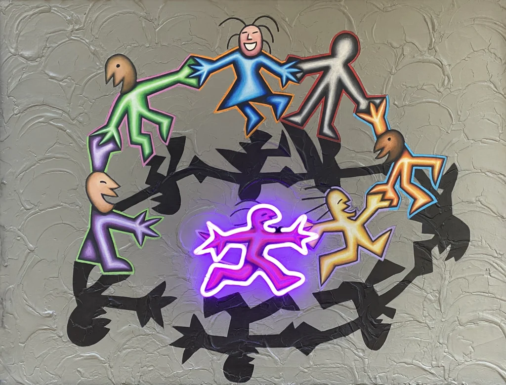
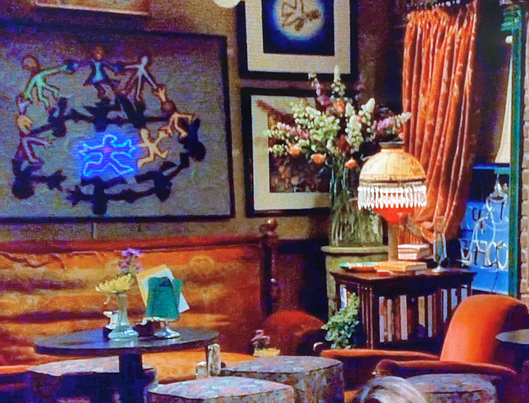
Artist Scott Bruza created many of the original paintings displayed at Central Perk, working with his brothers Michael and Gregg Bruza. One of the most recognizable was Circle of Friends, which appeared behind the coffeehouse seating area in the pilot and throughout the first season. The original was made with acrylic, stucco and neon on canvas.
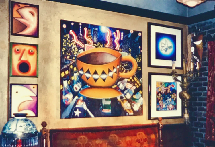
Other Bruza works appeared throughout the series, including Coffee Cup, Downtown, Peace and Noah’s Trip. And the choices were not completely random. Downtown, for example, shows people out in New York City, making it a particularly fitting piece for a coffeehouse where so much of the show’s story revolves around friendship, dating and city life. Peace references the 1960s peace-and-love movement and was also used on the fourth wall of the set when the camera needed a different angle.
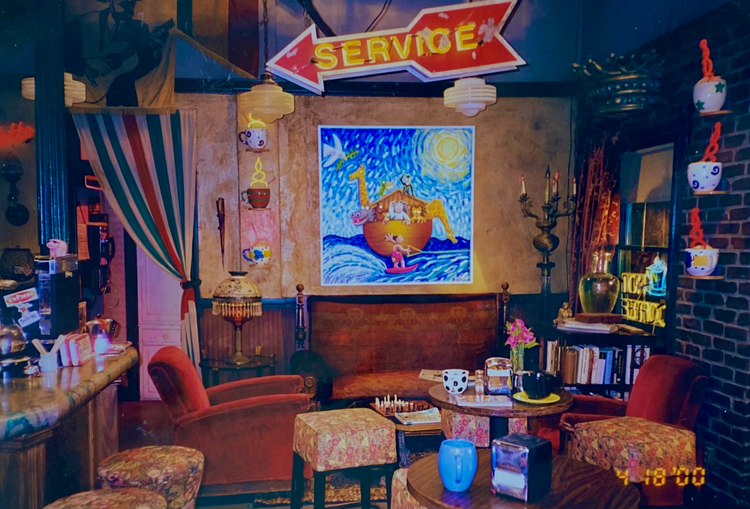

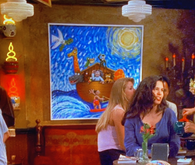
Even the Central Perk menu board was designed specifically for the show. The result is a space that feels lived in rather than decorated for television. You may not consciously notice every painting while watching an episode, but together they help create the slightly eccentric, creative Greenwich Village atmosphere that makes Central Perk feel like Central Perk.
The Art Of Mad Men
If there is one television show that practically demands that you look at the walls, it is Mad Men. Set in the world of 1960s advertising, the series is filled with mid-century furniture, graphic design, paintings, posters and decorative objects that help establish both the era and the personalities of its characters.
The show’s production design was famously meticulous. Its sets included genuine period pieces alongside carefully selected reproductions and objects. In Roger Sterling’s office, for example, you can find designs associated with Eero Saarinen and Herman Miller, while the space also included artwork created specifically for the series in the style of Op Art.
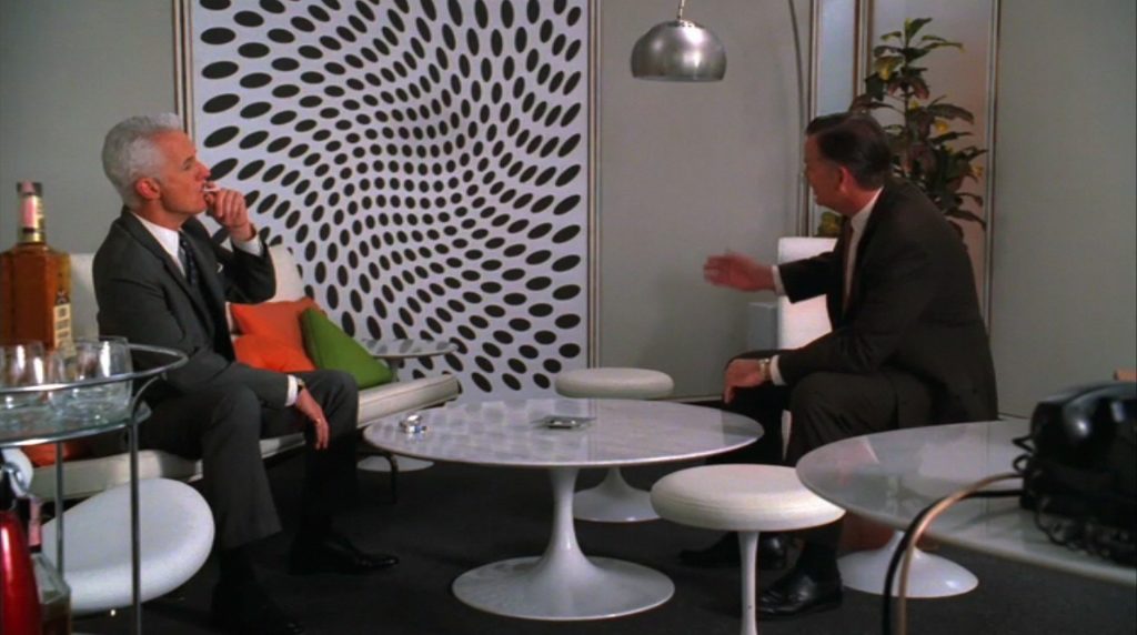
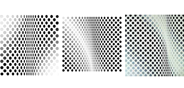
One particularly interesting example is the artwork commissioned for Roger’s office. Rather than simply finding an existing famous painting, the Mad Men art department created works that echoed the visual language of artists such as Bridget Riley.
The artwork does not simply tell us that the characters have good taste. It tells us what kind of good taste they think they have. Mad Men is obsessed with appearances, advertising and the difference between what something is and what it is made to look like. The art and furniture become part of that larger conversation.
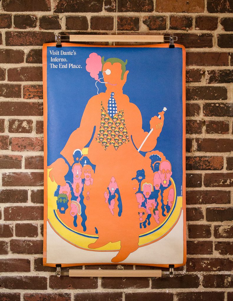
And sometimes the real art world entered the show quite directly. Seymour Chwast’s work appeared in Roger Sterling’s office, while Milton Glaser, one of the most influential American graphic designers of the twentieth century, designed the key art for the show’s seventh season. In Mad Men, the walls are almost another character.
Frasier’s Art-Filled Apartment
Frasier Crane’s Seattle apartment is one of those television homes where you immediately understand the character without anyone having to explain him.
The apartment is sophisticated, expensive and carefully put together. Frasier is a psychiatrist, but he is also someone who loves opera, wine, literature, architecture and art. Naturally, his home reflects that.
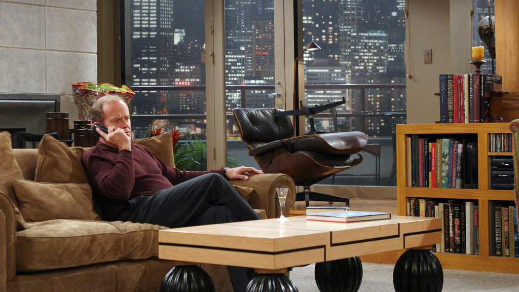
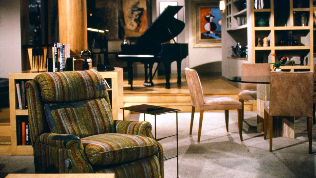
The original apartment set became famous for its combination of modern furniture and art. It included pieces inspired by or reproducing major twentieth-century designs, including the Eames Lounge Chair and Ottoman and Marcel Breuer’s Wassily Chair.
The art is part of the same visual language. It tells us that Frasier wants his home to communicate culture and sophistication. And because the character can sometimes be hilariously insecure about how other people perceive him, the apartment becomes an extension of that personality.
It is not simply a nice apartment. It is a carefully curated version of Frasier Crane. That is one of the pleasures of looking at set decoration through an art lens. Sometimes what we are really looking at is character development in physical form.
The Objects Of The White Lotus
Few recent shows have made their decorative objects feel as suspicious as The White Lotus. The series may take place in luxurious resorts, but the beautiful surroundings are never just beautiful. The art, architecture and objects often carry hints about the people staying there and the darker stories unfolding around them.
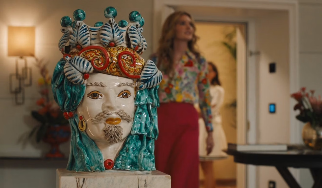
In Season 2, set in Sicily, production designer Cristina Onori and her team incorporated regional objects and antiques throughout the fictional White Lotus resort. Sicilian ceramics, vases, tiles and traditional teste di moro, or Moor’s head ceramics, were used throughout the hotel. The latter became particularly memorable because their imagery echoed the season’s increasingly ominous story.
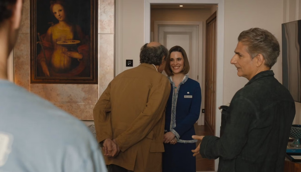
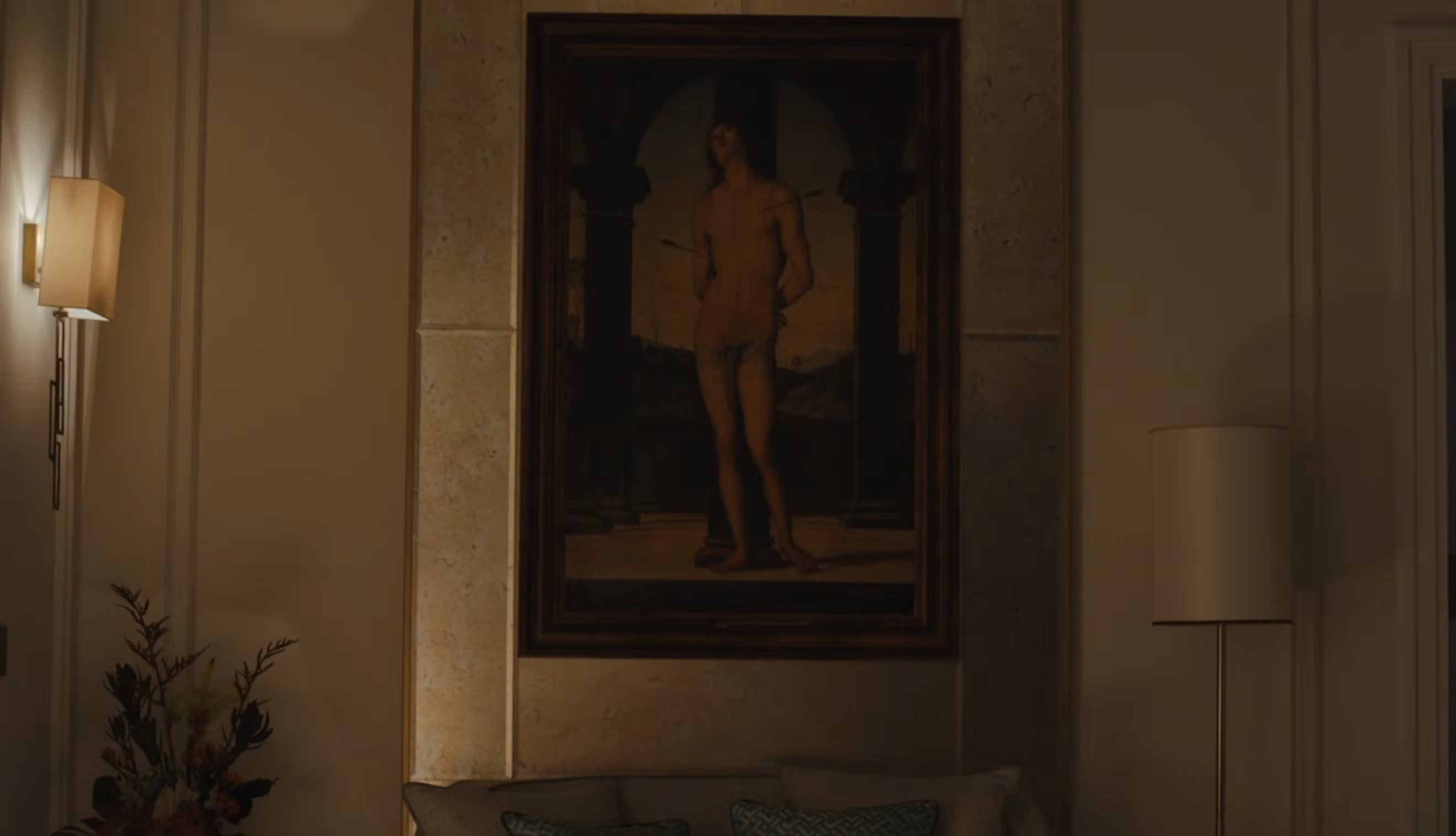
The paintings also contained clues. Albie’s room featured an image of Saint Sebastian, while Tanya’s room contained a painting of Mount Etna erupting. Bert’s room included an image connected to Saint Lucia. These were not merely pretty things selected to fill empty walls. The production design used them to quietly reinforce the characters and themes.
The first season was just as deliberate. Production designer Laura Fox described the show’s Hawaiian hotel interiors as intentionally excessive. In the Pineapple Suite, the pineapple motif appeared everywhere, from lamps and artwork to glassware and books with custom-designed dust jackets.
The rooms tell us where we are before the characters tell us who they are. And occasionally, they tell us something the characters themselves do not yet know.
Art As Status In Succession

If The White Lotus uses art for clues, Succession uses it to talk about money, power and status. The Roy family’s homes are filled with expensive-looking objects, impressive interiors and artwork that often appears just familiar enough to make us wonder whether we are looking at a real masterpiece.


Production designer Stephen Carter explained that the show’s team deliberately kept much of the art less recognizable in many rooms so that it would not distract from the story. At other times, they deliberately used recognizable names such as Warhol because those works could communicate wealth and status immediately.

That is a fascinating way to think about art in television. A painting does not necessarily need to be the center of attention to communicate something. Sometimes it only needs to be expensive. Or expensive-looking. Or recognizable enough that we understand the kind of person who might own it.
In Succession, art becomes part of the language of wealth. The rooms are filled with things that signal taste, access and money, even when the characters barely acknowledge them. The artwork is there because the characters’ world is there.
The Homes Of Gossip Girl
The original Gossip Girl was another show where interiors did an enormous amount of character work. Upper East Side apartments were not simply attractive backdrops. They were carefully constructed reflections of the people who lived in them.
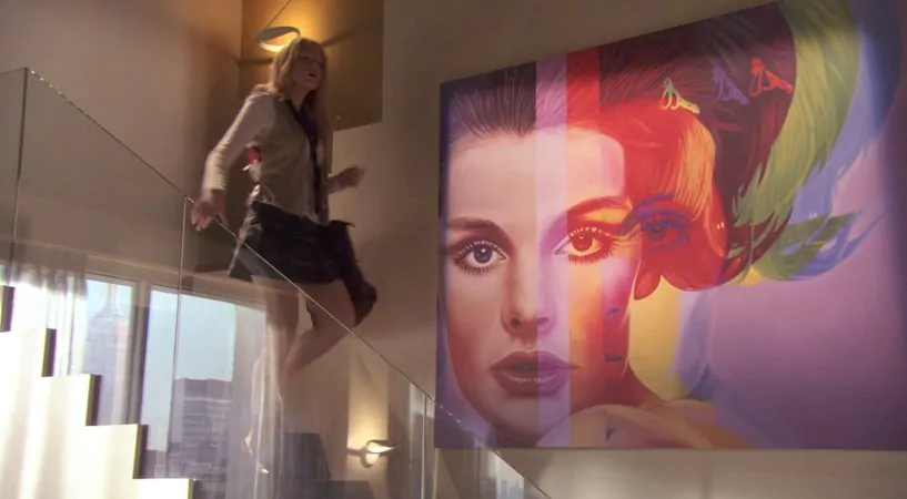
That idea continued into the HBO Max revival, where production designer Ola Maslik explained that the homes were designed around the characters themselves. Color palettes, nostalgic objects and artwork were used to make each home feel like an extension of its resident.
This is especially interesting because a teenage bedroom can function almost like a self-portrait. Posters, photographs, books, objects and colors become clues about identity.
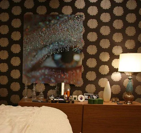
What someone chooses to put on their wall can tell us what they admire, what they remember, what they want to be associated with and sometimes what they are trying to become. In that sense, set decoration is not only about making a room look good. It is about asking: Who would live here?
When The Object Becomes The Story
Sometimes, the most memorable piece of “art” in a television show is not technically a painting at all. It might be a chair. A lamp. A vase. A typewriter. A record player. A sculpture. A strange little object sitting on a character’s desk.
These things matter because television is a visual medium. We understand characters partly through what surrounds them. That is why production design can be so powerful. A room does not have to explain itself. It can simply exist, and we instinctively begin reading it.
The same thing happens when we walk into a real person’s home. We notice the books. The photographs. The things they have collected. The artwork they have chosen to live with. Television simply does this on a much more deliberate scale.
Look At The Walls Next Time Too
The next time you settle into an episode of your favorite TV show, try looking away from the characters for a moment. Look at the wall behind them. Look at the desk. Look at the bookshelf. Look at the painting that has been sitting in the same corner for three seasons.
You might discover an artist you have never heard of. You might notice a historical reference. You might realize that a character’s entire personality is being communicated through a room before they even open their mouth.
And that is what makes art in television so interesting. It does not always ask to be noticed. Sometimes it is there quietly, doing its job. Creating a world. Building a character. Setting a period. Planting a clue. Making a room feel lived in. Or simply giving us something beautiful to look at while the story unfolds. The next time you rewatch a favorite show, maybe do not just watch the people. Watch the walls, too.
Editor’s Note:
Less than 2 weeks left to our latest Open Call, 101 Art Book: Texture Edition, with Rachel Burke as our Guest Curator for this one, we can not wait to see your submissions. If you have been thinking about submitting, this is your chance. Submit before October 16, 2026.