
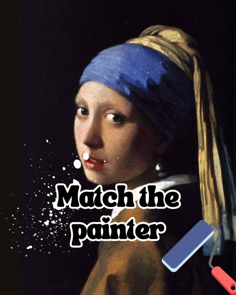


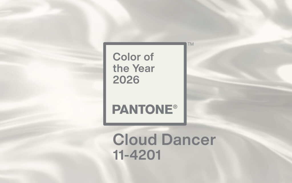
The Pantone Color Everyone Will Be Using in 2026

👁 207 Views
Color trends tend to become visible only after they have already settled into everyday use. By the time a shade feels “everywhere,” it has usually been circulating through studios, product teams, and design systems for years. Pantone’s Color of the Year works as a formal acknowledgment of that shift rather than its starting point, which is why it continues to matter to artists and designers who pay attention to long-term cultural patterns.
For 2026, the Pantone Color Institute identified a move toward restraint and neutrality as a defining visual direction. According to Pantone, this decision reflects extensive research into global design behavior, consumer response, and cultural signals across fashion, interiors, art, and digital environments. The emphasis is not on novelty, but on stability and visual clarity in a period marked by economic uncertainty and ongoing digital saturation.
What distinguishes this year’s selection is the absence of spectacle. According to Pantone’s published commentary, the 2026 color choice responds to a growing demand for tones that support focus and longevity rather than instant impact. This aligns with broader observations from design and business publications, including TIME, which noted that neutral and softened palettes are increasingly favored in environments shaped by screen fatigue and constant information exposure.
For artists, this shift has practical implications. Color does not function in isolation. It affects scale, contrast, material choice, and how work holds attention over time. When a neutral tone becomes culturally dominant, it changes the baseline against which all other colors are read. Pantone Color Institute analysts have consistently pointed out that these shifts tend to influence creative decisions well beyond a single calendar year.
This is the context in which the Pantone color for 2026 should be read. Not as a trend to copy, but as a signal. Understanding why this color is being positioned as ubiquitous helps artists make informed choices about how their work sits within the visual language of the moment.
Why Pantone Really Picked Cloud Dancer and Why It Matters More Than It Looks
Pantone’s Color of the Year process is built on long-range observation rather than reaction. The Pantone Color Institute tracks cultural signals across fashion, interiors, technology, art, and consumer behavior years before they surface publicly. According to Pantone, their 2026 selection reflects not a momentary preference, but a sustained shift toward visual restraint that has been building quietly across creative industries.
Cloud Dancer stands out precisely because it resists spectacle. According to Pantone’s official release, the color was chosen to represent calm, clarity, and a sense of openness in response to prolonged visual saturation. This makes it less about decoration and more about function, how color supports focus, longevity, and mental ease rather than demanding attention.
What is significant is that Cloud Dancer marks the first time since the Color of the Year program began in 1999 that Pantone has selected a white tone. According to coverage by TIME, this decision signals a break from the expectation that each year must be defined by boldness or novelty. Instead, it reflects a cultural moment that values editing, simplicity, and intentional quiet.
Pantone analysts have noted that neutrality today does not mean absence. According to the Pantone Color Institute, soft whites like Cloud Dancer act as stabilizers in design systems, allowing other elements to carry meaning without visual competition. This explains why the shade is being positioned as foundational rather than decorative.
For artists and designers, this matters because foundational colors shape everything built on top of them. When the baseline shifts toward softness and lightness, contrast behaves differently, materials read differently, and even scale feels altered. Cloud Dancer is not meant to stand out on its own, it is meant to hold space, and that is exactly why it carries weight.
Minimalism Is Not Disappearing, It Is Getting Smarter About It
Minimalism today looks very different from its earlier, harsher iterations. Where once it relied on stark whites and sharp contrasts, the current version leans toward warmth, softness, and comfort. According to House Beautiful, recent design forecasts show a strong preference for warmer neutrals that feel lived-in rather than clinical, which places Cloud Dancer firmly within this evolution.
This shift is closely tied to how people experience space now. According to ArchDaily, designers are increasingly prioritizing environments that reduce cognitive load, especially as work and life continue to blur through screens. Softer neutrals allow the eye to rest, making spaces feel more sustainable to inhabit over long periods.
Pantone’s choice reflects this reframing of minimalism as supportive rather than performative. According to Pantone Color Institute commentary, Cloud Dancer is meant to create a visual pause, a surface that does not compete with form, texture, or movement. This explains why the color is being adopted across interiors, packaging, and digital design simultaneously.
Importantly, this does not signal a rejection of color altogether. Instead, it creates a calmer foundation that allows accent colors to carry more intention. Designers cited by ArchDaily note that muted backdrops actually make selective color use feel more deliberate and emotionally precise.
For artists, this evolution matters because minimalism is no longer about removal alone. It is about control. Choosing restraint now communicates awareness rather than absence, and Cloud Dancer fits neatly into that more mature design language.
How Cloud Dancer Is Moving Through Fashion and Product Design
Fashion often reveals cultural shifts before other industries because it sits so close to daily life. According to Hypebeast, Cloud Dancer has already begun appearing in fashion collections that emphasize longevity, versatility, and material quality rather than seasonal trends. This includes everything from tailored outerwear to knitwear and accessories.
What makes Cloud Dancer particularly adaptable is its softness. Designers quoted by Hypebeast describe it as less severe than pure white, allowing it to work across textures without feeling sterile. This makes it easier to wear, layer, and repeat, which aligns with current consumer demand for pieces that outlast short trend cycles.
Product design is following a similar path. According to ArchDaily, neutral tones are increasingly used in furniture, tech accessories, and home goods because they integrate seamlessly into varied environments. Cloud Dancer works as a neutral anchor that does not dominate but still feels intentional.
Retail positioning also reflects this mindset. According to Hypebeast, brands are framing neutral products as essentials rather than statements, emphasizing durability and timelessness. This indicates a broader move away from novelty-driven consumption.
For creatives watching these industries, the takeaway is clear. Cloud Dancer functions less like a fashion color and more like an infrastructure color, one that supports systems, collections, and long-term use rather than momentary attention.
The Pushback Around Choosing White and Why It Is Part of the Story
Pantone’s 2026 selection has sparked debate, and that reaction is worth acknowledging. According to People, some critics questioned whether choosing a white shade could feel disconnected from broader cultural tensions. These conversations highlight how color choices are rarely interpreted in purely aesthetic terms.
Others have challenged whether a neutral can meaningfully represent a year at all. According to The Guardian, critics argue that the absence of bold color might feel uninspired or overly cautious. However, the publication also notes that restraint itself can be a powerful cultural signal.
Pantone has addressed these critiques by emphasizing intent rather than symbolism. According to the Pantone Color Institute, Cloud Dancer is positioned as a response to sensory fatigue rather than a statement of neutrality in a social sense. This distinction matters, especially for creatives navigating interpretation.
What is clear is that the controversy reinforces Pantone’s influence. Few design decisions generate public discussion at this scale, particularly around something as seemingly simple as color. The reaction itself confirms how deeply visual language is tied to culture.
For artists, understanding both the design logic and the public response provides valuable context. It allows for informed engagement rather than blind adoption, which is always the stronger creative position.
How Artists Can Use the 2026 Color Direction Without Losing Their Voice
Cloud Dancer does not demand imitation. Instead, it offers context. According to Pantone, the color is intended to support creativity by reducing visual noise, which gives artists more control over emphasis and narrative within their work.
In practice, this might mean experimenting with lighter grounds that allow texture, line, or material to carry more weight. According to ArchDaily, neutral foundations often enhance perception of detail, making subtle decisions feel more intentional rather than overlooked.
Artists working with color-heavy palettes can also use this trend strategically. A softer neutral background can heighten the emotional impact of saturated accents, allowing contrast to feel deliberate rather than overwhelming. This approach aligns with current design thinking around balance rather than excess.
Importantly, engaging with the 2026 color direction does not mean surrendering originality. According to Pantone analysts, successful creatives tend to interpret trends rather than replicate them, using broader signals as reference points rather than rules.
Ultimately, Cloud Dancer offers artists a moment to reconsider pace, clarity, and intention. Whether embraced, adapted, or resisted, understanding why this color is rising allows creative decisions to be conscious rather than reactive.
Why This Color Will Age Better Than Most Trends Do
Some colors peak fast and fade just as quickly. They dominate for a season, look dated a year later, and feel exhausting by the time the trend cycle moves on. Cloud Dancer works differently. According to the Pantone Color Institute, neutral tones tend to have longer cultural lifespans because they adapt across contexts instead of defining a single moment. That flexibility is one of the reasons Pantone positioned this shade as foundational rather than expressive.
Longevity matters more now than it did a decade ago. According to TIME, consumers and creatives alike are moving away from disposable aesthetics toward choices that feel stable and repeatable. This shift shows up in everything from slower fashion cycles to design systems built for long-term use rather than constant refreshes. A soft white like Cloud Dancer supports that mindset rather than fighting it.
From an artistic perspective, colors that age well usually do not announce themselves loudly. They allow work to evolve around them. According to ArchDaily, neutral palettes are increasingly favored in architecture and interiors precisely because they remain relevant as functions and styles change over time. The same principle applies to visual art and design.
Cloud Dancer also avoids the problem of trend fatigue. Because it does not carry a strong stylistic identity, it does not lock work into a specific year or movement. According to Pantone analysts, this kind of color functions as a stabilizer, one that can absorb shifts in taste without becoming visually obsolete.
For artists who think beyond immediate exposure, this is important. Choosing colors that hold up over time allows work to circulate longer, live in more contexts, and remain legible as trends move on. Cloud Dancer supports that kind of slow relevance rather than quick recognition.
What This Shift Says About Where Visual Culture Is Headed
Color trends often reflect deeper changes in how people relate to images. According to the Pantone Color Institute, the move toward softer, quieter tones mirrors a broader recalibration in visual culture, away from constant stimulation and toward intentional viewing. This is not about rejecting imagery, but about reducing visual noise so meaning can surface more clearly.
This direction is especially visible in digital environments. According to TIME, screen fatigue has changed how people respond to color, with users spending more time in interfaces and spaces designed to feel lighter and less demanding. Bright, high-contrast palettes that once felt energetic now often feel overwhelming when encountered daily.
Design platforms have responded accordingly. According to ArchDaily, contemporary design increasingly prioritizes legibility, comfort, and focus over spectacle. Neutral backgrounds, reduced palettes, and softer contrasts allow users to engage for longer periods without fatigue. Cloud Dancer fits directly into this logic.
For artists, this shift changes expectations around attention. Work no longer needs to shout to be seen. Instead, it benefits from clarity, pacing, and thoughtful composition. A restrained color environment allows viewers to stay with a piece rather than skim past it.
This does not mean visual culture is becoming dull or safe. It means the emphasis is moving from impact to endurance. Cloud Dancer signals a culture that values staying power, nuance, and depth over instant reaction.
How This Color Changes the Way Other Colors Behave
One of the least discussed aspects of neutral trends is how they reshape surrounding palettes. According to Pantone Color Institute research, soft whites alter color relationships by reducing visual tension. When the base is calm, other colors gain precision rather than volume. This changes how saturation, contrast, and emphasis function within a composition.
Artists working with strong color often assume neutrals will dull their work. In reality, the opposite is often true. According to ArchDaily, neutral backdrops allow accent colors to appear more intentional and controlled, making bold choices feel sharper rather than louder. Cloud Dancer provides that kind of support.
This is especially relevant for artists working across mediums. In painting, a softer white ground affects how pigments sit and reflect light. In digital work, it changes how color values read across screens. According to Pantone analysts, these subtle shifts can significantly affect perception without viewers consciously noticing why.
Cloud Dancer also encourages selective color use. When the surrounding field is quiet, every hue introduced carries more meaning. This aligns with current design thinking that favors fewer, more deliberate color decisions rather than broad palettes.
For creatives, understanding this interaction opens up new possibilities. Cloud Dancer does not flatten color, it sharpens it. Used thoughtfully, it allows artists to work with restraint without sacrificing intensity or voice.