

How to Make a Website That Represents You

👁 80 Views
There’s something really exciting about having a space online that’s completely your own. A place where your art, your style, and your story come together in one beautiful, personal site. Whether you’re an artist, designer, or photographer, having a website that truly reflects who you are isn’t just a bonus anymore. It’s a must.
But let’s be honest!! It can also feel a bit overwhelming at first. You might be wondering, “Where do I even begin? How do I make sure my site looks professional and really feels like me?” Those questions are totally normal, and trust me, you’re not alone in feeling that way.
And the good news is, you don’t have to figure it all out by yourself. So today, we’ll guide you through the process step by step. I’ll show you how to create a website that not only showcases your work beautifully but also captures your unique artistic style in a way that feels authentic and polished. We’ll keep it simple, and I’ll share some great tools and inspiration along the way to make things easier.
So, take a deep breath and get ready to bring your creative vision to life online. Let’s get started!
Start with Your Core Style
Let’s start with the most important thing: your artistic style. Before you even think about colors, fonts, or fancy layouts, it’s super important to get clear on who you are as an artist and what vibe you want your website to give off. Think of your website as an extension of your work. It should feel like walking into your personal studio, where everything reflects your creative energy.
So, ask yourself: What’s my artistic style? Are you drawn to bold, graphic shapes that make a statement? Do you work with soft, delicate watercolours that feel light and airy? Maybe your photography leans toward moody, monochrome tones that evoke emotion. Whatever it is, your website should echo that style in every element, from the colours you choose to the way you lay out your galleries.

Here’s a little exercise to help: grab a notebook or open a doc on your laptop, and start jotting down words that describe your art. Think about words like playful, minimalist, gritty, romantic, dark, vibrant, earthy, futuristic, or whatever fits. These words will become your guiding stars as you start building your site. Keep them handy and refer back to them whenever you’re making design choices.
To get your creative juices flowing, check out some artists’ websites that nail this idea of style consistency:
- Loish (loish.net): Loish’s site is colorful, whimsical, and super engaging, just like her art. Everything from the pastel color palette to the playful font choices reflects her signature style, making her site a real joy to explore.
- Owen Gildersleeve (owengildersleeve.com): Owen works with intricate paper art, and his site has a clean, minimalist design that emphasizes the textures and details of his work. It feels modern and sleek but still very personal.
- Jillian Evelyn (jillianevelyn.com): Jillian’s bold, graphic paintings come through loud and clear in her site design. Strong, contrasting colors and a simple grid layout make her work pop right off the screen.
Of course, the goal here isn’t to copy anyone but to be inspired by how thoughtfully these artists have tied their website’s look and feel to their creative identity. That’s exactly what will make your site feel cohesive and authentic.
So, before you jump into any design platform, take the time to reflect on your style. Trust me! It’ll make every decision along the way so much easier and your final site so much stronger.
Pick the Right Platform
Alright, let’s move on to the next step, which is actually building your site. And here’s the good news: you don’t need to be a tech wizard or have any coding skills to create a website that looks amazing and works beautifully. Seriously, these days, there are so many user-friendly platforms out there that make it super easy to customize everything to fit your vibe. Here are some popular options:
- Squarespace: Great for sleek, modern designs with lots of artistic templates.
- Wix: Offers tons of flexibility and creative control.
- Adobe Portfolio: If you’re already using Creative Cloud, this one’s a no-brainer and integrates smoothly with Behance.
- Format: Tailored for creatives, with clean, minimal layouts that put your work front and center.
These platforms all offer drag-and-drop features and customizable templates, so you can tweak things to reflect your unique style without knowing any code.
Design Elements That Speak Your Language
Now comes the fun part: design! To ensure that your website feels like you, every element, from color to typography to layout, should connect back to your artistic style.
Color Palette
Your color palette sets the tone. If your artwork is full of soft pastels, you might want a light, airy palette. If you work with bold, dramatic colors, a deep and rich palette might suit you better. A great tool for choosing palettes is Coolors.co, which helps you easily build color schemes.
Typography
Fonts carry personality. A handwritten font can feel personal and quirky, while a sleek sans-serif looks modern and clean. Keep it simple. Choose one or two fonts max to keep your site looking polished.
Layout
Think about how your visitors will move through your site. Do you want a simple scroll-through gallery or a grid that shows off multiple pieces at once? Make sure your layout serves your art and is easy to navigate. Avoid clutter, let your work breathe.
Showcase Your Work Thoughtfully
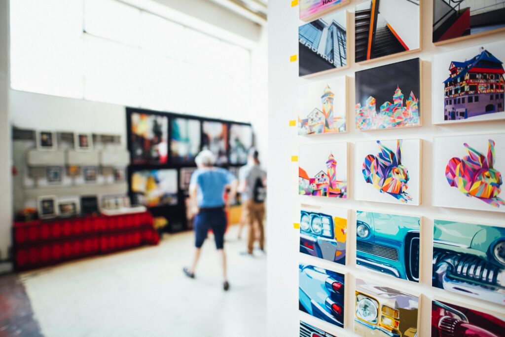
Of course, the heart of your website is your portfolio! This is where your work really gets to shine. But here’s something a lot of people miss: it’s not just about uploading a bunch of images and calling it a day. How you present your work is just as important as the work itself.
Think of your portfolio like curating a mini-exhibition. You want your site visitors to have a smooth, engaging experience as they look through your creations. Instead of tossing everything into one big gallery, try grouping similar pieces together by theme, medium, style, or even by project. This creates a nice sense of flow and cohesion and makes it much easier for people to follow along and really get what you’re all about.
And don’t forget the power of words! Adding short, thoughtful captions under each piece can make a huge difference. Share a little backstory, what inspired the piece, what materials you used, or what it means to you personally. You don’t need to write a novel, but just enough to give a bit of insight. These little details help visitors feel more connected to your work, and honestly, they make your portfolio feel a lot more human and relatable.
And here is a good tip for you: Imagine someone is walking through a real-life gallery of your work and you’re right there with them. What would you naturally say about each piece? That’s the kind of tone you want to capture.
And one more thing!! Make sure your images are high quality. Crisp, clear photos, no dark or blurry shots! Really let your work shine and show that you care about the details.
Add a Personal Touch with Your About Page
And here’s one of the most important parts of your website!!! Your About page. A lot of people think the portfolio is everything, and yes, it’s super important, but your About page is where you get to really tell your story. This is your chance to help visitors connect with you on a personal level, not just through your art but through who you are.
The key is to write in your own voice, or you can make a video, too. Check our Zaria Forman About Page.

Don’t worry about sounding super formal or stiff, just be you. Share what drives you to create, a bit about your journey, and what lights you up creatively. People love getting a peek behind the scenes, and when your bio feels genuine and relatable, it makes your work even more memorable.
Think of it like introducing yourself at a gallery opening. What would you say to someone curious about your work? Keep it friendly, keep it real.
If you’re not sure where to start, and don’t worry, writing about yourself is hard sometimes, there are some great tools that can help you get the words flowing. Hemingway Editor is awesome for keeping your writing clear and simple, and if you’re really stuck, something like Jasper AI or even ChatGPT can help you draft ideas that you can tweak into your own voice. For inspiration, you can also check out the About pages of different artists.
So don’t skip this step!! It really does make a difference. When people feel like they know the artist behind the work, they’re way more likely to remember you, follow your journey, and maybe even reach out for opportunities.
Make It Easy to Connect
And here’s something you definitely don’t want to overlook: your Contact page. It might seem like a small detail, but trust me, it’s super important. You’ve put all this effort into showcasing your amazing work, and now you want to make it really easy for people to reach out to you, whether it’s for commissions, collaborations, or just to say hello. Look at Alex Garant’s contact us page.

Keep it simple and clear. Make sure your email address is front and centre, and include links to your social media profiles. Some artists also like to add a quick contact form, which is great for people who want to get in touch quickly without opening their email app.
And here’s a little tip: if you’re open to specific things like commissions, collaborations, or exhibitions, say so right there on your Contact page. A warm, inviting tone can really encourage people to reach out, and it shows you’re approachable and ready for opportunities.
So before you hit publish on your site, double-check that your Contact page is working, all links are active, and the vibe feels inviting. After all, the goal is to open the door for new opportunities, and a great Contact page does exactly that!
Keep It Updated
A website isn’t something you build once and forget about. Keep it fresh by adding new work regularly, updating your bio with any new achievements, and making sure all your links still work. This shows visitors and potential clients that you’re active and engaged.
Bonus Tip: Get Professional Help If You Need It
Let’s be honest! Sometimes, no matter how many templates you try, it’s hard to get your site exactly the way you want it. If you’re struggling or want a truly custom look, consider hiring a professional designer or developer. Even a few hours of expert help can make a huge difference and take your site from good to amazing.
Sites like Fiverr, Upwork, or even local creative communities are great places to find affordable help. It’s an investment, but one that can pay off big time in terms of your site’s appearance and feel.
One Last Thing Before You Go
Your website is more than just a place to show your work!! It’s your online home, your creative space, and your personal stage. It tells the world who you are, what you create, and why it matters. The best part is that your website can grow with you. Don’t feel like it has to be 100% perfect from day one. Take your time, stay true to your vision, and don’t be afraid to tweak and update things as your work evolves. That’s the beauty of having your own space online: it’s always a work in progress, just like your art.
And trust me, when your site feels authentic, polished, and looks like you, people notice. The right opportunities, connections, and clients are way more likely to come knocking when your online presence feels solid and genuine.So, you’ve got all the tools and tips you need! Now it’s time to go out there and make something amazing.