

Dinah Letteboer’s Colour-Driven Art Finds Meaning in the Feelings Behind Every Shade
At Arts to Hearts Project, The Big Book is a global publishing initiative created to celebrate artists around the world, and to give creators at every stage of life a respected place where their work is published, recognised, and preserved. It isn’t a single book, but one continuous project that grows with each new edition, every one dedicated to a different community of creators, so that no artist is left without a place to belong.
It began in 2024 with The Big Book of Tiny Creatives, a celebration of young artists, and set the spirit that still guides it: no ranking, no competition, just participation, documentation, and a permanent place in a published archive. This year, it opens its doors to a new community.
The Big Book of Painters 2026 welcomes adult painters working across every style and subject, from realism and portraiture to abstraction, landscape, still life, and experimental work. Beautifully produced in hardcover and distributed worldwide, it gathers a curated group of artists from different countries and backgrounds into a single volume, and a lasting record of the painting being made today.
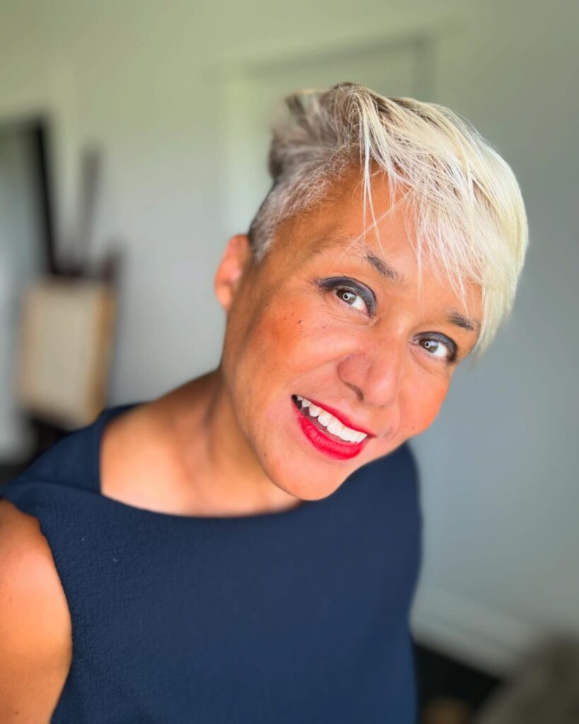
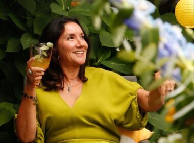
Among the artists featured is Dinah Letteboer, for whom, quite simply, everything begins with colour. Dinah is a Dutch artist based in the Netherlands, and colour is not just part of her practice, it is the whole of it.
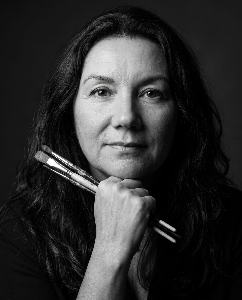
To Dinah, colour is never just a visual element or a finishing touch. It is a language in its own right, a powerful, intuitive way of expressing emotion, mood, and personal stories without a single word. That belief shapes everything she creates, and gives her work its unmistakable warmth and energy.
Her foundation is a serious one. Dinah studied art history, and her deep love of art and architecture has never left her, she still spends many hours in museums, in constant conversation with the painters who came before her.
She went on to train in oil painting through masterclasses rooted in the techniques of the old masters, learning to work slowly, carefully, and with real attention. Today she paints in oil and acrylic on canvas, and has also begun creating digital work and museum-quality reproductions, so that her art can live in more homes and reach more people.
Her creative process always begins with a feeling, never a subject. Before she picks up a brush, Dinah builds a mood board, gathering base colours and images from art books, museums, and nature, so she can see how those colours speak to one another.
From there, she trusts her very first instinct, asking herself one simple question: does this colour make her heart beat faster, and which emotion does it strengthen? But she never treats that plan as fixed.
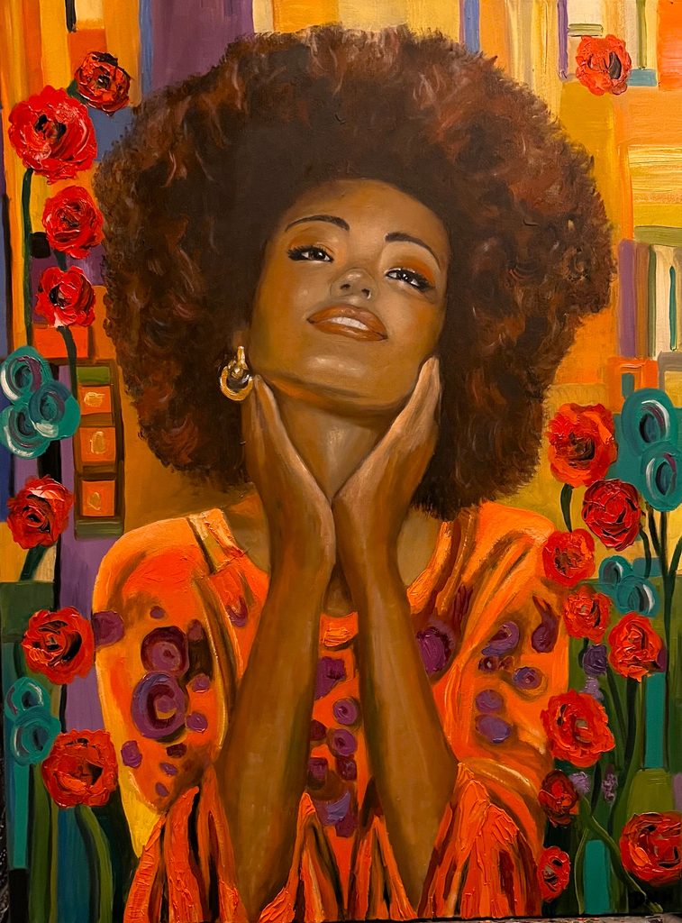
On the canvas, a colour is never alone, it shifts the moment it meets another, and she welcomes those surprises, following a new direction whenever it makes the feeling stronger, and letting go of anything that is merely pretty. It is why no two of her works are ever quite the same.
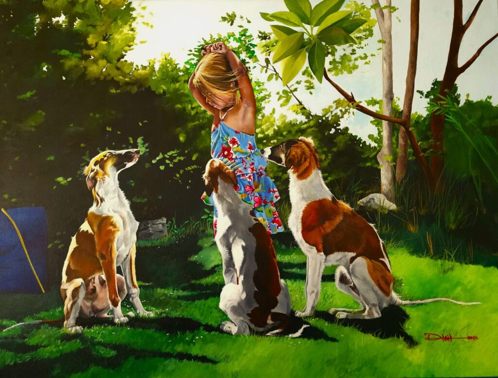
What makes her work so compelling is how instinctively and expressively she uses colour. She is drawn to bold, saturated, emotional combinations, warm tones that lift the energy of a room, calm blues and greens that invite you to rest, strong contrasts that wake you up.
Above all, Dinah believes that art belongs in the middle of everyday life, not only behind museum walls. In 2022 she founded DNH Artful Living with her partner Edo, a creative world built entirely around the transformative power of colour, bringing together original paintings, prints, colour-theory workshops, and curated art experiences.
She is fascinated by how a painting can change the mood of a space, and increasingly by how colour and art can support well-being, developing work for homes, workplaces, and places of care. For Dinah, a painting may not be medicine, but it can quietly make a day more beautiful.
Now let’s hear from Dinah about seeing the world in colour, the training and study behind her work, her intuitive creative process, and her belief that colour can transform the spaces, and the lives, we live in.
Q1. Dinah, colour sits at the heart of your creative practice. Could you share how your journey as an artist began?
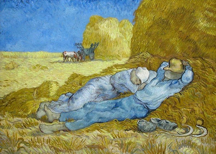
For as long as I can remember, colour has played a central role in my life. As a child I did not see the world in shapes but in shades. A conversation had a colour, a mood had a palette. My love of art and architecture grew during my studies in art history, and it never left me. Later I followed masterclasses in oil painting, based on the techniques of the old masters, and I still spend many free hours in museums.
Painting became my way of saying what I could not put into words.
In 2021 I started DNH Artful Living, because I wanted to share that love of colour with others. I believe art does not belong only behind museum walls. It belongs in the middle of daily life.
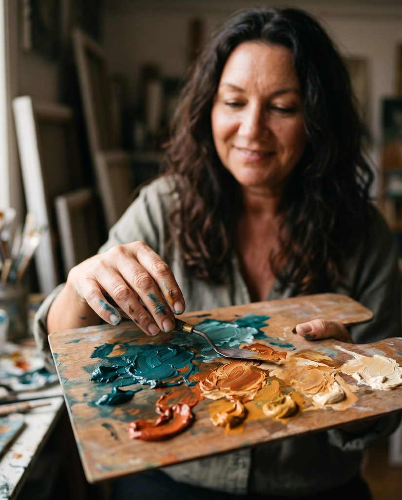
Q2. Your approach to painting has changed over the years. How has your relationship with materials and techniques evolved?
I started with technique. In masterclasses I learned to paint in oil the way the old masters did, slowly and with attention. For years I experimented with pigments, textures and techniques, in oil and in acrylic on canvas. Along the way one thing became clear to me: colour is not decoration, it is a language. So today a painting begins with a feeling and a colour, not with a subject.
I still make a mood board first, with base colours and images from art books, museums and nature, but I leave room for the painting to change while I work. Art history has become a conversation partner. I may borrow a structure from Breitner, Vermeer or Matisse, but never the palette. The most recent step is digital work that builds on my original paintings, and museum quality reproductions, so the work can live in more homes.
Q3. You describe colour as a language that can be felt. When did you first become aware of its emotional power?
There was no single moment. Colour was simply always there. A season was never a date on the calendar for me, it was a shift of light. I felt colours long before I had words for what they did. The words came later. During my studies in art history, and in all those hours in museums, I saw that painters have known this for centuries. Vermeer showed me how much a single point of light can carry.
Matisse showed me that colour can do the drawing. And life itself did the rest. Love, family and friendship have their colours, and so do grief and loss.
When I paint, I translate those feelings into colour, so that someone else can feel them too.
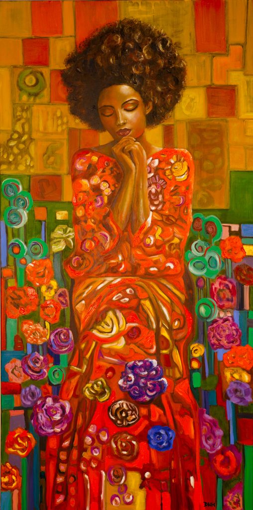
Q4. When beginning a new painting, how do you choose colours that work together to create a particular mood?
I always begin with the feeling, and then I look for the colours that can carry it. My first reaction decides. I ask myself one simple question: does this colour make my heart beat faster, and which emotion does it strengthen? Warm, saturated colours raise the energy. Muted, layered tones give you permission to be still. Strong contrast wakes you up. Before I start I make a mood board with a few base colours and images from art books, museums and nature, so I can see how the colours react to each other.
I love bold and expressive combinations, but they have to hold together as one mood. If a combination is only pretty and says nothing, it goes.
Q5. Colour can carry both personal and cultural meanings. How do you approach these different associations in your work?
I don’t try to balance them. I let them meet. Choosing a colour is always personal. Every colour brings its own energy and atmosphere, and I think we choose the ones that suit who we are and how we want to live. At the same time colour carries shared stories. In the Netherlands orange means celebration, and somewhere else it can mean something completely different.
In my Geisha and Kimono collections I look at how Japanese art uses colour and pattern to carry emotion. I cannot control which of those meanings a viewer brings, and I don’t want to. In the studio I trust my own reaction, because that is the only honest starting point I have. After that I let go. Once a painting hangs, it belongs to the person looking at it.
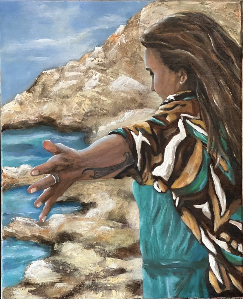
Q6. You believe art can transform everyday spaces. How does the environment around a painting shape the way it is experienced?
A painting never hangs alone. The light, the wall, the furniture and even the silence or noise of a room become part of it. The same work feels different in a white gallery than above a table where a family eats every evening.
That is why I say colour is not decoration. The room you sit in every night shapes your mood, and neutral is also a choice, not the absence of one. When I make a work on commission, I first talk with the people who will live with it about the shape, the palette and the feeling the room needs. Collectors often send me photos of a painting in its new home. Those photos teach me more than any review, because only there can I see whether the work is doing its job.
Q7. Do certain colour combinations ever take your paintings in unexpected directions?
Yes, all the time, and I have learned to welcome it. My mood board is a starting point, not a contract. On the canvas a colour is never alone. It changes as soon as it gets a neighbour, and sometimes two colours together do something I had not planned. That is also what I teach in my workshops: colours influence each other.
While I work, a new inspiration or emotion can come in and take the painting somewhere else. I follow it when it makes the feeling stronger. When it only makes the painting nicer, I don’t. In the weeks before an exhibition abroad I once reworked one canvas three times, because the colour was polite rather than honest. Those detours are the reason no two works are ever the same.
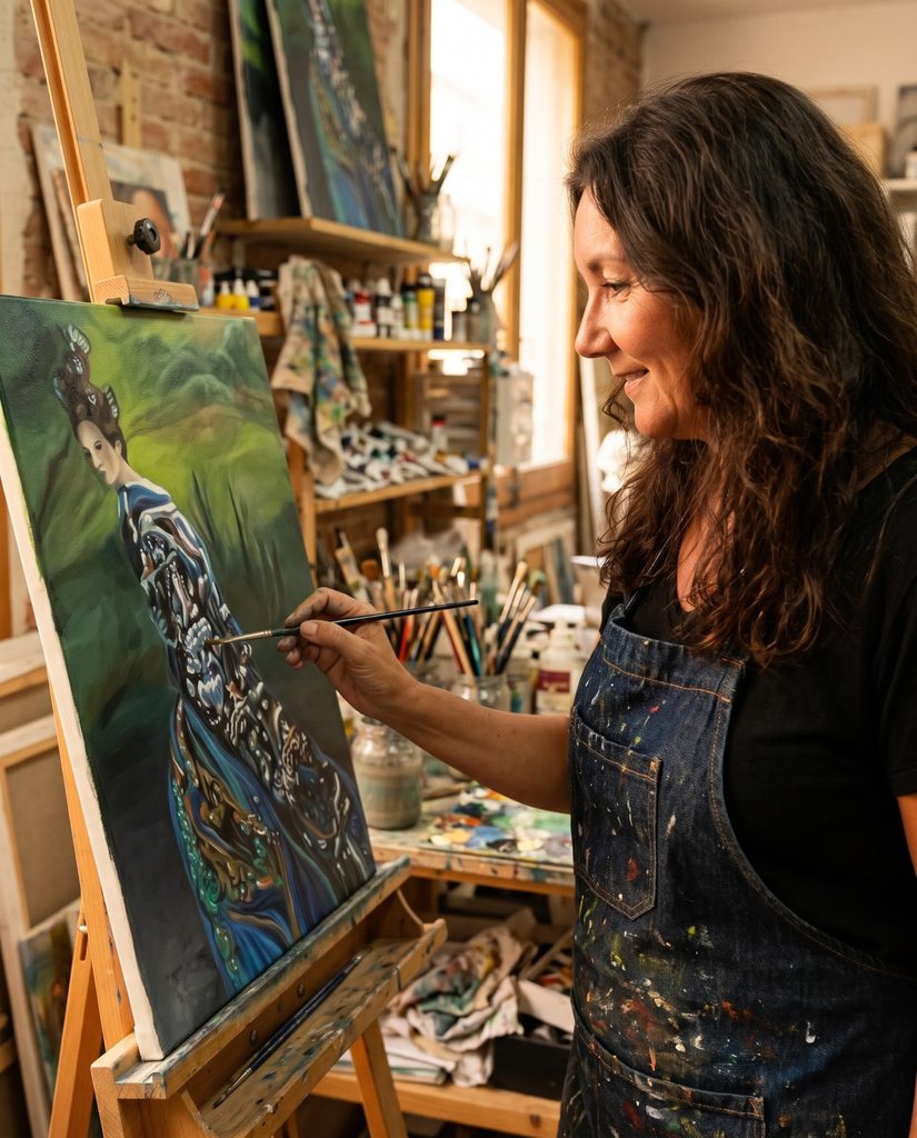
Q8. You invite viewers to bring their own feelings to your paintings. How important is this personal connection to you?
It is essential. I paint feelings, not messages. Happy is not a portrait of someone, it is a feeling. Freedom is not a destination, it is a gesture. I give a painting its title like a door that stands open, and then I step back. My paintings are not asking to be admired.
They ask for a pause, and in that pause someone can notice their own state. One person may see rest in Serenity, another strength, and both are right. I hope people leave feeling something they had not planned to feel. If a painting only said what I meant, it would be finished on the day I signed it. Because people bring their own lives to it, it keeps changing.
Q9. Your recent work explores the connection between art and well-being. What inspired you to explore this further?
It grew from what I see every day. Colour reaches people before words do. That is why hospitals, hotels and homes feel the way they feel. In my colour theory workshops I notice that people already know how colour makes them feel.
They have just never been given the words for it. What convinced me were museum programmes for people with dementia, such as Meet Me at MoMA in New York and the Dutch programme Onvergetelijk at the Stedelijk Museum and the Van Abbemuseum. There, looking at art together opens conversations and memories when words fall short.
With DNH Artful Living we are now developing this for care homes and other care environments: warm colours where people come together, calm blues and greens where they rest, and a recognisable painting as a landmark in a corridor.
A painting is not medicine. But it can make a day more beautiful, and in care that matters.
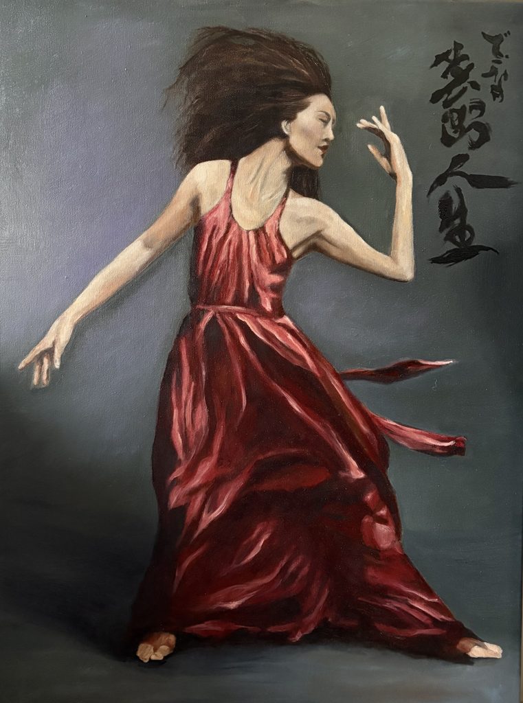
Q10. Has a viewer’s response ever changed the way you understand your own work?
Yes, and it was not one person but a whole fair. In 2023 I exhibited at FIABCN in Barcelona. Abroad nobody knows you. There is no story attached to the work and no home audience, so I had chosen the paintings that I believed could stand on their own. What happened there surprised me.
Visitors who did not share my language, my country or my references stopped in front of the same paintings and described the same feelings back to me, each in their own words. Until then I thought I was painting my own emotions. There I saw that colour really travels, and that what starts as my feeling can become someone else’s. It changed how I work. Every painting since has had to pass that test.
Q11. What advice would you give emerging artists learning to trust their instincts and develop their own voice?
Start by trusting your first reaction. If a colour or an idea makes your heart beat faster, that is information, not a coincidence. Then learn your craft properly. I followed masterclasses and I still go to museums, because instinct needs tools. Show your work to strangers, also outside your own country, and ask yourself whether it still speaks when nobody explains it.
Listen to feedback about the execution but never let it choose your direction. If someone tells you to paint softer or more neutral so it fits more living rooms, smile and keep your colour. And don’t do everything alone.
I paint, and my partner Edo takes care of the business side. That gives me room to stay close to the work. Building a career takes patience. Your own voice is the one thing nobody else can offer.
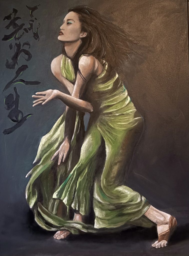
After our conversation with Dinah, we found ourselves thinking about how differently we treat colour once we leave childhood behind, how quickly we learn to call it mere decoration, and how much we lose in the process.
Dinah spends her whole practice arguing otherwise, and we think she’s right. The art world can be oddly suspicious of beauty and bold colour, as though serious art must be restrained or difficult, and a painter who leads with joy and feeling is somehow less rigorous.
Dinah quietly refuses that idea. For her, colour is a language as precise and powerful as any other, capable of carrying grief, love, stillness, and strength, and she treats it with real seriousness and study. In a culture that often mistakes the understated for the profound, there is something quietly radical about an artist who insists that colour itself can speak directly to the soul.
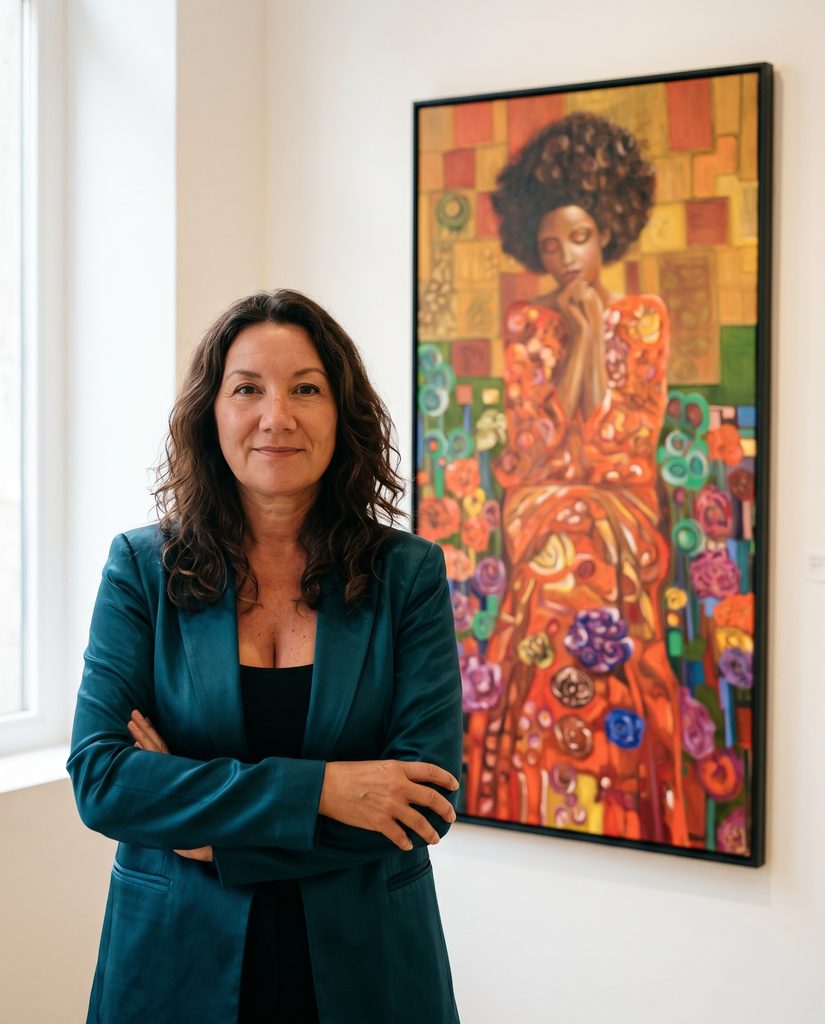
There is something refreshing, too, in where she believes art belongs. The art world tends to place painting behind gallery walls and above collectors’ sofas, as something to be admired at a respectful distance. Dinah wants it in the middle of daily life, in homes, in workplaces, and increasingly in places of care, where it can actually shape how people feel, rest, remember, and come together.
In choosing to explore art’s power to support well-being rather than only its market value, she reconnects painting to something older and more human: the simple idea that beauty is not a luxury, but something that genuinely makes a life, and a day, better.
For art lovers and collectors, Dinah’s work brings warmth, energy, and real emotion into a space. Bold, expressive paintings built entirely from the language of colour, where every hue is chosen to make you feel something rather than simply to please the eye. People tend to find their own moods and memories reflected back in them, each person seeing something a little different. To live with one of her pieces is to invite a particular feeling into your home, a shift of light, a change of mood, a quiet companion that colours your days.
Follow Dinah Letteboer through the links below and see her work for yourself.
At Arts to Hearts Project, submissions are now open for the 101 Art Book: Garden Edition, the sixteenth chapter in our beloved 101 Art Book series.
A garden is so much more than a place where things grow. It is a world of colour, form, pattern, and transformation, found in a single flower, the flight of a butterfly, a tangled forest, or a world entirely of your own imagining. For this edition, we are opening that idea up to each artist’s own interpretation.
Flowers, plants, trees, insects, birds, wild landscapes, botanical forms, or something imagined, remembered, symbolic, or abstract, we welcome it all. There’s no prescribed subject, style, or medium, and we aren’t looking for conventional florals, but for how differently each artist sees the natural world through their own practice.
Each edition of the series gathers 101 artists around a single theme in a premium hardcover book, distributed worldwide. One theme, 101 artists, 101 ways of seeing the world.
So show us what a garden means to you, whether you find it in a flower, a forest, a fleeting moment in nature, or a world entirely your own. This could be your edition.