


The Art Behind Iconic Album Covers
👁 46 Views
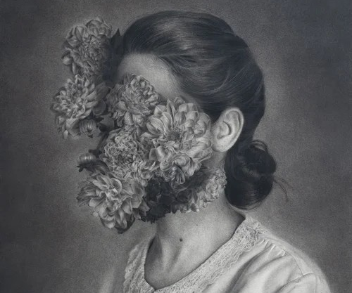
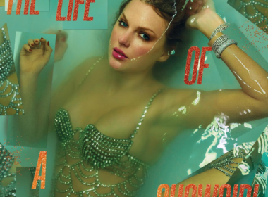
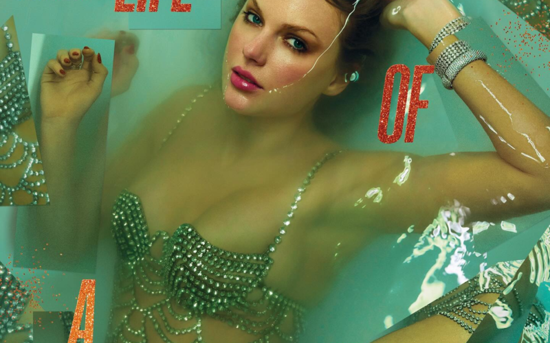
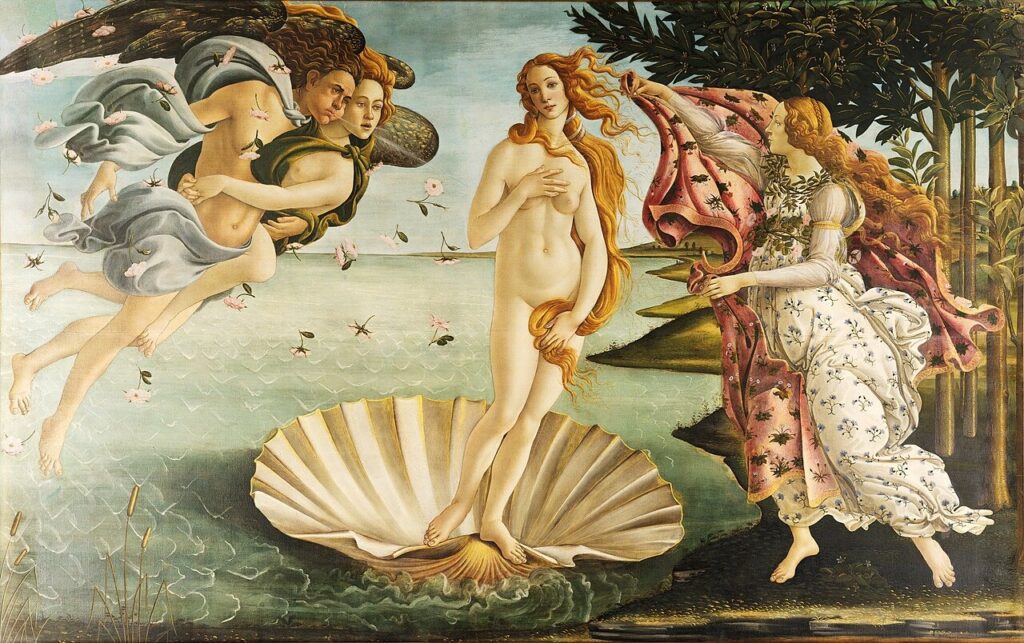
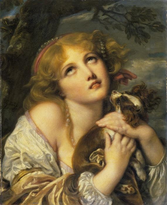
When Taylor Swift unveiled the cover for The Life of a Showgirl, many people felt a sense of familiarity before they could explain why. The image didn’t just look contemporary, it echoed something older, something already embedded in visual culture. For some, it immediately brought to mind Ophelia, a painting that has come to define a very specific kind of beauty and stillness.
This kind of connection is not new. Musicians have long turned to art history when shaping their visual identity, borrowing from paintings, movements, and artistic styles that already carry meaning. It’s not simply about aesthetics. A single image can set the tone for an entire album, offering context before the first track even begins.
Over time, album covers have evolved from functional packaging into something far more intentional. They act as extensions of the music, shaping perception, building narrative, and often revealing the conceptual direction of an artist’s work. Referencing art allows musicians to tap into a shared visual language, one that audiences may not always consciously recognise, but instinctively respond to.
What makes this intersection compelling is that it goes beyond imitation. These covers don’t just replicate existing artworks; they reinterpret them, placing familiar imagery into new cultural contexts.
From Renaissance paintings to Pop Art and contemporary collaborations, the relationship between music and visual art continues to evolve, proving that sometimes, the way we see an album is just as important as the way we hear it.
1. Taylor Swift – The Life of a Showgirl × Ophelia by John Everett Millais
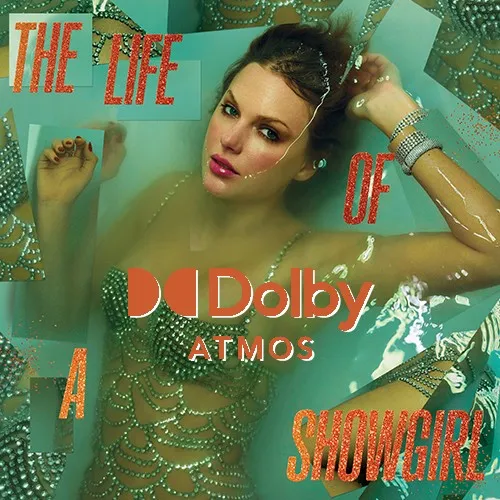
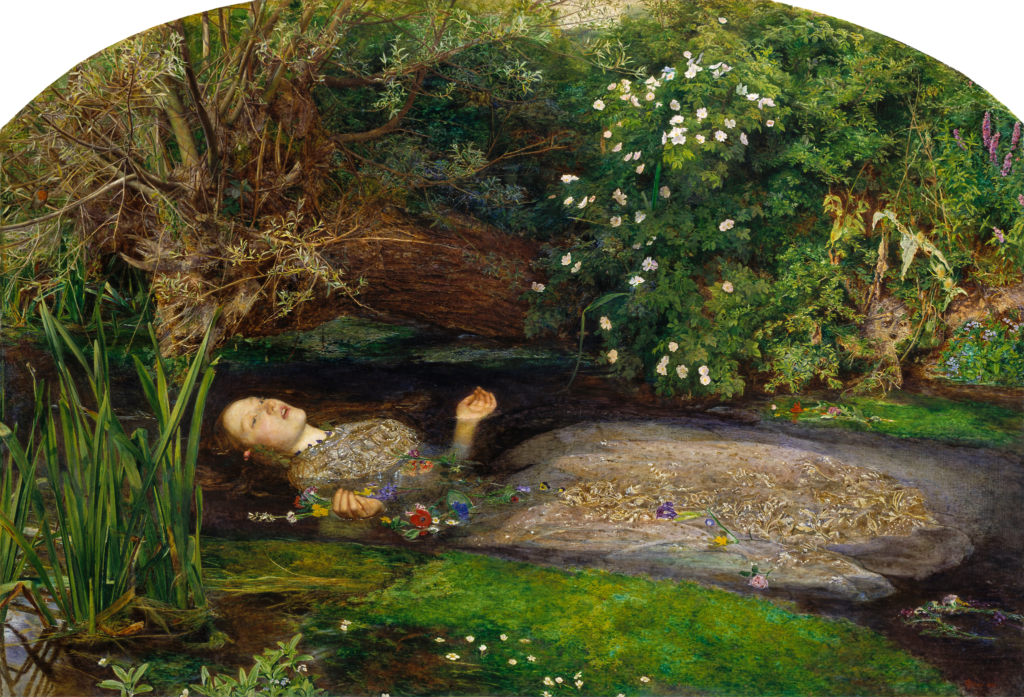
When Taylor Swift unveiled the cover for The Life of a Showgirl, it immediately sparked conversation, not just among fans, but within art circles as well. The visual language of the cover strongly echoes Ophelia, a Pre-Raphaelite masterpiece known for its delicate portrayal of Shakespeare’s tragic heroine.
Millais’ Ophelia captures a moment of stillness suspended in time, a figure floating in water, surrounded by intricate natural detail, embodying both beauty and quiet despair. Swift’s interpretation doesn’t replicate the painting directly, but it borrows its emotional atmosphere. There’s a similar sense of softness, theatrical vulnerability, and controlled stillness that feels intentional rather than coincidental.
This reference works particularly well within Swift’s larger artistic approach. She has consistently treated her album visuals as extensions of her storytelling, using imagery to deepen the narrative before the music is even heard. By drawing from Ophelia, she taps into a pre-existing emotional framework, one associated with femininity, fragility, and performance.
At the same time, the choice feels contemporary. Instead of simply recreating the painting, Swift reframes it through her own identity as a performer. The result is not a copy, but a reinterpretation, one that connects 19th-century art with modern pop culture in a way that feels both intentional and accessible.
This is exactly where music and art history meet: not in imitation, but in translation.
2. Coldplay – Viva La Vida × Liberty Leading the People by Eugène Delacroix
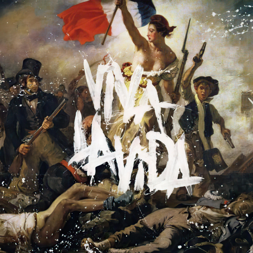
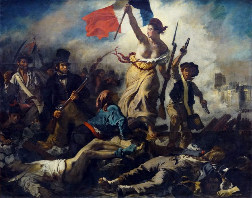
When Coldplay released Viva La Vida or Death and All His Friends in 2008, the album cover stood out immediately. It featured a bold, almost disruptive overlay of handwritten text across Liberty Leading the People, a painting deeply rooted in the history of revolution and resistance.
Delacroix’s work, created in 1830, captures the spirit of the July Revolution in France. At its center is the allegorical figure of Liberty, leading people forward over barricades, holding the French flag high. The painting is energetic, chaotic, and charged with movement, a visual symbol of upheaval and change.
Coldplay’s decision to use this image wasn’t purely aesthetic. It reframed the album’s themes through a historical and political lens. The rough, almost graffiti-like typography layered over the painting contrasts with its classical composition, creating a tension between past and present. It suggests disruption, not just visually, but conceptually.
What makes this cover particularly effective is how seamlessly the painting’s original meaning aligns with the music. Viva La Vida explores ideas of power, loss, and transformation, and Delacroix’s imagery amplifies those themes without needing explanation. The reference does the work quietly but powerfully.
Rather than feeling like a borrowed image, the cover becomes a collaboration across time, where a 19th-century painting is recontextualized to speak to a modern audience.
3. The Strokes – The New Abnormal × Bird on Money by Jean-Michel Basquiat
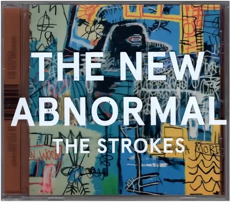

When The Strokes released The New Abnormal in 2020, they didn’t reinterpret a painting, they used one directly. The album cover features Bird on Money, a 1981 work by the influential neo-expressionist artist.
Basquiat’s painting is raw, layered, and intentionally chaotic. Created as a tribute to jazz musician Charlie Parker, Bird on Money reflects themes of genius, pressure, and the cost of creativity. The composition, filled with fragmented text, symbols, and bold, almost aggressive strokes, feels urgent and unresolved.
This visual language aligns closely with the tone of The New Abnormal. The album itself deals with disillusionment, modern anxiety, and a sense of cultural unease. By choosing Basquiat’s work, the band doesn’t just add visual interest, they anchor the album within a broader artistic and emotional context.
Unlike more subtle references, this is a direct integration of fine art into music culture. It also signals intention. Basquiat’s legacy is tied to rebellion, identity, and challenging systems, values that mirror the band’s own evolution and commentary on contemporary life.
What makes this pairing effective is its honesty. There’s no attempt to soften or reinterpret the artwork for mainstream appeal. Instead, the band allows the painting to remain as it is, complex, intense, and open to interpretation.
In doing so, the album cover becomes more than an image. It becomes a statement about the kind of art and conversation the music wants to be part of.
4. Joni Mitchell – Turbulent Indigo × Self-Portrait with Bandaged Ear by Vincent van Gogh
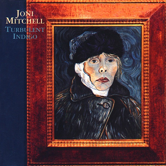
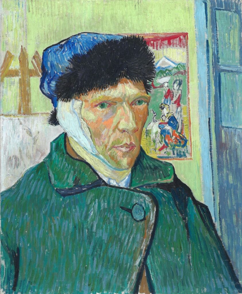
Unlike many musicians who borrow from art history, Joni Mitchell approached it from both sides, as a musician and a painter. For her 1994 album Turbulent Indigo, she didn’t just reference Self-Portrait with Bandaged Ear, she reimagined it, painting herself in its place.
Van Gogh’s original work is deeply personal, created during a period of emotional and psychological turmoil. The bandaged ear has become one of the most recognisable symbols in art history, often associated with the idea of the “tortured artist.” By stepping into that image, Mitchell isn’t simply paying tribute, she’s drawing a parallel.
Her version mirrors the composition closely but replaces Van Gogh’s identity with her own. This shift transforms the painting into something autobiographical. Turbulent Indigo as an album explores themes of injustice, disillusionment, and emotional unrest, and the cover reinforces that tone visually. It suggests a shared experience across time, the struggles of being an artist navigating both inner and outer worlds.
What makes this reference particularly compelling is its directness. There’s no subtle nod or hidden influence. Mitchell makes the connection explicit, inviting the viewer to consider not just Van Gogh’s story, but her own.
In doing so, she blurs the line between homage and self-expression. The album cover becomes a space where art history is not just referenced, but inhabited, reshaped to reflect a contemporary voice while still carrying the weight of the original.
5. Lady Gaga – Artpop × Botticelli’s The Birth of Venus (with Jeff Koons)
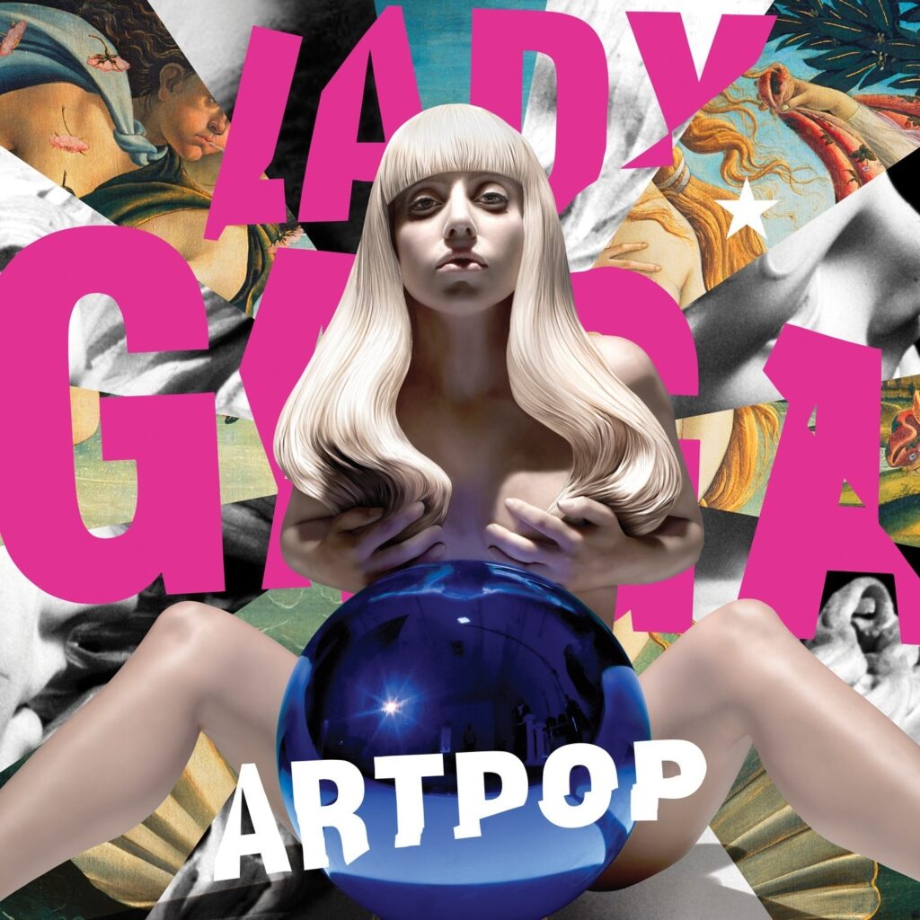
With Artpop, Lady Gaga made her intentions clear from the start, this was not just an album, but a statement about art itself. The cover, created in collaboration with contemporary artist Jeff Koons, layers multiple visual references, most notably The Birth of Venus.
Botticelli’s Renaissance masterpiece is one of the most recognisable images of classical beauty, Venus emerging from the sea, symbolising love, femininity, and idealised form. In Artpop, fragments of this painting appear behind Gaga, partially obscured yet unmistakable. The reference is deliberate, but it’s not presented in a traditional way.
Instead, Koons introduces his own visual language into the composition, most prominently through the reflective blue gazing ball placed at the center. The result is a collision of eras and aesthetics: Renaissance idealism meets hyper-polished contemporary art, with Gaga positioned at the intersection.
This layering reflects the album’s central idea, that pop culture and fine art are not separate worlds. By placing herself within this visual dialogue, Gaga challenges the hierarchy between “high” and “low” art, suggesting that both exist within the same cultural space.
What makes this cover effective is its boldness. It doesn’t subtly reference art history; it actively engages with it, reshaping it into something theatrical, modern, and self-aware.
Rather than simply borrowing from the past, Artpop turns it into a stage, one where identity, fame, and art continuously overlap.
6. Kanye West – Graduation × Takashi Murakami’s Superflat World

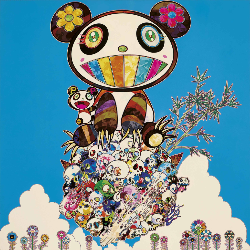
For Graduation, Kanye West didn’t reference a single historic painting, instead, he collaborated directly with Takashi Murakami, bringing an entire contemporary art movement into the album’s visual identity.
Murakami is known for his “Superflat” style, a distinctive blend of traditional Japanese art, anime aesthetics, and commentary on consumer culture. The Graduation cover reflects this fully: bright, saturated colours, playful yet surreal imagery, and the now-iconic Dropout Bear being launched into a cosmic, dreamlike landscape.
This wasn’t just a design choice, it marked a shift in how hip-hop albums could position themselves visually. Instead of gritty realism or minimalism, Graduation embraced a highly stylised, almost fantastical aesthetic. The influence of Murakami’s work makes the cover feel expansive and futuristic, aligning with the album’s themes of ambition, success, and transformation.
What makes this collaboration stand out is its balance between accessibility and concept. On the surface, the artwork is vibrant and instantly appealing. But underneath, it carries Murakami’s deeper exploration of mass production, pop culture, and the blurred line between commercial and fine art.
By working with Murakami, Kanye didn’t just borrow from the art world, he actively stepped into it. The result is a cover that feels cohesive with the music while also existing as a standalone piece of contemporary art.
It’s less about referencing the past, and more about redefining what album art could look like in the present.
7. Blur – Think Tank × Banksy (with echoes of René Magritte)
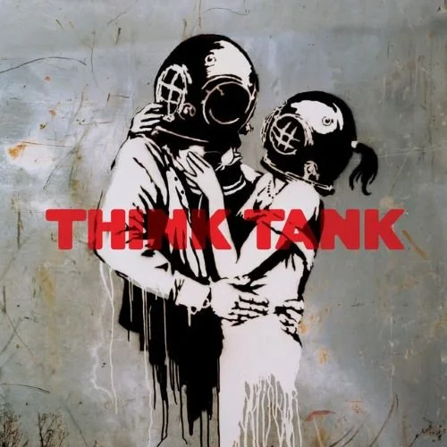
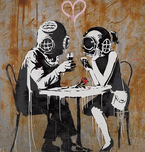
For Think Tank, Blur turned to the elusive street artist Banksy, whose work is known for its sharp political undertones and instantly recognisable stencil style. The album cover features a couple wearing vintage diving helmets, locked in a kiss, an image that feels both intimate and strangely distant.
While not a direct reference to a single classical painting, the visual language draws heavily from René Magritte and the broader Surrealist movement. Magritte’s work often explored themes of obscured identity, contradiction, and the tension between what is seen and what is understood. That same tension is present here.
The diving helmets act as barriers. Even in a moment of closeness, there’s separation, a visual metaphor that mirrors the album’s themes of emotional distance, disconnection, and modern unease. The image feels simple at first glance, but the longer you look, the more unsettling it becomes.
What makes this cover particularly interesting is how it bridges two worlds: street art and fine art. Banksy’s raw, anti-establishment aesthetic meets the conceptual depth of Surrealism, creating something that feels both accessible and layered.
Rather than borrowing directly from art history, Think Tank absorbs its ideas and reinterprets them through a contemporary lens. The result is a cover that doesn’t just illustrate the music, it extends its meaning, turning a single image into a quiet but powerful commentary on connection in the modern world.
8. Fleetwood Mac – Tango in the Night × Henri Rousseau’s Dreamlike Worlds
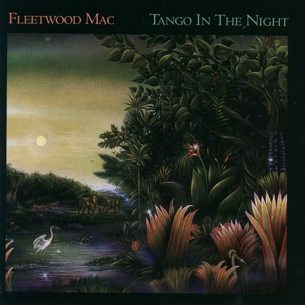
With Tango in the Night, Fleetwood Mac leaned into a visual world that feels both lush and slightly surreal. The cover, created by artist Brett-Livingstone Strong, draws clear inspiration from the work of Henri Rousseau, whose paintings are known for their dense jungles, dreamlike settings, and quiet sense of mystery.
Rousseau’s work often sits somewhere between reality and imagination. His forests are rich with detail but feel almost too perfect, too still, like scenes from a dream rather than direct observation. That same quality appears in Tango in the Night. The cover features deep greens, glowing moonlight, and a sense of calm that feels slightly otherworldly.
This atmosphere aligns closely with the album itself. The music blends polished production with emotional undercurrents, creating a sound that is both smooth and introspective. The cover mirrors that balance, visually serene, but layered with mood.
What makes this reference effective is its subtlety. Unlike direct reproductions of famous paintings, this is more of an aesthetic borrowing. It captures Rousseau’s visual language without copying a specific work, allowing the album to feel cohesive rather than referential.
The result is a cover that feels immersive. It doesn’t just present an image; it creates a setting, one that invites the listener into a space where sound and atmosphere are closely intertwined.
In this case, art history isn’t quoted outright. It’s absorbed and reimagined into something that feels timeless.
9. The Smashing Pumpkins – Mellon Collie and the Infinite Sadness × Raphael & Jean-Baptiste Greuze
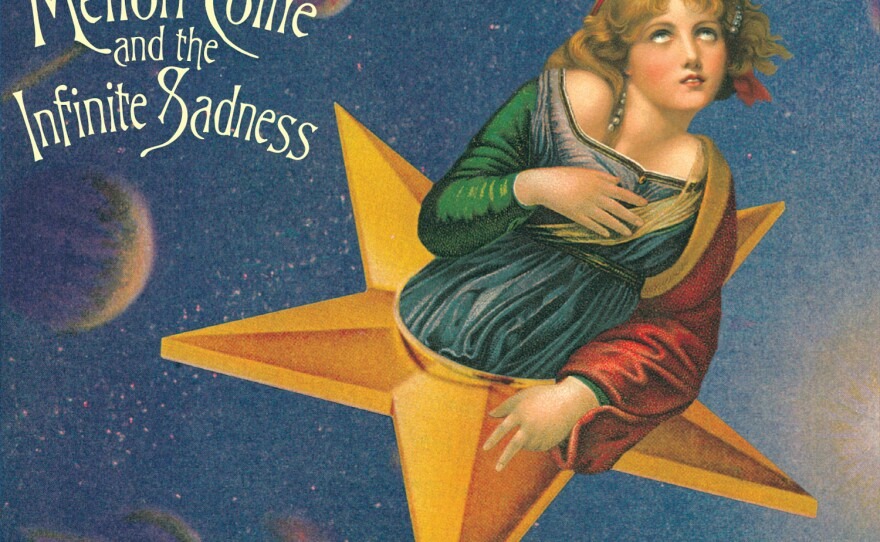
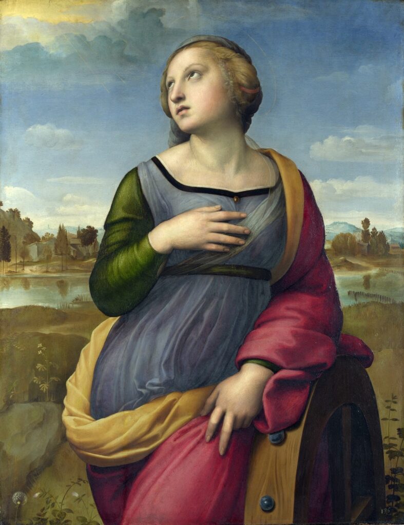
The cover of Mellon Collie and the Infinite Sadness by The Smashing Pumpkins is one of the most intricate examples of art history being directly reassembled into a new image. Designed by John Craig, the artwork is a composite, combining elements from two different paintings: Saint Catherine of Alexandria and The Souvenir.
The body of the figure is drawn from Raphael’s Renaissance painting, while the face comes from Greuze’s 18th-century portrait. These two elements are seamlessly merged and placed within a surreal, celestial setting, a woman seated on a star, floating in an imagined sky.
What makes this cover particularly compelling is how naturally these references come together. Despite originating from different time periods and artistic styles, the final composition feels cohesive rather than fragmented. It transforms classical imagery into something dreamlike and slightly surreal, aligning with the album’s expansive and emotional tone.
Mellon Collie and the Infinite Sadness itself explores themes of youth, longing, and existential reflection, and the cover mirrors that sense of scale and introspection. The use of historical imagery adds a timeless quality, as if the emotions within the music extend beyond a single era.
Rather than simply referencing art history, this cover actively reconstructs it. It takes familiar elements and rearranges them into something entirely new, proving that influence doesn’t have to be subtle to be effective, it just has to be intentional.
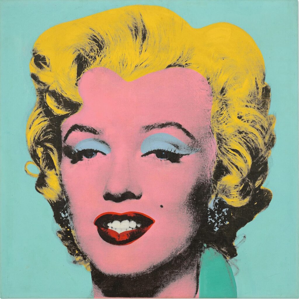
10. Madonna – Celebration × Andy Warhol’s Pop Art Portraits
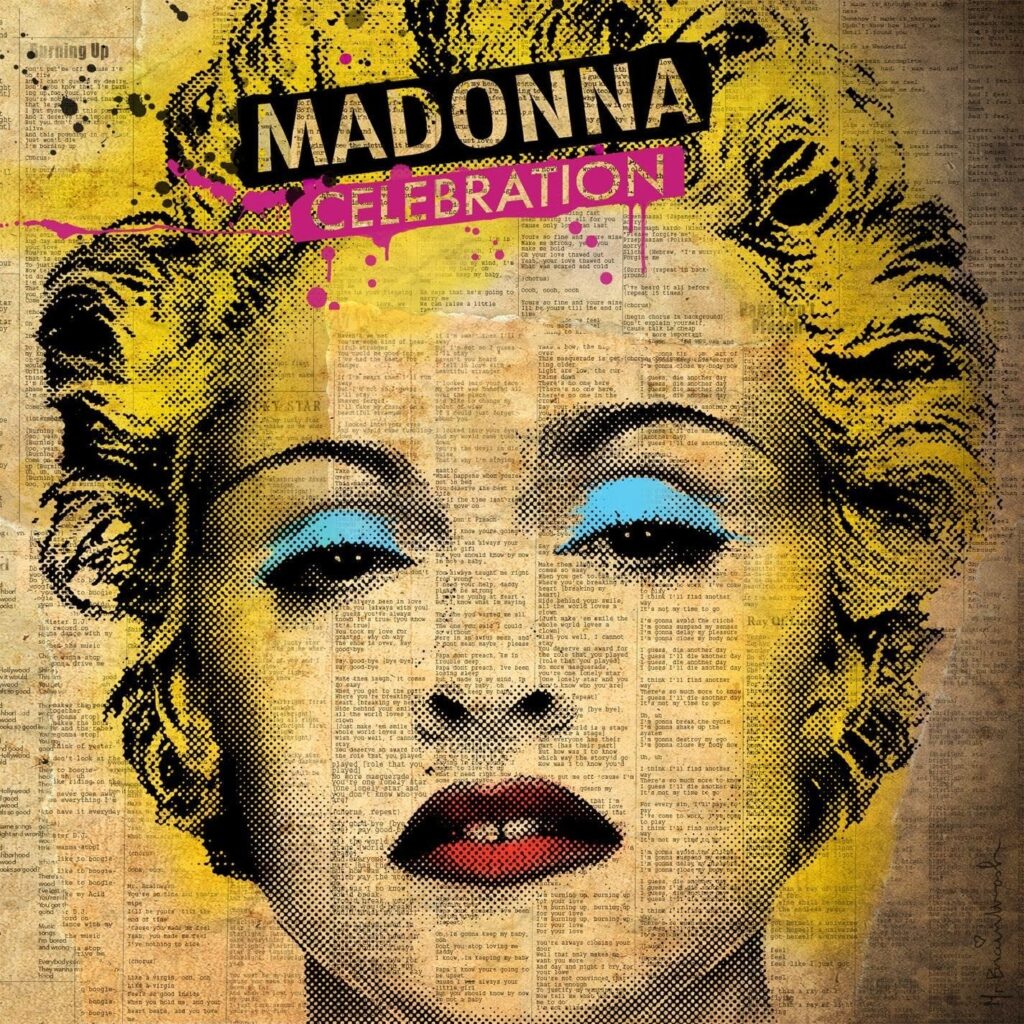
With Celebration, Madonna leans into a visual style that feels instantly familiar, bold colours, graphic repetition, and a stylised portrait that echoes the legacy of Andy Warhol.
Warhol’s Pop Art portraits, especially of figures like Marilyn Monroe, redefined how celebrity was represented in art. By using flat colours and repetitive imagery, he turned public figures into icons, not just people, but symbols of mass culture. That same visual language is clearly present in Celebration.
Madonna’s cover doesn’t directly replicate a single Warhol piece, but it adopts his aesthetic framework. Her face is rendered in high contrast, with exaggerated tones and a graphic quality that removes realism and replaces it with something more constructed. The result feels less like a photograph and more like an idea of Madonna, a persona shaped by decades of reinvention.
This connection is particularly fitting. Like Warhol’s subjects, Madonna has always existed at the intersection of fame, performance, and image-making. Her career has consistently played with identity, visibility, and control over her own representation.
By drawing from Warhol’s style, the cover reinforces that narrative. It positions Madonna not just as a pop star, but as a cultural icon in the same lineage as the figures Warhol immortalised.
Rather than simply referencing Pop Art, Celebration becomes part of its ongoing conversation, where celebrity itself is the artwork.
11. The White Stripes – De Stijl × Piet Mondrian’s De Stijl Movement
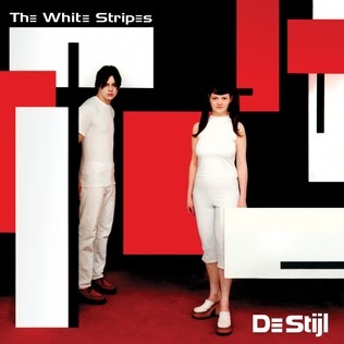

With De Stijl, The White Stripes made one of the most direct visual references to an art movement, not just a painting, but an entire philosophy. The album takes its name and aesthetic from De Stijl, a Dutch artistic movement led by figures like Piet Mondrian.
Mondrian’s work is instantly recognisable: grids, straight black lines, and blocks of primary colours. The goal of De Stijl was simplicity, reducing form and colour to their most essential elements to create balance and harmony. It was about stripping away excess and focusing on structure.
That same principle carries into the album’s visual identity. The De Stijl cover uses a limited palette, primarily red, white, and black, along with clean, geometric composition. It feels controlled, intentional, and minimal.
This visual choice mirrors the band’s musical approach at the time. The White Stripes were known for their raw, stripped-down sound, often built on just guitar, drums, and minimal production. By aligning themselves with De Stijl, they reinforce that idea of reduction. Nothing unnecessary, nothing decorative.
What makes this reference particularly effective is its consistency. It’s not just the cover, the band’s entire branding, from stage design to clothing, followed this restricted colour palette and aesthetic logic.
Rather than borrowing a single artwork, De Stijl adopts a complete visual system. It shows how deeply art movements can influence not just how music looks, but how it presents itself as a whole.
12. David Bowie – “Heroes” × Expressionist Visual Language
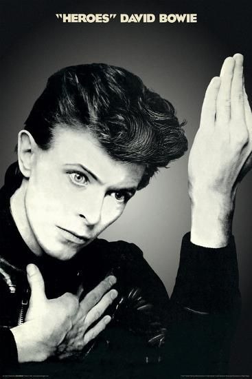
The cover of “Heroes” by David Bowie is deceptively simple, a stark black-and-white photograph of Bowie mid-gesture, his hand frozen in an ambiguous, almost theatrical pose. But behind this minimal composition lies a clear visual reference to Expressionism, particularly the work of Erich Heckel.
Bowie’s pose closely mirrors Heckel’s painting Roquairol, where the figure’s hand is similarly raised in a stylised, emotionally charged gesture. Expressionism as a movement focused less on realism and more on conveying internal states, distortion, tension, and psychological depth.
That same intensity is present in the “Heroes” cover. The image feels controlled, yet slightly unsettling. The gesture is not immediately readable, which creates a sense of distance between the viewer and the subject. It invites interpretation rather than offering clarity.
This aligns with Bowie’s broader artistic identity during this period. The “Heroes” era was marked by experimentation, reinvention, and a move toward more introspective, atmospheric work. The visual restraint of the cover contrasts with its emotional weight, much like Expressionist art itself.
What makes this reference effective is its subtlety. Unlike direct reproductions of paintings, this is about borrowing a visual language, a way of expressing emotion through form and gesture.
In doing so, Bowie turns a simple photograph into something far more layered, where meaning isn’t fixed, but felt.
What makes these album covers so compelling is not just the reference itself, but what happens after. A painting that once belonged to a museum wall is reintroduced into everyday culture, streamed, shared, and seen by audiences who may never have encountered it otherwise. In that shift, its meaning expands.
When Taylor Swift echoes Ophelia, or when Coldplay places Liberty Leading the People at the center of an album, they aren’t just borrowing imagery, they’re repositioning it. They bring historical works into contemporary conversations, allowing them to be experienced through a different lens.
At the same time, this exchange works both ways. Music gains depth and context, while art history becomes more accessible, less distant, and more integrated into popular culture. The boundaries between disciplines begin to blur, making it harder to separate what belongs to the past from what feels current.
Album covers, in this sense, are not just visual accompaniments. They are points of connection, between eras, mediums, and audiences. They show how creative fields continuously overlap, influence, and reshape one another.
And perhaps that’s why this practice continues.
Because some images never really stay in one place. They evolve, reappear, and find new meaning, each time we see them again.
So the next time an album cover feels familiar, it might be worth asking: are you looking at something new, or something that has simply been seen differently?
Now we wanna know, Which album cover do you like the most?
If this intersection of art and storytelling intrigued you, you might enjoy exploring what happens when artworks are given a voice of their own – If Famous Artworks Could Talk