


4 Lessons from Malevich’s Art Every Mixed-Media Artist Can Use

👁 89 Views
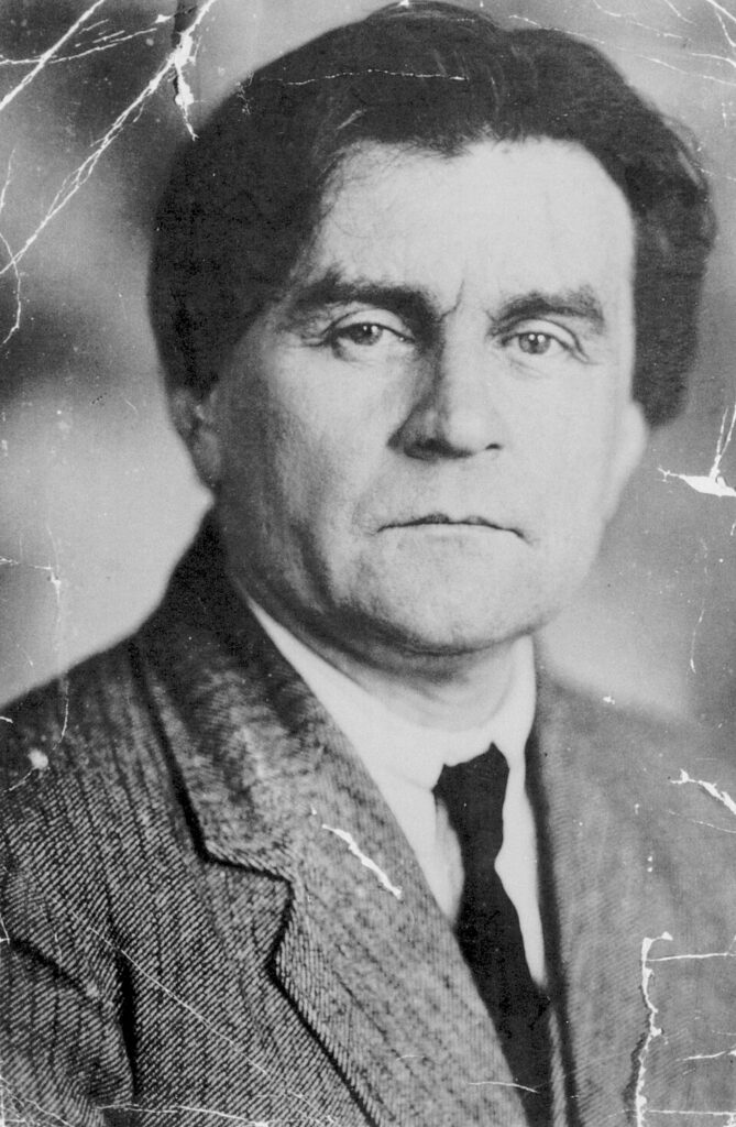
Kazimir Severinovich Malevich (1879–1935) was a radical avant‑garde painter and theorist, best known as the founder of Suprematism, a groundbreaking art movement centered on geometric abstraction. Suprematism was his vision of “pure feeling” in art , a language of shapes, colors, and forms divorced from the physical world.
He was born near Kyiv, in what was then the Russian Empire, into a family of Polish descent. His early years were shaped by rural life and folk traditions, which later influenced his aesthetic simplification. Malevich studied at the Moscow School of Painting, Sculpture, and Architecture, absorbing styles like Impressionism, Symbolism, and Cubism before forging his own path.
By about 1913, he began developing Suprematism, abandoning representational subject matter in favor of abstract geometric forms , such as squares, circles, and crosses , painted in a limited palette. His 1915 masterpiece, Black Square, is often seen as a symbolic “zero point” in art, the end of traditional depiction and the beginning of a new form of expression.
Malevich wasn’t just a painter. He was a theorist who wrote influential texts like From Cubism and Futurism to Suprematism and The Non‑Objective World, arguing that art could convey spiritual and emotional experience through pure form. His ideas reshaped how modern art understood abstraction and “non-objectivity.”
Despite his influence, his later years were difficult. Suprematism fell out of favor under Soviet rule, and Malevich’s work was censured. He died in 1935, largely unappreciated by the authorities of his time. Yet today, he is recognized as one of the most important pioneers of abstract art, whose radical reduction of form continues to inspire artists, architects, and thinkers around the world.
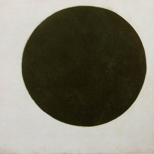
Black Square (1915)
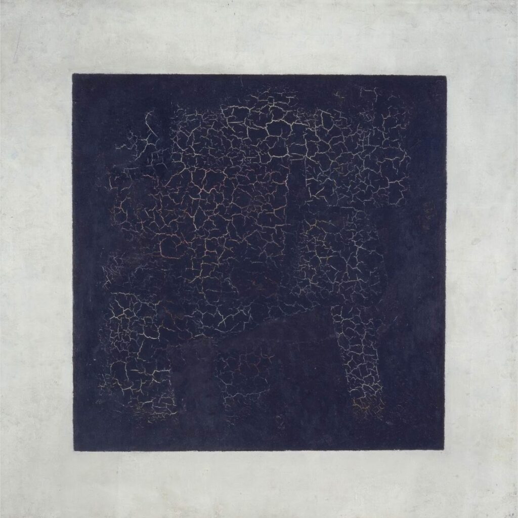
This painting marks the moment Malevich declared a radical break from representation to pure abstraction. He described it as the “zero point of painting”, a square that might look simple but carries monumental intent.
In 1915 it was exhibited at the “0.10” exhibition, hung in the “beautiful corner” reserved for icons in Russian homes , signalling that Malevich saw his new art as comparable in significance to religious imagery.
The composition itself , black square on a white field , strips away narrative, figure and detail: what remains is form, colour, space, and feeling.
Viewers at the time found it shocking: no more subject, no depiction of the everyday. Instead the painting asked: what is painting at its core? It challenged the conventions of art.
For today’s artists the Black Square remains a touchstone: it asks you to consider how minimal something can be while still carrying meaning. It emphasises design, intention, and elimination of excess.
Ultimately, this painting set the stage for all the later works I’ll cover below: squares, circles, crosses, floating shapes, each exploring what art is when the subject disappears.
Black Cross (c. 1915)
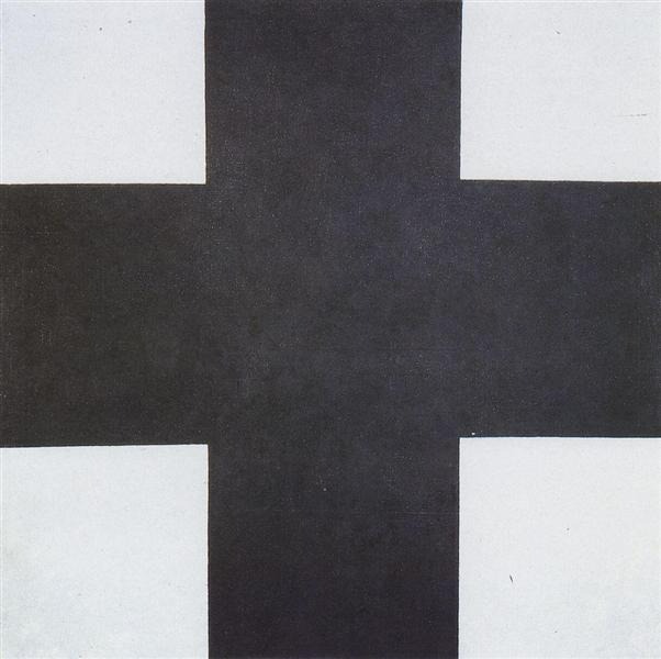
Shortly after the Black Square, Malevich produced the Black Cross , the same square format but with the barest of forms: a dark cross on a white background. Wikipedia+1
In this work the cross becomes a geometric icon freed from figurative meaning. Malevich was no longer painting something; he was painting nothing, or rather painting pure form that points to feeling or space, not object. Wikipedia
The arms of the cross reach out equally in all directions, set squarely within the canvas , the format emphasises balance, stasis, and the idea of form as presence.
For a mixed‑media or abstract‑focused artist today, the Black Cross invites reflection on how structure and simplicity can hold tension: how minimal form can still carry weight, intention, and presence.
It also opens the idea that a “symbol” doesn’t have to depict something , it is something. The cross here is not religious in the usual sense; it’s abstraction turned emblematic.
The Black Cross helps trace the evolution from the bold gesture of the Square towards other experiments in pure form, paving the way for circles, floating shapes, and colour‑relationships that follow.
Black Circle (1923–24)
The Black Circle takes the square format further still into abstraction: here the shape is soft, the edges curved, the form less rigid. The circle floats within white space, asserting itself without telling you what it is.
In this piece the geometry becomes less “architectural” and more “motion‑potential” or “presence in space.” The circle doesn’t anchor; it hovers. For artists working with mixed media today, this suggests freedom: the shape invites interaction, layering, texture.
The circle’s simplicity belies its depth: we see how Malevich abandoned object‑based painting altogether and instead looked at how pure form can evoke perception, space, even silence.
This painting suggests to you: what if you treat your mixed media piece not as representation but as exploration of form + material + space? What if you play with layers so the circle is more than shape, it is experience?
Here the white field is not empty; it is active space. The black circle draws and holds attention because everything else fades away. That becomes a lesson: simplification amplifies.
For a checklist or template product for artists today, Black Circle invites the creation of “form‑over‑subject” frameworks: guides to how shape, texture, layering, and space interplay.
Suprematism No. 38 (1916)
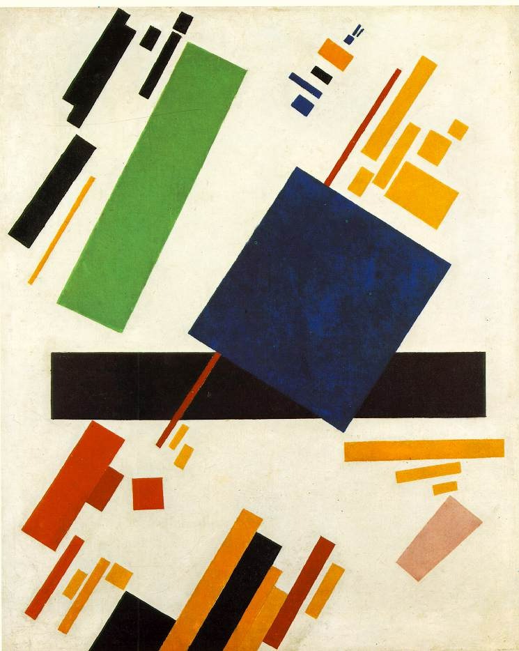
This painting pushes the Suprematist idea further: elongated rectangles, bold red beams, smaller fragments of colour, all set against white background and emphasising dynamic composition.
What you see is not a depiction of anything real. Instead you’re invited to feel movement, weight, lightness, and balance. For the mixed‑media creator today, this signals the idea of “compositional choreography” rather than “image of something”.
Imagine your materials (paper, paint, fabric, found objects) as these geometric actors: how do they relate? How do they balance? Where is the tension? Where is the calm? This painting gives a blueprint.
Also interesting: the proportions are less “square” and more rectangle, this change in format suggests variety in composition matters. For templates today you could include “format checklist” (square, rectangle, tall, panorama) for mixing media.
The energetic diagonal lines and overlapping shapes show that abstraction can feel active, not passive. For mixed media artists this means use of texture, direction, layering matter.
Finally, Suprematism No. 38 reminds us that composition itself can carry meaning. It wasn’t about subject or story, but about how form, space and colour interact, and that’s a potent lesson for artists working beyond representation.