


How Jay Tang turns Sheets of paper into landscape photography

At Arts to Hearts Project, our 101 Artbook Photography Edition is full of photographers who are pushing what the medium can do. But every now and then someone submits work that makes you question what you are even looking at.
Not in a confusing way. In the way where your brain says this looks like a painting of a mountain range and then someone tells you it is actually a photograph of a crumpled tissue and you have to sit down for a second.
Jay Tang does that. He is one of our selected artists in this edition and his work genuinely made us rethink the relationship between what something is and what it looks like.
Jay is a photographer and visual designer based under the brand Visual Creature. He came to photography later than most, enrolling at thirty-one, and he brought a design brain with him that shapes everything about how he approaches the medium.

His series Everyday Landscapes started during his final year of study and the story of how it began is so simple and so perfect that we are going to leave it for the interview because it is the kind of origin story where you go of course, that is exactly how something like this should start.
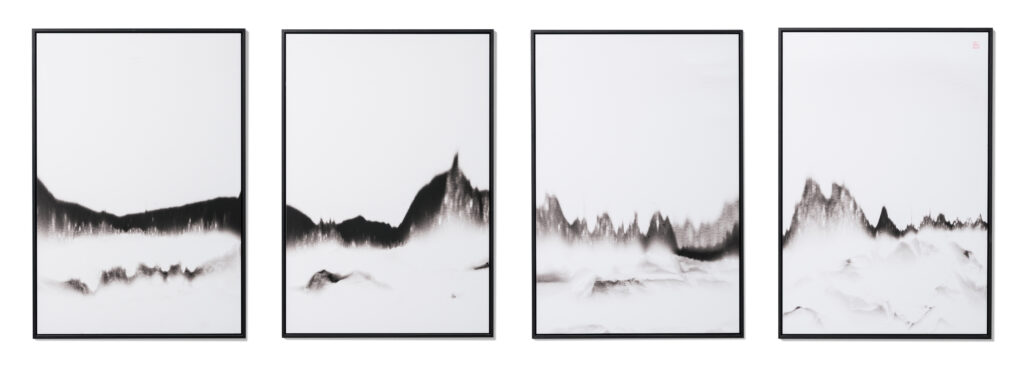
The work is built on the most fundamental elements of photography. Light, shadow, subject, camera. That is it. No heavy post-processing. No digital manipulation. No software tricks. Just household materials arranged and lit in a way that transforms them into something your eye reads as landscape or nature or mountain or sea.
The gap between what the material actually is and what your brain tells you it is, that gap is where the entire practice lives.
Now let’s hear from Jay about the moment that started everything, what his landscapes are actually made from, and why going back to the absolute basics of photography turned out to be the most creative decision he ever made.
Q1. Could you share a little about your journey into art and how your visual language evolved into these imaginative, creature-filled worlds?
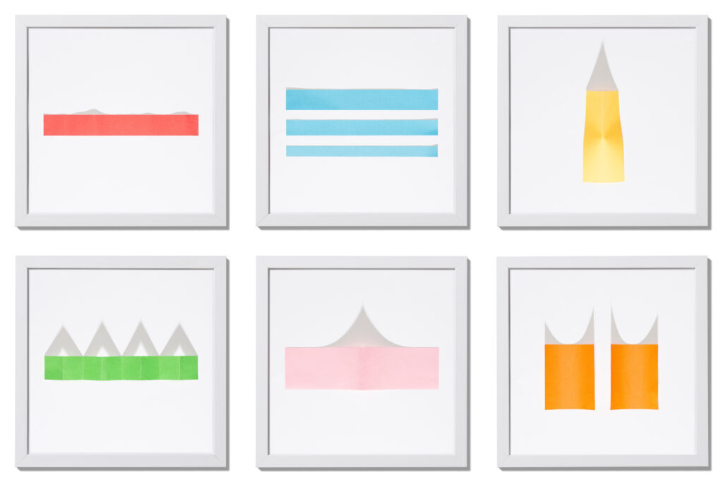
I started my Everyday Landscapes series during my final year of my photography study. As a photographer with a background in visual design, I wanted to photograph something with a strong visual appeal, so I used coloured paper as my subject. In the week after, I continued using coloured paper, but this time I cut them in to shapes to create an abstract look.
One of those pieces looked like some islands on a horizon. This triggered me to continue this path. I started to experiment with white paper instead of coloured ones. Through this process, I was able to create painting-like, abstract landscapes.
Q2. Your brand name, Feixueniao (“Flying Snow Bird”), is wonderfully distinctive where did it come from, and what does it mean to you?
My brand name is called VISUAL CREATURE and is a reflection of my passion for visuals. The logo I designed is based on the letters V and C, which then resembles a swan. When I decided to make a Chinese name, I named it 飛雪鳥. 飛雪 sounds somewhat similar to ‘visual’ in both Mandarin and Cantonese and a swan is bird (鳥), so it’s full circle.
Q3. Your work focuses on light, shadow, subject, and camera what drew you back to those essentials?
As a designer, I already work with software and the computer. As a photographer, I like to go back to the fundamentals of the craft: Just lights, shadows, subject and camera.
Q4. Did Everyday Flora grow naturally out of Everyday Landscapes, or did it open up a completely new direction for you?
One evening, when I came home, I noticed the shadow a bag of bread on the table cast a shadow the resembled a flower. This inspired me to create Everyday Flora. I used cling foil and paper to create shadows of flowers and projected that on the wall. Whilst similar in execution, it feels different enough to warrant its own title.

Q5. Do you work digitally or on film for this series, and how much does that choice shape the final image?
Most of this work is shot digitally and edited slightly on the computer. I have experimented with analogue in the past, but haven’t had the right results yet. It is something that I intend to develop further though. What matters most is that I can get those deep shadows to make it look like black paint.
Q6.Have any everyday materials surprised you by not working the way you expected?
I’ve tried all kinds of different white paper, tissues, foil, cushion fillings and even salt. Most of the materials I’ve used has led to interesting effects. The one material I’ve used that didn’t work for me were bubble wraps.
Q7.Your work explores identity and legacy through abstraction how do those ideas find their way into images without being directly shown?
My work is framed in a black wooden floating frame, with some of them in a long vertical format. They resemble the aesthetics of traditional Chinese paintings. One piece, Thoughts About Home, is actually a very personal piece as that work is inspired by the view on top of the mountain close to my father’s village.
Q8. Which piece in your portfolio do you feel is most underestimated one that has more in it than most people realise?
I wouldn’t say it is underestimated, but the piece Snow Mountain is very layered and has resulted in the most diverse interpretations from the viewers. Some see a mountain in it, while others seen a desert or even a face!
Q9. If you could go back and say something to the version of yourself who was enrolling in photography school at 31, what would it be?
You were right to pursue the path of photography. That was the right decision to make.
Q10. Fine art photography is often viewed differently from painting or sculpture, how have you navigated that as an artist?
I think fine art photography has been a very well respected field in the art world. In the end, it’s just one medium to express the artists’ vision. If the results resonates with the audience, I don’t think they really care what the medium is.
Q11. What advice would you give to photographers trying to develop a visual language that feels truly their own?
Having your own recognisable visual language is important to stand out from the crowd. It makes the viewer takes longer to view your work.

As our conversation with Jay came to a close, we kept thinking about perception. About how much of what we think we see is actually constructed by our own brains rather than recorded by our eyes.
Because that is exactly what Jay’s work plays with. You look at his photographs and you see landscapes. Mountains, horizons, natural forms. And then you find out what they are actually made from and something shifts in your brain.
You go back and look again and you cannot unsee either version. The landscape is still there. But so is the truth of the material. And the photograph holds both at the same time without choosing one over the other.
There is something genuinely playful about what he does but also something that raises real questions about how we see the world. Jay is not asking those questions in a heavy way. He is asking them by making you mistake something ordinary for something extraordinary. And that lands harder than any philosophical text on perception ever could.
We also really appreciate the simplicity of his approach. In a photography world that keeps adding more, more editing, more software, more processing, more steps between the camera and the final image, Jay went the opposite direction. Stripped everything back to the fundamentals.

And the results are more visually striking than work made with ten times the technology. That tells you something important. That complexity is not the same as depth. And sometimes the most powerful creative decision is about what you choose not to use.
For anyone thinking about collecting Jay’s work, his photographs work on two levels at once. They are beautiful abstract images you could live with purely for how they look on your wall, strong compositions, rich tones, a convincing sense of landscape that is calming and elegant. But they also carry a conceptual layer that keeps them interesting long after the first impression fades.
Once you know what you are actually looking at, the photographs become a conversation between illusion and reality that does not get old. And the way he frames and presents them adds a physical presence and cultural dimension that makes them feel considered and complete.
Follow Jay Tang through the links below and see what happens when someone turns a kitchen table into a mountain range with nothing but light and paper.