




The Art You Hang Is Affecting You More Than You Realize

How Color in Art Quietly Shapes the Way We Feel
We don’t just look at art anymore. We regulate ourselves through it.
The art you hang affects you more than you realize. The painting across a bedroom is no longer simply decorative. The muted canvas in a hallway changes how silence feels when you walk past it every morning. A dark-toned artwork can make a room feel intimate and grounding. A pale blue abstraction can soften emotional tension without us fully noticing why.
For years, conversations around art collecting focused on aesthetics, investment, and status. What matched the interiors. What looked expensive. What felt culturally relevant. But increasingly, people are choosing art for a different reason entirely: emotional atmosphere.
And that shift says something important about the moment we are living in.
We are surrounded by relentless stimulation. Screens, noise, algorithms, artificial brightness, endless information. Attention is constantly being demanded from us. In response, homes are beginning to transform into spaces of emotional recovery rather than performance. The art people live with reflects that change clearly.
The rise of soft abstraction, muted palettes, earthy greens, textured neutrals, and darker contemplative works is not simply an interior trend. It reflects collective emotional exhaustion. People are no longer only decorating for visual impact. They are decorating for nervous-system relief.
Perhaps that is why certain artworks feel impossible to leave behind. Not because of what they depict, but because of what they emotionally regulate.
Because over time, the colors we live with stop behaving like decoration.
They become part of how we feel.
Blue: Why We’re Craving Quiet Art Again
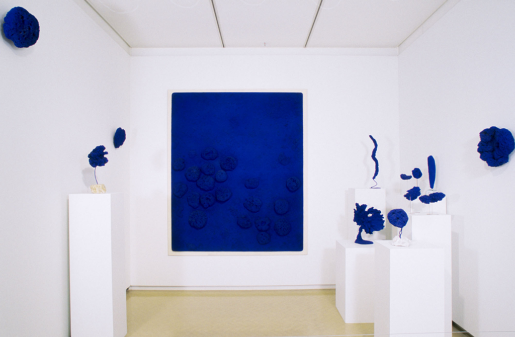
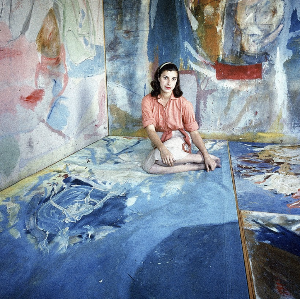
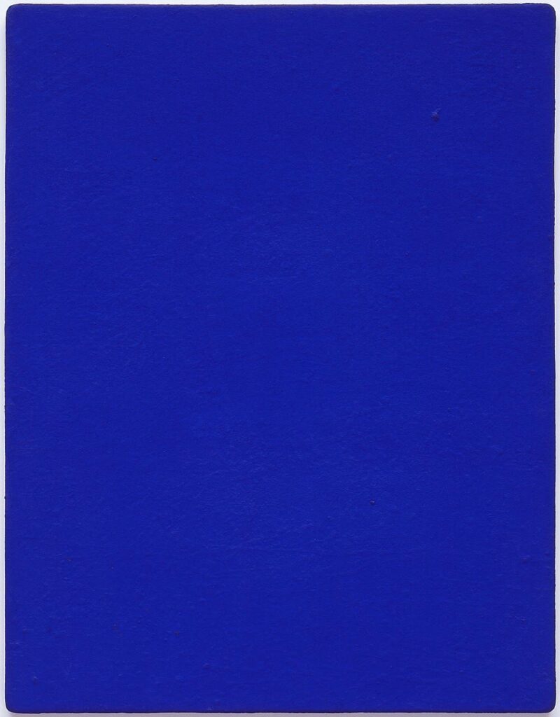
There is a reason blue artworks have become almost unavoidable in contemporary interiors. They appear in collector homes, boutique hotels, galleries, wellness spaces, and minimalist apartments with remarkable consistency. But this shift is not simply aesthetic. It feels psychological.
We are living through an era of constant stimulation. Notifications, endless scrolling, artificial light, crowded visuals, algorithmic noise, attention is being consumed at all times. Against that backdrop, blue art feels less like decoration and more like relief.
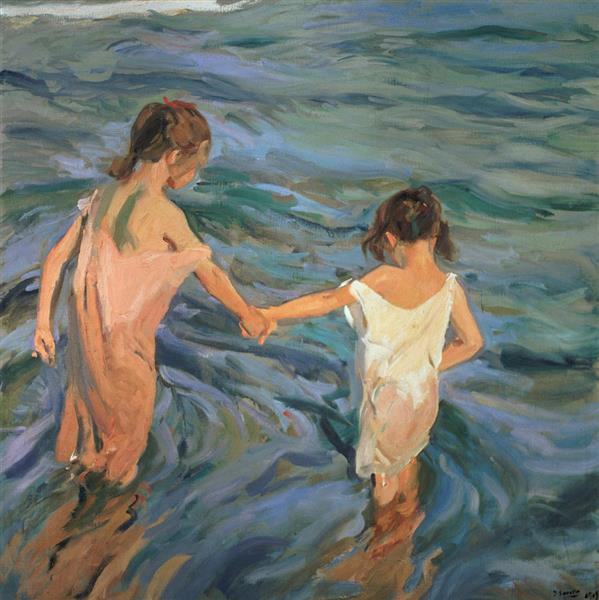
Unlike warmer colors that immediately activate a room, blue creates distance. It slows visual processing. It introduces emotional spaciousness. A pale blue abstraction across a bedroom does not demand attention aggressively; it absorbs tension quietly. The room begins to breathe differently around it.
This is perhaps why so many collectors are gravitating toward blue abstraction right now. The appeal is not only visual sophistication, but emotional regulation. People are no longer choosing art purely to impress guests or complete interiors. Increasingly, they are choosing artworks that soften the nervous system.
Artists have long understood blue’s emotional complexity. The monochromatic works of Yves Klein transformed blue into something immersive and almost spiritual, while painters like Helen Frankenthaler used diluted blue fields to evoke atmosphere rather than image.
Blue also carries contradictions. It can feel peaceful, but also melancholic. Expansive, yet isolating. Perhaps that emotional ambiguity is precisely why it resonates so strongly now.
Because in overstimulated times, people are not necessarily searching for happiness in art.
They are searching for quiet.
Red: Why Intense Art Feels Uncomfortable Again
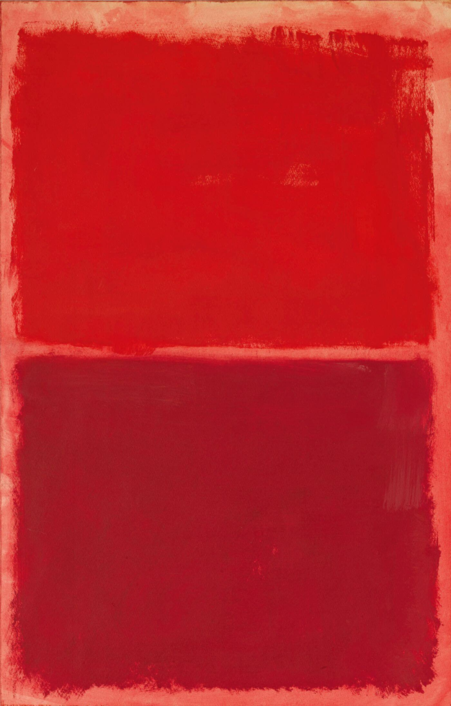
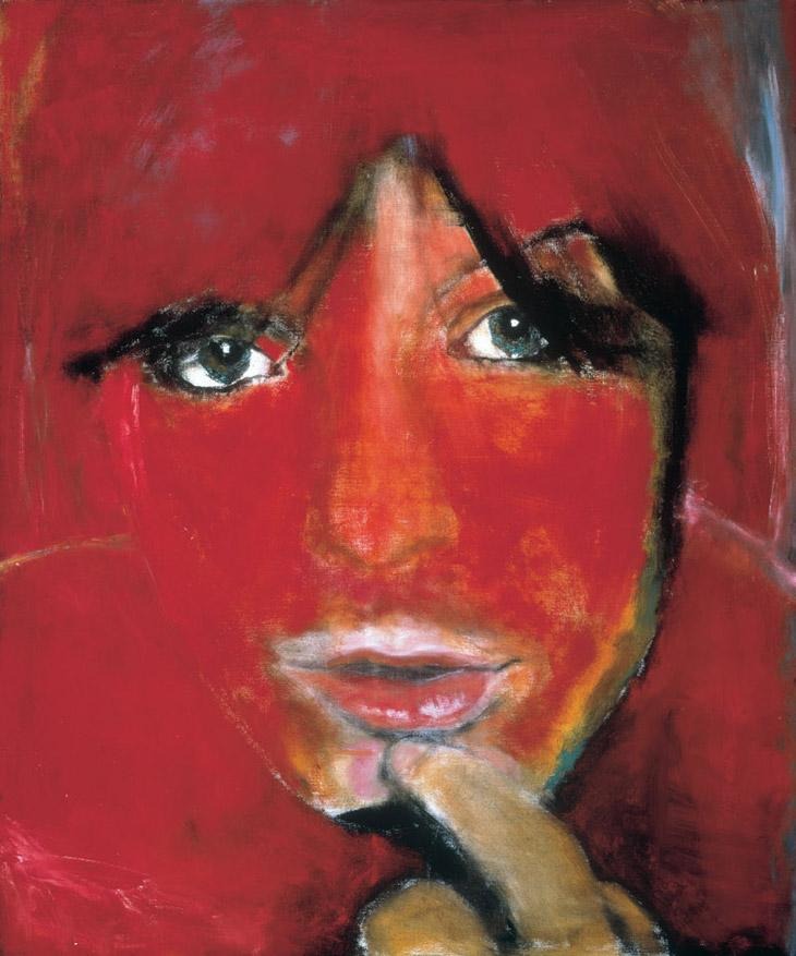
There was a time when loud interiors symbolized luxury. Bold color palettes, dramatic statement pieces, maximalist rooms designed to impress rather than comfort. But recently, something has shifted. Many contemporary interiors are becoming softer, quieter, and emotionally restrained. Which makes the presence of red art feel more striking than ever.
Red refuses to disappear into the background.
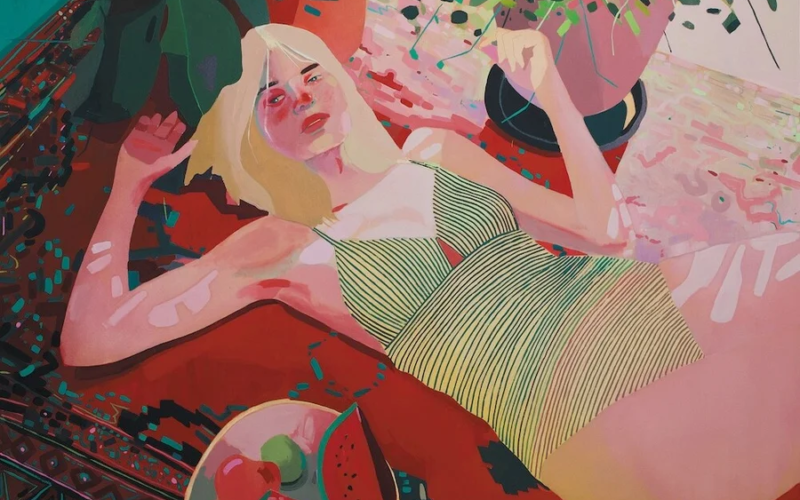
Unlike blue or neutral tones that allow the eye to rest, red demands engagement immediately. It increases visual tension inside a space. Even a single crimson painting can change the emotional temperature of a room entirely. Conversations feel louder around it. Silence feels heavier. Attention sharpens instinctively.
This may explain why collectors today often approach red artworks cautiously. In a culture already saturated with stimulation, aggression, and urgency, intensely warm palettes can feel emotionally exhausting rather than energizing. What once felt glamorous can now feel overwhelming.
Yet red remains impossible to abandon completely because it still carries something deeply human. Desire. Appetite. Vulnerability. Intimacy. Conflict. Red is emotional exposure in color form.
The paintings of Mark Rothko demonstrate this beautifully. His vast red canvases do not feel decorative, they feel immersive, almost physical. Similarly, the emotionally charged figurative works of Marlene Dumas use red not as spectacle, but as psychological tension.
And perhaps that is why red art still matters. Not because it calms us, but because it interrupts emotional numbness.
In an era obsessed with soft minimalism and muted aesthetics, red reminds us that art is not always meant to soothe.
Sometimes it is meant to confront.
Green: The Color of Emotional Recovery
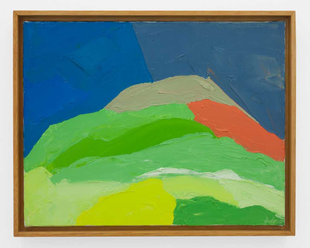
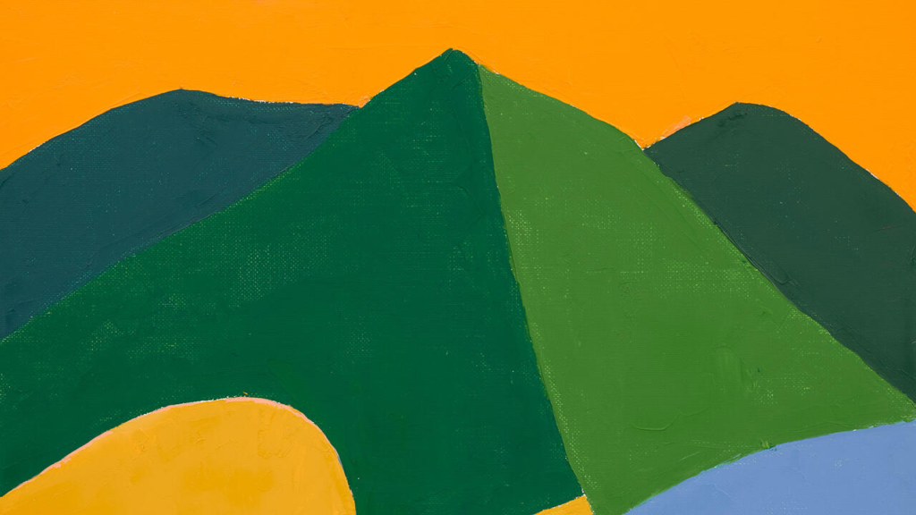
Green artworks are quietly taking over contemporary interiors, and not in the dramatic way trend forecasts usually predict. They arrive softly, sage abstractions, moss-toned canvases, olive landscapes, muted botanical palettes. Yet their growing presence says something important about the emotional state of modern living.
People are exhausted.
Not only physically, but visually. Cities have become louder, screens brighter, and everyday life increasingly disconnected from natural environments. Many homes now function simultaneously as offices, studios, resting spaces, and emotional shelters. In response, interiors are shifting away from performance and toward restoration.
This is where green art becomes significant.
Unlike highly stimulating colors such as red or orange, green exists in a psychologically balanced space. The eye processes it comfortably over long periods of time, which is why green environments often feel less mentally draining. Even abstract green works tend to evoke something instinctively familiar, forests, landscapes, shadows, vegetation, open air.
The paintings of Etel Adnan capture this beautifully. Her landscapes, though minimal and abstracted, hold an emotional warmth that feels connected to memory, land, and stillness rather than spectacle.
What is particularly interesting is that many contemporary collectors are not necessarily seeking nature imagery itself. They are seeking the feeling associated with nature. Calm. Breathing room. Psychological softness.
This reflects a larger cultural shift. Homes are no longer designed purely for aesthetics or status. Increasingly, they are being shaped around emotional survival.
And perhaps that explains why green no longer feels like a decorative choice.
It feels restorative.
Yellow and Warm Tones: Why Optimism Now Feels Complicated
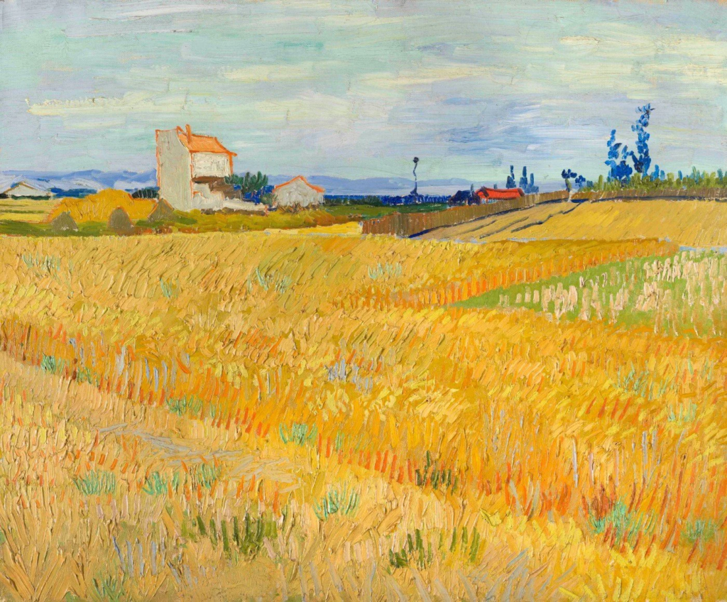
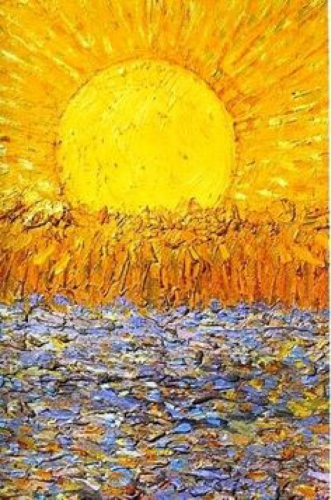
Yellow has always carried the burden of optimism.
It is the color most associated with sunlight, warmth, energy, and emotional openness. Interiors filled with ochres, golds, terracottas, and honey-toned artworks often feel welcoming almost instantly. They create visual warmth in a way cooler palettes rarely can. But recently, warm-toned art has begun to feel more emotionally complicated than comforting.
Part of this comes from overstimulation. In a world already demanding constant visibility, productivity, and emotional performance, excessively bright environments can feel exhausting rather than uplifting. Warm colors radiate outward. They pull attention continuously. And unlike blue or green, which create psychological space, yellow keeps the nervous system alert.
This may explain why contemporary collectors are gravitating less toward saturated sunshine yellows and more toward muted warmth, dusty ochres, faded ambers, softened terracottas. These tones still create intimacy, but without the pressure of forced optimism.
There is also something culturally revealing about this shift. For years, social media aesthetics celebrated brightness relentlessly: bright homes, bright palettes, bright personalities. But people are increasingly drawn toward spaces that feel emotionally honest rather than performatively cheerful.
Warm-toned artworks still matter deeply because they humanize interiors. They make spaces feel inhabited, social, and alive. But today’s warmth feels quieter. Less performative. More grounded.
Many contemporary painters use warm palettes not to symbolize joy, but memory, fragility, nostalgia, or emotional vulnerability. The color becomes less about happiness itself and more about the longing for comfort.
And perhaps that is what makes warm-toned art resonate now.
Not because it promises joy.
But because it offers tenderness.
Neutrals: The Rise of Quiet Art in an Overstimulated World
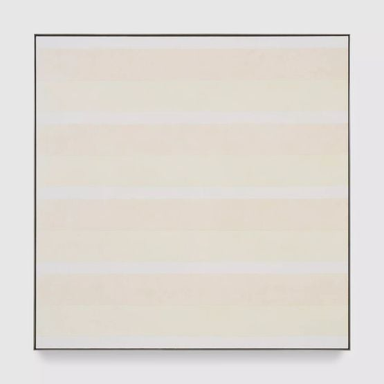
The rise of neutral-toned art says something unsettling about the cultural moment we are living through.
For years, the art world celebrated spectacle, large gestures, visual excess, instantly recognizable statements. But increasingly, collectors are filling their homes with artworks that whisper instead of shout. Beige abstractions. Pale textured canvases. Soft monochromes. Sculptural whites. Rooms designed not around impact, but emotional quiet.
At first glance, this aesthetic can seem purely trend-driven, tied to minimalist interiors and the rise of “quiet luxury.” But beneath the surface, it feels psychological. People are no longer decorating for stimulation. They are decorating for relief.
Neutral artworks absorb attention differently. They slow visual processing instead of competing for it. In spaces already crowded with screens, advertisements, notifications, and endless digital noise, these quieter works create a rare sense of stillness. The eye softens around them.
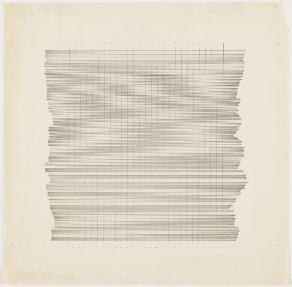
Artists such as Agnes Martin understood this long before contemporary minimalism turned it into an aesthetic language. Her restrained grids and muted palettes were never empty; they were emotionally precise. Silence itself became part of the artwork.
What is fascinating is how this emotional minimalism now dominates luxury interiors. Not because wealthy collectors want less personality, but because overstimulation has become exhausting. Quietness itself now feels aspirational.
And yet, neutral art is often misunderstood as emotionally cold. In reality, many of these works are deeply intimate. Without dramatic color or narrative, texture becomes emotional language. Light becomes movement. Restraint becomes vulnerability.
Perhaps our obsession with quiet art is not aesthetic at all.
Perhaps it is nervous-system management disguised as taste.
Dark Tones: Why Moody Art Feels Comforting Right Now
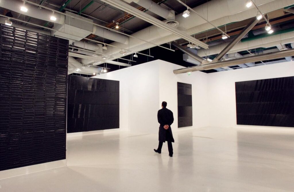
For a long time, bright interiors dominated contemporary visual culture. Airy white rooms, sunlit minimalism, optimistic palettes designed to feel endlessly clean and emotionally light. But recently, darker artworks have begun returning to collector homes and gallery spaces in a striking way.
And interestingly, they no longer feel depressed.
They feel comforted.
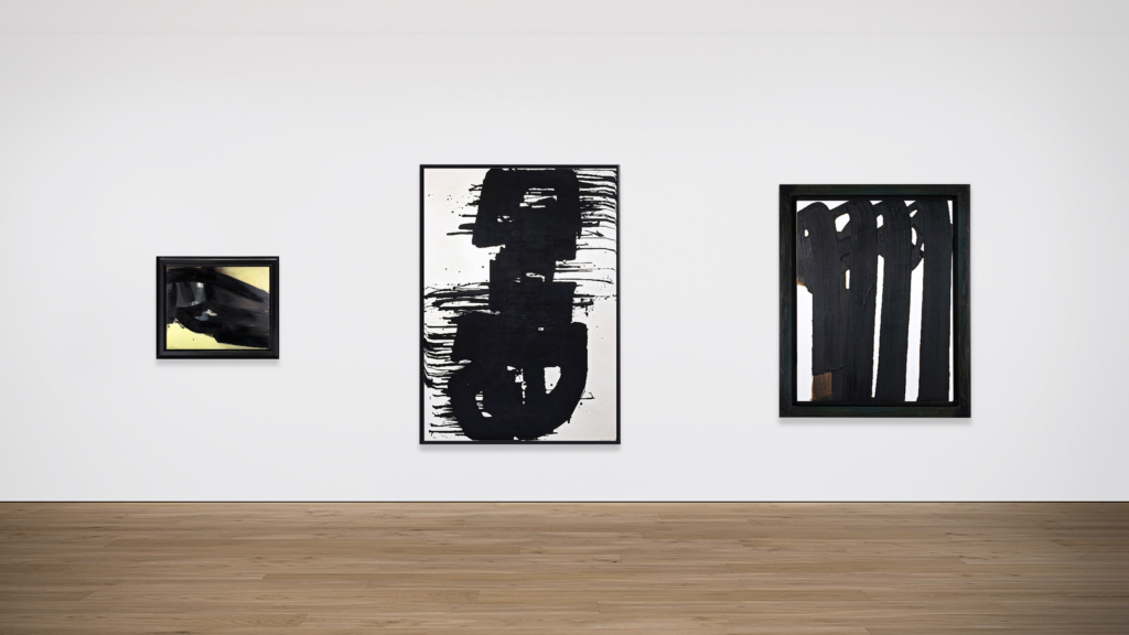
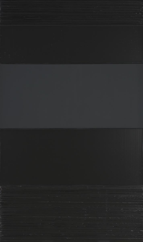
Dark-toned paintings absorb light rather than reflect it. Deep blacks, charcoal grays, burgundies, midnight blues, and shadow-heavy compositions create spaces that feel slower and more intimate. Instead of expanding a room visually, they pull attention inward. The atmosphere becomes quieter, more cinematic, more emotionally grounded.
This shift may reflect a larger cultural exhaustion with forced positivity. People are increasingly resistant to environments that demand constant brightness, productivity, or emotional performance. Dark art offers something different: permission to feel complexity without immediately resolving it.
The works of Pierre Soulages demonstrate this beautifully. His black paintings are not empty voids, but surfaces alive with texture, reflection, and movement. Darkness becomes immersive rather than oppressive.
Many contemporary figurative painters are also embracing darker palettes to explore themes of memory, solitude, vulnerability, and emotional ambiguity. These works do not seek instant readability. They ask viewers to slow down and sit with uncertainty.
Perhaps that is why dark artworks feel increasingly relevant right now. In overstimulated spaces, they reduce visual noise. In emotionally performative cultures, they offer honesty.
Not every room needs to radiate optimism.
Some spaces are meant for contemplation. Some are meant for silence. Some are meant to hold emotional depth without apology.
And dark art understands that better than almost anything else.
Perhaps the most revealing thing about contemporary art trends is not what people are buying, but what they are emotionally seeking from the spaces around them.
The growing presence of quiet abstraction, earthy palettes, dark tonal paintings, and emotionally restrained interiors reflects more than aesthetic preference. It reflects a culture searching for softness after years of overstimulation. A culture increasingly drawn toward stillness, intimacy, slowness, and emotional honesty.
Art has always shaped the atmosphere, but today, people seem far more aware of its psychological effect. A painting can energize a room, soften it, ground it, or emotionally overwhelm it. Certain works make spaces feel expansive. Others create intimacy. Some invite reflection, while others refuse comfort entirely.
And perhaps that is why living with art feels different now than it once did. The relationship has become less performative and more personal.
People are no longer asking only:
“What looks beautiful here?”
They are asking:
“What allows me to breathe here?”
That question changes everything.
Because eventually, the art we live with becomes tied to memory, routine, emotion, and emotional survival itself. The colors we surround ourselves with quietly shape how mornings feel, how conversations unfold, how rest happens, and how solitude settles into a room.
Which means art is never really passive.
It is emotional architecture.
And maybe the most powerful artworks are not always the loudest ones, but the ones that quietly change the way a space and the person inside it feels over time.
Do you choose art for how it looks, or for how it makes you feel?
Curious why dark paintings feel emotionally magnetic right now? Explore the unsettling brilliance of Francisco Goya’s Black Paintings in our deep dive: Why Goya’s Black Paintings Are Still the Darkest Works in Art History.