

Artists On Color
10 Artists Share What Color Means To Them
Color has a way of changing how we see things. A little blue can make a painting feel quiet and familiar, while a bright red can bring energy to an otherwise simple composition. Sometimes, a single shade is enough to change the entire mood of a piece. And for artists, color can be so much more than something to fill a canvas with.
It can be a feeling, a memory, a way of looking at the world, or a language that helps express something words cannot quite capture.
Every artist approaches color differently. Some are drawn to the colors they find in nature, while others love experimenting with unexpected combinations, bold contrasts, and shades that might not exist anywhere outside their imagination. Over time, these choices become part of what makes their work feel so personal.
But what do artists themselves have to say about color? How do they understand its place in their work, and what can their words teach us about finding our own way with it?
We gathered ten thoughtful quotes from artists whose work has helped us see color differently. Whether you are an experienced painter or someone who is still finding their way around a palette, we hope their words inspire you to look a little closer, experiment a little more, and enjoy the colors that make you want to create.
1. Georgia O’Keeffe: Color Can Make Life More Beautiful
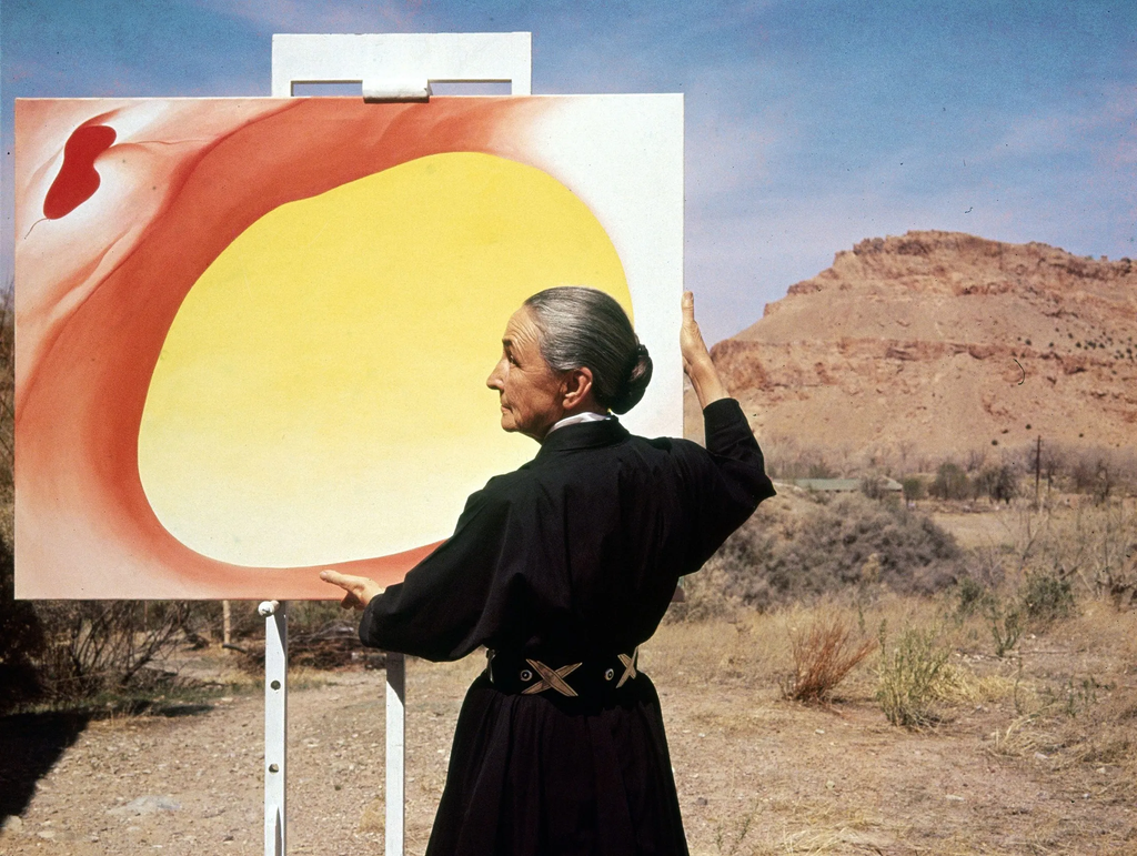
“Color is one of the great things in the world that makes life worth living to me.”
Georgia O’Keeffe had a remarkable way of making us look at familiar things differently. Her paintings of flowers, landscapes, and the natural world invite us to slow down and notice details we might otherwise overlook. A flower becomes something monumental. A stretch of desert feels full of possibility. Even the simplest shapes can hold an extraordinary amount of feeling.
O’Keeffe’s relationship with color was deeply connected to the way she experienced the world around her. She did not simply want to reproduce what she saw. She wanted to communicate what those sights meant to her, using color and form to create an emotional response.
Her words remind us that color does not need to be complicated to be meaningful. Sometimes, it is the particular shade of a flower, the changing light across a landscape, or the blue of the sky on an ordinary afternoon that makes us want to pick up a brush.
As artists, we can become so focused on technique, composition, and getting things right that we forget to enjoy the simple act of looking. O’Keeffe encourages us to return to that feeling of wonder. What colors make you feel something? Which ones do you find yourself returning to, even without knowing why? Perhaps those are the colors worth exploring in your next piece.
2. Henri Matisse: Let Color Express What You Feel
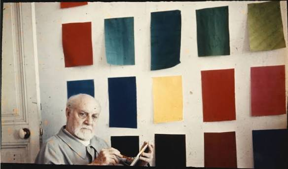
“A color for me is a force.”
Henri Matisse understood that color could do much more than describe the world around us. Throughout his career, he used vivid, sometimes unexpected combinations to create paintings that felt alive with movement and emotion.
In his work, green did not always have to represent grass, and blue did not have to stand for the sky. Color could be chosen for the way it worked within a painting, the feeling it created, or the relationship it established with the shades around it.
This approach allowed Matisse to move beyond the idea that a painting had to look exactly like its subject. Instead, he could use color to express his own response to what he saw.
For artists, this can be a liberating way to think about the palette. You do not always have to choose the shade that seems most realistic. A portrait can use unexpected colors. A landscape can contain pinks, purples, or oranges that have little to do with what is actually in front of you.
Sometimes, the most interesting choice is the one that feels right rather than the one that follows the rules.
Matisse reminds us to trust our eyes and instincts. Color has its own energy, and learning to work with that energy can open up possibilities we might never discover by trying to get everything exactly right.
3. Wassily Kandinsky: Color Speaks To The Soul
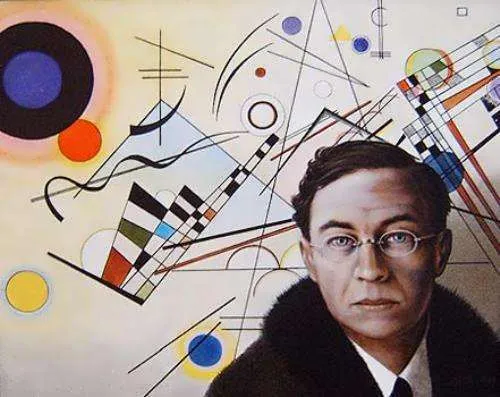
“Color is a means of exerting direct influence upon the soul.”
Have you ever looked at a painting and felt something before you could explain what you were seeing? Perhaps the colors made you feel calm, curious, unsettled, or unexpectedly happy. You might not have understood the artist’s intention, but something about the work still reached you.
Wassily Kandinsky was fascinated by this relationship between color, feeling, and the human experience. A pioneer of abstract art, he believed that color and form could communicate independently of recognizable objects. His paintings often bring together vibrant shades, lines, and shapes in compositions that feel almost musical.
For Kandinsky, color had an expressive power of its own. It could create an experience without needing to tell a literal story.
This is an especially lovely idea for artists who are exploring abstraction or trying to find a more personal visual language. You do not always need a clear subject or a detailed explanation for what you make. Sometimes, a combination of shapes and colors can express something that is difficult to put into words.
The next time you sit down to paint, try asking yourself how you want the work to feel before deciding what it should look like.
Would you like it to feel playful, quiet, restless, or full of energy? Let those feelings guide your color choices and see where they take you.
4. Helen Frankenthaler: Let Color Lead You Somewhere New
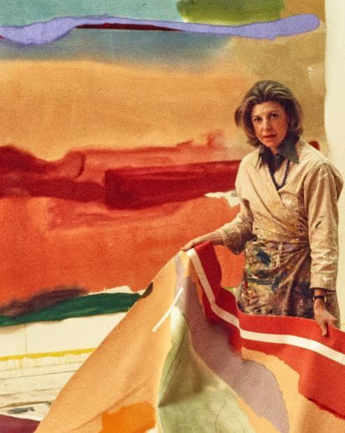
“For me, color always comes out of drawing.”
Helen Frankenthaler helped expand the possibilities of abstract painting through her innovative use of diluted paint and unprimed canvas. Rather than treating color as something that simply sat on top of a finished composition, she allowed it to spread, flow, and become part of the structure of the work itself.
Her approach was experimental and deeply connected to the act of making. Color and drawing were not entirely separate activities. They worked together, influencing how the painting developed. Frankenthaler’s words offer an important reminder that the creative process does not always follow a neat sequence. We often imagine that an artist begins with a complete plan and then carefully brings it to life. In reality, making art can be much less predictable.
A line might suggest a new shape. A wash of paint might change the direction of an entire piece. A color combination that seemed unusual at first might turn out to be exactly what the painting needed.
If you are working on a piece that feels too controlled, perhaps this is an invitation to loosen your approach. Try allowing one decision to lead to another instead of deciding everything in advance. You might discover something you would never have planned. And even when an experiment does not work, it can still teach you something about the way you like to make art.
5. Claude Monet: Finding Joy In The Search For Color
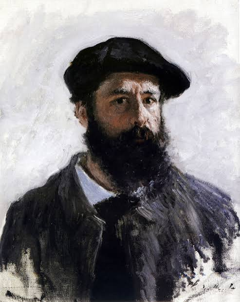
“Color is my day-long obsession, joy and torment.”
For Claude Monet, color was a lifelong pursuit. Best known for his Impressionist paintings, Monet spent years studying the changing effects of light on landscapes, gardens, water, and everyday scenes.
His paintings show how dramatically a subject can change depending on the time of day, the weather, or the atmosphere surrounding it. A pond can become a world of shifting blues, greens, pinks, and violets. A familiar building can look entirely different beneath the morning sun or the fading light of evening.
Yet Monet’s quote also reveals something wonderfully honest about being an artist. Color brought him joy, but it could also frustrate him. The search for the right shade or the right combination was not always easy.
Many artists know that feeling. You can spend hours mixing colors, trying to recreate a shade you can picture perfectly in your mind, only to find that nothing seems quite right. Sometimes, the more you try to control the outcome, the further away it feels.
Monet reminds us that this struggle is part of the relationship we build with our work. Loving something does not mean it will always come easily. Perhaps the joy is in continuing to look, mix, experiment, and discover. You do not have to find the perfect color immediately. You only have to remain curious enough to keep searching.
6. Sonia Delaunay: Color Has A Language Of Its Own
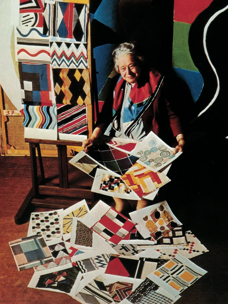
“Color is the skin of the world.”
Sonia Delaunay believed in the expressive possibilities of color, and her work shows just how far that belief could take her. A pioneering modern artist and designer, she explored bold geometric forms and vibrant color combinations across painting, textiles, fashion, and other creative mediums.
Her compositions often bring together contrasting shades that seem to move and interact across the surface. Rather than using color simply to describe an object, Delaunay made it central to the experience of the work.
Her description of color as the skin of the world is a beautiful way to think about how deeply it shapes our surroundings. Color is everywhere, from the clothes we choose to wear to the patterns of light that fall across a room. It influences how we experience objects, spaces, and even one another.
For artists, Delaunay’s approach offers a chance to look beyond the canvas. Color can travel between mediums, inspiring a painting one day and a textile, illustration, or design the next. You might find inspiration in a patterned fabric, a collection of everyday objects, or the colors that appear together in a busy street. You do not have to limit your ideas to what you already know how to make.
Sometimes, a single combination of colors can become the starting point for an entirely new direction in your practice.
7. Paul Klee: Let Color Become Part Of You
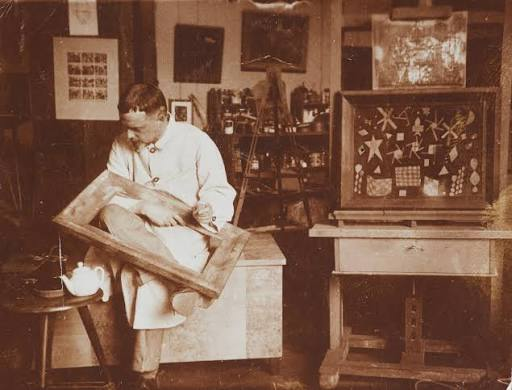
“Color has me. I don’t have to pursue it. It will always possess me, I know it.”
Paul Klee’s work often feels like an invitation into a world of imagination. His paintings and drawings bring together playful shapes, delicate lines, symbols, and carefully considered color relationships. Some works resemble musical compositions, while others feel like fragments of a dream or memories of a place that never quite existed.
Klee approached art with a deep curiosity about how visual elements could work together. His use of color was not simply about choosing attractive shades. It was about exploring relationships, building rhythm, and creating a sense of movement across the surface.
His words suggest a kind of trust that many artists spend years learning to develop. Instead of chasing a particular result, he describes color as something that stays with him, something that has become part of how he sees and makes sense of the world.
Perhaps this is what happens when we spend enough time with the things we love. We begin to notice them everywhere. Colors appear in the most unexpected places, and combinations that once seemed ordinary suddenly catch our attention.
If you are still figuring out your artistic style, you do not have to force yourself to settle on a signature palette right away. Pay attention to the shades that keep drawing you in. Save the references that excite you. Experiment with combinations that feel natural to you, even if they seem unusual to someone else.
Over time, those small preferences may become part of your own visual language.
8. Josef Albers: Color Changes Depending On What Surrounds It
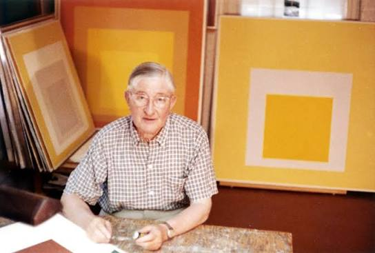
“In visual perception a color is almost never seen as it really is — as it physically is.”
Josef Albers spent much of his artistic and teaching career investigating how we perceive color. His celebrated series of square paintings, along with his influential book Interaction of Color, explored the way a shade can appear different depending on the colors placed beside it.
A blue might seem warmer next to one shade and cooler next to another. A pale color can appear brighter against a dark background, while a strong color may feel softer when surrounded by equally vivid tones.
Albers wanted artists to experience these relationships for themselves rather than simply memorizing rules about color theory. This is a particularly useful lesson for anyone who has ever mixed a color they loved on the palette, only to discover that it looked completely different once it reached the canvas. The color itself may not have changed, but the colors around it have changed how we perceive it.
Instead of immediately deciding that a shade is wrong, try moving it into a different context. Place it beside another color, change the background, or introduce a new tone into the composition. You may discover that the problem was never the color itself. It was the relationship between the colors.
Albers reminds us that working with color is not just about knowing individual shades. It is about learning to see how they behave together.
9. David Hockney: Make Room For Color In Your Life
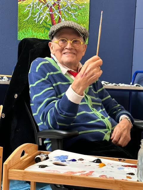
“I prefer living in color.”
David Hockney has spent decades exploring how we see the world through painting, drawing, photography, and digital art. His landscapes, portraits, and depictions of everyday life are often celebrated for their vivid palettes and fresh approach to familiar subjects.
Hockney’s use of color can make ordinary scenes feel wonderfully alive. A swimming pool becomes an arrangement of luminous blues. A landscape is filled with bright greens and unexpected pinks. Even a familiar view can become something worth looking at again.
His short statement feels like a small declaration of affection for the world. It suggests a willingness to embrace color, to notice it, and to let it become part of everyday experience. For artists, this can be a reminder that inspiration does not always have to come from grand subjects or extraordinary events. It can begin with the colors already around us.
Look at the flowers on your table, the light coming through your window, or the collection of objects on your desk. Notice the shades that appear together without anyone having planned them. You might find a combination that inspires a new painting or a detail that changes how you approach an existing one.
Hockney’s words encourage us to remain open to the visual richness of ordinary life. Sometimes, the best thing we can do for our creative practice is simply to pay attention to what is already there.
10. Grandma Moses: Let Your Own Imagination Guide You

“I look out the window sometimes to seek the color of the shadows and the different greens in the trees, but when I get ready to paint I just close my eyes and imagine a scene.”
Anna Mary Robertson Moses, widely known as Grandma Moses, began her celebrated painting career later in life. Her scenes of rural America brought together memories, everyday activities, changing seasons, and the landscapes she knew so well.
Her paintings are full of lively details and a distinctive sense of storytelling. The colors help bring these scenes to life, creating a world that feels personal rather than simply copied from a photograph. What makes her words especially lovely is the balance between observation and imagination. She looked carefully at the world around her, noticing the greens of the trees and the colors of shadows. But when it came time to paint, she also allowed herself to imagine.
For artists, that balance can be incredibly freeing. Studying nature, learning about color theory, and practising technical skills are all valuable parts of developing a creative practice. But observation does not have to end with reproduction.
You can take the colors you see outside and transform them into something that belongs entirely to you. A familiar landscape can become brighter, softer, more dreamlike, or filled with details drawn from memory. You do not have to reproduce a scene exactly as it appears in front of you. You can paint how it feels to remember it.
Grandma Moses reminds us that our imagination is just as important as our ability to observe. The world gives us endless inspiration, but what we choose to do with it is where our own creativity begins.
Color, Creativity, And Finding Your Own Way
Put these ten artists in one room, and they would bring very different ideas about color to the conversation.
Georgia O’Keeffe saw it as one of life’s great pleasures. Henri Matisse understood its expressive force. Wassily Kandinsky explored its connection to emotion, while Helen Frankenthaler allowed it to guide the movement of her paintings. Claude Monet pursued it with both joy and frustration. Sonia Delaunay celebrated its place in the world, Paul Klee trusted its hold on his imagination, and Josef Albers studied how it changes in relation to other colors. David Hockney reminds us to appreciate the vividness of everyday life, while Grandma Moses shows us how observation and imagination can work together.
Their approaches are different, but perhaps that is what makes their words so valuable. There is no single correct way to work with color. You can spend years studying color theory, or you can begin with a shade that makes you happy. You can plan every detail of a composition, or you can allow a painting to develop through experimentation. You can choose colors that reflect the world around you, or you can create a world that exists only in your imagination.
The important thing is to stay curious about what color can do in your work. The next time you sit down with your paints, pencils, or pastels, give yourself permission to experiment. Try a combination you would not normally choose. Return to a shade you have always loved. Pay attention to the colors that make you pause when you see them in everyday life.
You might not always know why a particular color feels right, and you do not have to explain every decision you make. Sometimes, creating art begins with something as simple as seeing a color and wanting to spend a little more time with it. And perhaps that is one of the loveliest things about being an artist: there is always another shade to discover, another combination to try, and another way to see the world.